Media AS Evaluation
This project details the creation of a modern urban music magazine aimed at the younger generation. By utilizing Photoshop, I designed a front cover featuring a male model in typical urban attire, reflecting the preferences gathered from a questionnaire about music styles. The contents page maintains a cohesive color scheme and attracts attention despite striving for simplicity. My research and sketches guided the design process, while critical feedback highlighted areas for improvement, particularly in typography and layout. This evaluation underscores the importance of aligning aesthetics with target audience expectations.

Media AS Evaluation
E N D
Presentation Transcript
Media AS Evaluation Jamie Bevan : 6019
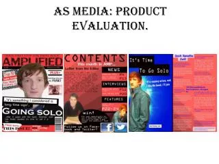
Genre And Target Audiences Front Cover • For my Front have used an urban theme using Photoshop. This has fit in with my questionnaire results as the majority of the results were leaning towards the more modern type of music. I made my front cover quite modern in the fact that it will hopefully be popular with the younger generation which it is aimed at rather than the more older generation.I have a male model in my front cover with a hood as i believe this is what a stereotypical person that listens to this genre would wear.
Genre And Target Audiences Contents Page • For my contents page have used a similar theme trying to use the same kind of colour scheme to make it obvious that they are part of the same magazine. I have a basic information contents page where the arty side is more of the look i am going for rather than a detailed information filled contents page. However it has maintained all of the information that a contents page should need. I believe this has made it more eye catching to the audience.
Genre And Target Audiences Article • I have had a clear picture in my head of what my Article back ground should look like. I chose to have 2 male models on a white background to draw all of the attention to them. ‘B.I.T.G’ is one of the models which should attract the eye of the reader as he is a ‘celebrity’. The idea was that the target audience would recognise him as the magazine is aimed at the ages of ten – twenties.
Research • For my research I prepared a questionnaire in which I asked members of the public to answer. i gathered the results and to my surprise the results were a big advantage to me as they were exactly how I had hopped they would be. The results told me that my initials ideas were shared by others giving me the go ahead to start the magazine to the theme of underground music.
The Plan And Sketch • I knew I wanted a male model as my main model for my magazine because I believe that the male gender is more likely to wear the type of clothing that suits the genre of music on a stereotypical level . I wanted to use a pin hole effect on the camera which would darken the corners of the image making the main focus more obvious and outstanding.
Taking The Photo • When taking the photo I wanted to achieve a simple photo which I could then make improvements to such as editing the colours of logo’s and feathering the photo to stick onto a different coloured background so I made sure that the photo was taken on a plain background (White). I also wanted a medium close up which would show more of the models face and expression which I believe is important for a pose on a front cover.
Photoshop • I found using Photoshop quite challenging at first, but once I gained the basic skills I found it quite easy. I believe my picture editing went well however I believe I could have done better on the Text side of things and if given another chance I would definitely go back and change a few things around erg take more time on the font as I think there are better fonts out there to use which would suit more to my genre of magazine.
InDesign • I also found Indesign a very hard program to get used to mostly because of the way you had to use the text features. I was not used to it and it took me a long time to sort it out the way I intended which took a lot of my time up and again if given the chance I would of liked to have gone back and had more time to get it exactly how I wanted it. However when setting the background of the article I found that it went very smoothly and to plan when setting the resolution correctly which I believe saved me a lot of time.
Criticisms! Analyses Basic Font The main things my Magazine has been criticised for is… Grey Font on a plane background Head Facing Down Small Font
The good stuff! Analyses Suitable Font(s)! Good use of a logo Colour scheme blends well Picture size and quality fits the page well
Analyses Again, Small font Repetitive Picture Blank Space
The ‘good’ stuff! Analyses Unique layout Decent colour scheme Good use of boarders ‘I like the colour of the font, it looks like a rainbow’
Analyses Criticism! Font a little bit hard to read Could of used the space a little better A tiny bit overlapping of the text on the left page
Analyses The good stuff! Text Mapping around the models Big, clear, designer heading Matching Colour Schemes