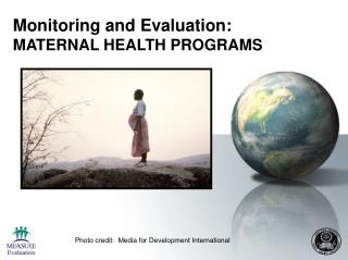
AS Media: Product Evaluation.
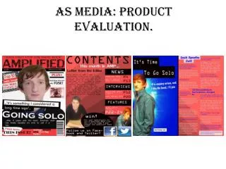
"Amplified" is an innovative Indie music magazine that challenges traditional conventions. By centralizing the main image and using direct address, it invokes the familiar style of established titles like Q. The cover's unique pull quote and lower cover line placement are designed to grab attention. Aiming at a youthful audience aged 16-26, the magazine reflects a sophisticated yet laid-back style, showcasing artists in formal attire. Distributed by Bauer Media Group, it targets both Indie enthusiasts and open-minded rock fans, ensuring a wide reach and appeal.

AS Media: Product Evaluation.
E N D
Presentation Transcript
In what ways does your product use, develop or challenge forms and conventions of real products? I made sure my main image was placed centrally and overlapped the headline, which is a convention used by many music magazines. The person in my image was staring straight at the camera (direct address), which is similar to the image on the Q cover. I challenged the convention of cover line placement, that is usually found higher up on front covers. However I liked the lower placement that ‘Q’ used, so I emulated this on my cover. I included a pull quote on my cover, just above the cover line, similar to the placement of the magazine ‘Q’. I used a similar placement for my pull quote to what Q used.
In what ways does your product use, develop or challenge forms and conventions of real products? I positioned my tag line above the title of my magazine so my main image didn’t obstruct it. It is also a convention used by the magazine Q I included separate cover lines on both the left and right thirds. Similar to Q magazine. I also varied the colouring, size and style of the font, to give it a more appealing look. I placed my barcode similarly to the placement on the Q front cover. I did this because it doesn’t obstruct any of the other content on my magazine, but also because it is in a position where it is easily visible.
How does you product represent particular social groups? • As my piece was based on Indie Rock, I wanted to represent the ‘Indie’ social group. Indie rock is a lot less heavy than other forms of rock, therefore I wanted to reflect this through my image choices. I made sure I took images of people wearing quite formal shirts, which represents a sophisticated look, and I also made sure that the images didn’t come across as being aggressive. My magazine was aimed at those aged 16-26, therefore I chose to take images of people within that age range. From my research of the magazine ‘Q’, I saw that most of their main images were of artists wearing quite formal clothing, which is what gave me the idea to replicate this in my product , as I was aiming for a similar style. To represent the sophisticated style I ensure that many of the people in my photos were wearing shirts. But to represent a ‘laid back’ style, I made sure this person in this image had his collar tied up. For example both of these Q front covers have images of artists wearing shirts and formal blazers, which represents the sense of sophistication I was trying to achieve.
What institution would distribute your product and why? • I think the distribution company most likely to distribute my product would be ‘Bauer Media Group’. I believe this because Bauer distribute magazines such as ‘Q’, ‘FHM’, ‘Mojo’ and ‘Kerrang’, and, as my magazine is of a similar genre, price range and target audience, it is appropriate that it would be distributed by the same company/institution. • Bauer also distributes masses of magazines per year, and targets a very wide audience, therefore to increase the chances of my magazine being sold, Bauer would be the best distribution intuition to distribute my product. As Indie is very current and popular, it is likely that people will be interested in buying an Indie music magazine, which would fit with the mass of distribution that Bauer does each month. • Many of the magazines that Bauer distribute, such as ‘Q’, are ‘monthly magazines’, and, as my magazine is a monthly magazine, it seems appropriate Bauer should be the company to distribute my product. Bauer also distributes many magazines that are extended to other forms of media such as radio and TV, Kerrang and ‘Q’ being two examples.
Who would be the audience for your product? • My magazine is aimed at males an females aged 16-26, however that is just my primary audience, the sophisticated style of my magazine may appeal to a secondary audience of those of an older generation. My audience are likely to be interested in Indie Rock as this is the primary genre of my magazine. However music fans that are open minded when it comes to musical tastes may also buy my magazine. General rock fans might also purchase my magazine due to the fact that they like all types of rock and sub genres of rock. My title ‘Amplified’ implies a sense that the music featured in my magazine is loud and heavy, which might appeal to fans of heavy metal or heavy rock. • I chose to aim my magazine at a target audience of those aged 16-26 because people in that age range are likely to purchase magazines on a regular basis. Those aged 16-26 are also likely to be interested in modern music, and, as Indie is current with regards to fashion as well as music, they may be persuaded to purchase this music magazine. It is also likely that my target audience would respond more positively to free gifts such as free posters or a free gig guide, therefore in my product I aimed to use similar conventions in order to appeal to my target audience.
How did you attract/address your audience? • To attract my target audience, I aimed to use similar codes and conventions of real, industry media products. During my research, I highlighted some of the codes and conventions used by industry music magazines, which then enabled me to follow them through during the production stages. I priced my magazine at £1.99 because my target audience of males and females aged 16-26 might not have much money to spare. Backstage interviews that give the reader an insight into what it’s like before a gig. Dominant main image of an indie rock musician which would appeal to the audience that knows who he is. I included ‘top 10 indie songs to appeal my target audience as they are interested in rock and indie rock. The main cover line is aimed at my target audience of people interested in indie rock bands and stories about indie rock bands. Free gifts and guides would appeal to music enthusiasts.
What have you learnt about technologies from the process of constructing the product? • During the process of creating my music magazine I have learnt a lot on ‘Photoshop’, which is software that I wasn’t familiar with at all at the start of the process. It was, however, essential that I used industry standard software like Photoshop in order to give myself the best chance of creating a professional looking magazine. These are some features that I learnt whilst using Photoshop: To enhance the visual aspects of my image I went on ‘filter’ then ‘artistic’ and then finally on ‘coloured pencil’, where I was then given editing options. In the end I chose the ‘coloured pencil’ option because it looked the most visually appealing compared to the others that didn’t seem appropriate. I used the same techniques to improve the red background on the right side. However this time I applied the ‘poster edges’, as this option looked the best.
What have you learnt about technologies from the process of constructing the product? To shape the rectangle into the paper style shape in the footer of my front cover, I clicked on ‘free transform’, I then right clicked and I was given options to format the shape. I clicked on ‘distort’, which enabled me to shape the rectangle in all different directions. I kept shaping it until I was left with a shape that looked like a piece of paper. To apply the distorted effect to my title ‘AMPLIFIED’, I changed the blend mode from ‘normal’ to ‘dissolve. I then changed the opacity percentage to 76% which made sure it was full visible, but still looked distorted.
Looking back at your preliminary task, what do you feel you have learnt in the progression from it to the full product? Placed side by side, I feel that it is obvious how I have progressed from by preliminary task to my main task. The preliminary cover looks very basic an un-appealing, whereas I think my main task looks a lot more professional and appealing to the eye. As my Photoshop skills developed, I was able to create a better magazine using the techniques learnt over the time of production. I made use of magazine conventions in my main task, but less so in my preliminary task. Because of this, my preliminary cover was unorganised and looked messy. This contrasts with my main task cover because it looks a lot more organised.
Audience feedback on magazine product. Kier Ireson, aged 17, student. Overall I think Adam’s magazine looks really good. It would appeal to people interested in indie rock music and the colour schemes used on all 3 bits are appealing to the eye. Looking at his magazine side by side to another one it is clear that he has used similar features to create a professional looking magazine. I think that the price of the magazine is appropriate because people aged 16-26 don’t always have that much money so making the magazine cheap would encourage them to buy it. It is good that Adam has used stories relating to rock music which further appeal to the audience. Luke Weatherington, aged 17, student. I think Adam’s magazine looks really professional compared to other magazines. He has made his so that it uses similar features of magazine already on sale. It is appropriate that he used storylines related to rock music because this was the genre of his magazine. I like that he has used the same colour scheme throughout the 3 pages, and I like the lighting surrounding the image on the double page spread. I think the magazine creates a laid back and formal look, which I think is what he was trying to achieve, therefore it would be successful. This is shown through the images of people wearing causal shirts.