ICON Magazine - Celebrating Rock 'n' Roll Legends
ICON magazine focuses on rock 'n' roll, embodying themes of attitude, rebellion, and pushing boundaries. With a goal to celebrate iconic stars, it captures the essence of the genre authentically through visuals and stories. The cover features a powerful logo and captivating captions, enticing readers with topics like top guitarists and exclusive band stories. The contents page mimics rock gig posters, providing a creative layout for easy navigation. By offering digital and print formats, ICON magazine expands its reach and engages a wider audience in the rock culture.

ICON Magazine - Celebrating Rock 'n' Roll Legends
E N D
Presentation Transcript
AS Media Evaluation By Toby Emery
ICON Magazine Introduction • ICON magazine solely focuses on the rock n roll genre of music. I have taken inspiration from existing entities such as Rolling Stone and Classic Rock to produce my three pieces. The genre of rock proposes themes of attitude, living in the moment, not tolerating authority, and pushing the envelope on what's acceptable. Therefore, I had to bring theses themes and ideas to life throughout the style of my magazine to be real, authentic and stay true to the history of genre and culture of the music. My goal was to capture this through every aspect of my work from the way my subjects our posing in the photographs to the language and stories in the text. I named the magazine ICON as the aim is to celebrate the careers and legacies of the ‘larger than life’ stars of past and present who personify the very essence of rock n roll. Moreover, it is such an impactful four letter word as for a person, in the music & entertainment business, if you are to be considered an icon by your peers and by the people, then that title holds the performer in extremely high regard as that person is representative of a generation, a time, a genre or even of music as an art form itself. And that’s the elite group of rock stars that ICON magazine celebrates- the biggest names of the genre. That’s what I wanted my magazine and its title to represent. • Dictionary definitions of Icon: • An image, picture, representation • A person or thing regarded as a symbol of a belief, nation, community, or cultural movement • A person regarded as a sex symbol or as a symbol of the latest fashion trends
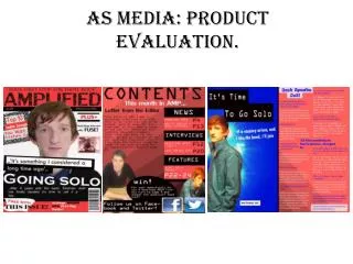
Cover Analysis • -The star and guitarist is the logo of the magazine and the original plan was to have the logo in the top left corner consistently like Q magazine. However, due to lack of space and I replaced the O with the logo this solved the space problem as well as it looking much more effective and unique. It stands in the upper centre of the page with the lower points of the star leading directly to the eyes of the subject. I used the visual of the iconic power stance as I needed an image that symbolises the genre and had a level of importance to co-exist with the word of icon. • -Read. Rock. Roll. Worked really well as the caption with use of power of three and alliteration. Its catchy, concise, and to the point that grabs readers attention with a bold statement of attitude, its not asking you, its commanding you to read, rock and roll. • -‘Win ACDC tickets’ – another selling point to the magazine using an iconic band that represents this genre like none other. Continuing the ‘star’ theme with the multitude of small stars circulating around the message to maintain consistency throughout. • -‘Top 50 greatest guitarists ever’ the main story situated on the left of the cover, strategically placed around the face of the subject to make a statement whilst not interrupting the image. ‘EVER’ being in a larger font to emphasise the enormity of the scale of competition. The ‘50’ in orange as I have used a system of colourization to show the reader what I want to stand out and what I want their attentions drawn to first as opposed to the predominantly white font. • -‘PLUS’ with a series of well known bands runs across the bottom of the page as many magazines do to show the reader what’s in the rest of the magazine- the secondary, 1/2 page stories etc. A customers favourite band maybe in these smaller stories, therefore its important to showcase these bands at the bottom of the page to attract to as many people as possible, by showing the buyer the amount of varied content available. • -The secondary story of Slash’s son placed in a black box with a small image to make an emphatic statement as a secondary story with its own font to make it unique. ‘Sweet Child of Slash Strives for Stardom’ – Using a play on words of the famous guns n roses song, sweet child of mine. Moreover, using sibilance to add to the effectiveness.
Contents Analysis • -The inspiration behind the contents page was to lay it out in a gig promotion poster style with the two columns of pages and stories mimicking the dates and venues from a poster. Through this, I am trying to imitate the culture of rock and roll through a creative, and not so obvious way. • -I am utilizing multiple media platforms where you can access the issue digitally, not just print. Moreover, through doing that I’m distributing my product on a much larger scale, reaching a larger fan base and in the process making more money. With technological developments of the amazon kindle, google play and the app store etc on tablets and phones, more people in todays era are downloading content because its faster and easier to do so rather than going to your local store and picking up a physical copy. However, I have chosen to still print physical copies, as there is still a market for that. Collectors value magazines and due to who my audience is, young/middle aged men- not all of that generation are on the digital platforms. Therefore, I have distributed on both digital and print platforms in order to reach the most amount of buyers. • -My favourite image of all the magazine resides on the contents page with the head of the guitar looks likes it coming out at you with the subject in the background. The image was shot with a low aperture to create that depth you can see in the photo. It is perfect for a contents page and is just continues with the attitude and style of the magazine. Standing with a heroic pose as if the guitar is his weapon and source of power to the audience. The facial expression almost shows a threatening notorious domineer as the attitude of the stereotypical rock star shines through on the page. • -As shown in many magazines, the font of the number, the heading and subtext differ in font and size to put a hierarchy of importance in terms of what needs to draw the attention of the reader first.
Double Page Spread Analysis • Following over from the DPS I have once again used a poster style look with the sharpened image and darkened background to augment the subject to a larger than life look. I have used the diagonal direction of the guitar to utilize headings and logos with a skewered slant to bring a unique dynamic to the page as opposed to the standard horizontal line. • I have used an outlandish, bold, statement of a quote to add another dimension to the ‘BLETSOE’ character making him confident and almost arrogant to fit that rock star mould that people want to admire and worship, once again, being very fitting to the title of the magazine. The swear word has been censored out with use of star simply another way to incorporate the logo. • The interviewers questions in orange and the stars words in white is an idea completely taken from the forms and conventions of real magazines. It is a system to accentuate from who’s who in the interview. Moreover, I have used my colours of white and orange as they part of the colour scheme I have used throughout the magazine. • The cover story is a Q & A about life on the road and promotion for a new album. Its in column form with a small, simplistic font so its easy to read. Once again, following the forms and conventions of existing magazines. • Looking back on the DPS, I could have written a lot more content but spacing was an issue as I wanted to maintain strong emphasis on the image as it’s a strong image. This is why I placed the arrow at the end of the page to show that the article would continue on the following pages. I would have liked to of had more content on the DPS but I wanted a big image and imposing header so I couldn’t of had it all with two pages I had access to.
Forms & Conventions • -The three primary colours I have used for the magazine are black, white and orange. The idea for these colours came naturally from the colours of my subject. His long ginger hair makes an emphatic statement in the photographs so I went along with it for and dropped it in and certain text I wanted attention drawn to. It goes really well with simplistic and timeless combination of black and white. In addition to this I have followed the forms and conventions of real media products through using the black and white yet contrasting it with a striking colour. This is called colourization. • -I have used alliteration and power of three in my sub-heading below the masthead as the magazines catchphrase/slogan. • -I have used an issue number and month/year on the cover • -The main story features a superlative as people want to hear about the best which is very fitting for ICON magazine • -The barcode and price stand in the bottom right corner as you would see in the majority of printed magazines • -The front cover image consists of a head and shoulder shot which has been used many times in the past • - I have challenged forms through the way I had edited my images. The image on the DPS is very grainy due to the fact that I wanted an old, raw and retro look and feel like you would see on a rock band tour poster. This is also evident in my contents page where it is laid out in a tour date like form, once again trying to replicate that feel of the rock n roll culture.
Social Groups/Audience • My magazine is aimed to a older audience of men. However, as my magazine is celebrating the biggest names of rock history, then that would undoubtedly appeal to a mainstream audience as it can be argued that 10 year old kids today sing along to ‘Livin on a prayer’, a song released nearly 30 years ago. Therefore, although the magazine is aimed at men aged in there 30s & 40s (as this is the music they grew up with), you can not ignore the crossover appeal to young and old and men and women, simply because of the music and how that has passed down through generations. On the other hand, the magazine does address taboo themes of drugs, sex and contains strong language so it would be deemed inappropriate to the youth generation. • The punk rock era is long gone. The drugs, sex and rock and roll life of the 70s and 80s that this magazine thrives on, is dead. Therefore, its hard to aim a magazine to a time period of people, music and attitude that no longer exists. However, 40/50 yr old guys can look back on the years when they were teenagers with crazy haircuts and a punk attitude who didn’t respond well to authority and almost worshipped the larger than life personas who defined pop culture at the time. So the magazine is for a middle age male demographic who would have been growing up around the time this cult like movement occurred and gives them the opportunity to relive the memories that are near and dear to their hearts. The magazine is unique in the fact its not looking at todays current pop culture of what your average young male and female are into. It is a blast from the past for the older generation to enjoy as many would not be open to todays current regime of music stars, so this is for that social group to enjoy. • As the magazine we are addressing who our the greatest guitarists of all time.. A very important and prestigious list that spans across 50/60 years of musicians. This story alone would appeal to a mass market because even if you're not a big fan of music, you still want to pick up a copy and flick to see who is number 1 as it would cause such great controversy and debate. Moreover, it is in our human nature to want to see, listen, know and read about the best. As noted previously, this magazines MAIN audience is 30/40 year old males. However, due to the greatest of all time story and the drugs, sex and rock and roll content, that sells to almost everybody aged 17/18 and over because these are very popular topics that men women and teenagers want to read about.
Distribution • The magazine would be sold in shops and local news agencies due to the fact that rock n roll is still a heavily popular and mainstream genre of music so its not going to be a free give away at a concert venue. • Sell the magazine at a price is crucial to the growth of the magazine as with the must read, compelling stories/articles, the issue would no doubt draw huge profit. • IPC Media produces over 60 iconic media brands. This includes NME music magazine. It’s a very well known media company that would have the power and brand recognition to get my magazine into the major news outlets. It has a good reputation with magazines like NME and has the name to put my magazine over.
Technology/Progression • -Photoshop • -In design • -Photo shoots • -Paint • -Pixlr • I have learned how and why magazine editors do what they do in order to release the best possible product. Through constant editing and moving layers around I have developed not only skills but my patience on working with different software. I am now confident with Photoshop on a basic/intermediate level. • When doing the shoot, I used no set lights or natural lighting. I had a black curtain and my camera on set on flash. I knew I wanted a black background on the pages so the physical curtain made the editing easier as all I had to do was increase the contrast of the black to strengthen the tone to a jet black. To get the grainy, poster style of the subject was to sharpen the image on photoshop. I originally used a low aperture of the photos to blur the background and make the focus point on the model- ideal for shooting portraits.