Display of Quantitative Information
230 likes | 291 Vues
This article discusses the principles and techniques for effectively displaying complex quantitative data, emphasizing the importance of clear portrayals and efficient design choices. It also explores the concept of data-ink ratio and the detrimental impact of unnecessary decoration or chart junk. The article concludes by highlighting the criteria for beautiful visualizations: informative, efficient, aesthetic, and novel.

Display of Quantitative Information
E N D
Presentation Transcript
Display of Quantitative Information PHYS 310 February 21, 2017
Design is choice...The principles should not be applied rigidly or in a peevish spirit. What is to be sought in designs for the display of information is the clear portrayal of complexity, not the complication of the simple.
The fundamental question in statistical analysis is: Compared with what?
Visual representations… should be governed by principles of reasoning about quantitative evidence…scientific reasoning.
Documenting the sources Enforcing appropriate comparisons demonstrating mechanisms of cause and effect Recognizing multivariate nature of problem Inspecting and evaluating alternative explanations.
https://gfycat.com/ImprobableFemaleBasenji#?speed=0.5 From Darkhorse Analytics
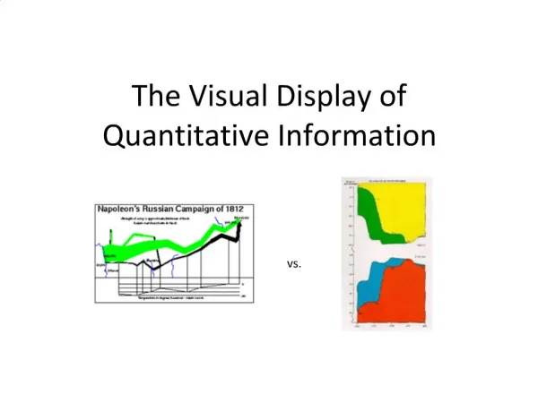
Data-Ink Ratio • In The Visual Display of Quantitative Information (1983), Tufte claims that good graphical representations maximize data-ink and erase as much non-data-ink as possible. • Non-data-ink: Scales, borders, and etc.
Examples of Graphical Excellence https://arxiv.org/pdf/1702.05556.pdf http://matplotlib.org/ http://journals.aps.org/prl/abstract/10.1103/PhysRevLett.118.061302
Data-Ink Ratio Low Data-Ink Ratio High Data-Ink Ratio
Chart Junk • “The interior decoration of graphics generates a lot of ink that does not tell the viewer anything new. The purpose of decoration varies — to make the graphic appear more scientific and precise, to enliven the display, to give the designer an opportunity to exercise artistic skills. Regardless of its cause, it is all non-data-ink or redundant data-ink, and it is often chartjunk.”
Beauty of Visualization • In Beautiful Visualization (2010), four criteria were raised to define the beauty of Visualization: • Informative • Successfully convey information • Efficient • Simple, focused, clear and straightforward • Aesthetic • Use axes, layout, shape, colors, lines, and typography appropriately • Novel • Be creative and attract readers with new design