Download

1 / 4
40 likes | 176 Vues
If you haven’t installed Google Analytics, just start by creating a free google account, get tracking code and place it in your page to collect all the site data we have presented above. This will definitely help you to create a mobile or a responsive website design.

E N D
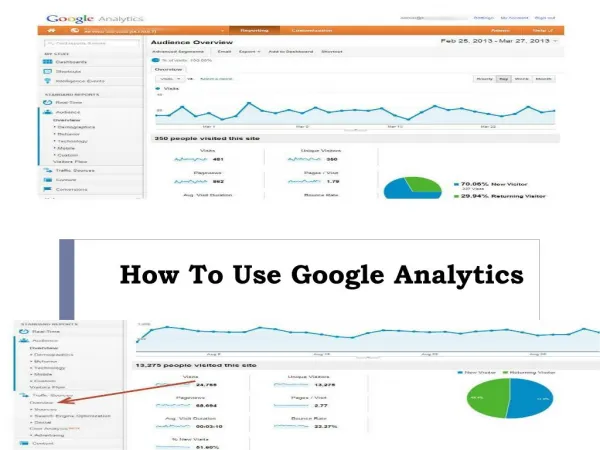
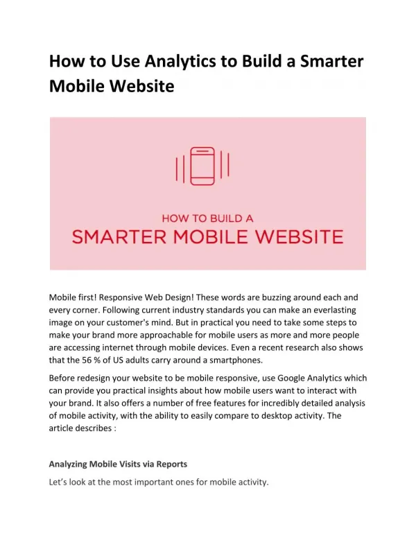
How to Use Analytics to Build a Smarter Mobile Website Mobile first! Responsive Web Design! These words are buzzing around each and every corner. Following current industry standards you can make an everlasting image on your customer's mind. But in practical you need to take some steps to make your brand more approachable for mobile users as more and more people are accessing internet through mobile devices. Even a recent research also shows that the 56 % of US adults carry around a smartphones. Before redesign your website to be mobile responsive, use Google Analytics which can provide you practical insights about how mobile users want to interact with your brand. It also offers a number of free features for incredibly detailed analysis of mobile activity, with the ability to easily compare to desktop activity. The article describes : Analyzing Mobile Visits via Reports Let’s look at the most important ones for mobile activity.
1. OVERVIEW This report (at “Audience” → “Mobile” → “Overview”) breaks down visits by mobile, desktop and tablet. The statistics will show you what percentage of visits are from mobile devices. A preview of the mobile overview report available in Google Analytics. You can also show this report to your client to realize the value of making a static website responsive, and it’s time to take their needs seriously. 2. DEVICES (“Audience” → “Mobile” → “Devices”) shows the statistics about the specific devices that people use to access your website. Also problems arise with usability on a particular phone, tablet or mobile operating system. A preview of the mobile device report.
3. BROWSER & OS (“Audience” → “Technology“ → “Browser &OS”) shows the main browsers being used to access your website, and it also highlights trends . You can see some useful reports to review when filtering down to mobile traffic. I. PAGES - determine the top pages viewed by mobile users
(“Behavior” → “Site Content” → “All Pages”) II. EXIT PAGES (“Behavior” → “Site Content” → “Exit Pages”shows the last pages people view before leaving the website. III. VISITORS FLOW (“Audience” → “Visitors Flow”) shows the top paths people take through your website IV. TRAFFIC SOURCES (“Acquisition” → “All Traffic”) shows the top sources through which people arrive on the website Conclusion If you haven’t installed Google Analytics, just start by creating a free google account, get tracking code and place it in your page to collect all the site data we have presented above. This will definitely help you to create a mobile or a responsive website design. iMediadesigns provide cost effective web design and development solutions and offers custom web design services in Toronto