Download
1 / 20
200 likes | 479 Vues
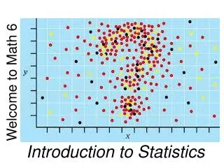
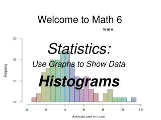
Welcome to Math 6. Statistics: Use Graphs to Show Data Histograms. Objectives. Interpret graphs that show the shape of a distribution of data . Discuss the center, spread and overall shape with dot plots, histograms and box plots.

E N D
Welcome to Math 6 Statistics: Use Graphs to Show Data Histograms
Objectives • Interpret graphs that show the shape of a distribution of data. • Discuss the center, spread and overall shape with dot plots, histograms and box plots.
A histogram is a data display in which the labels for the bars are numerical intervals.
Histograms: A histogram has solid bars like a bar graph. However, there are no spaces between the bars unless no data is given for an interval.
Histograms: 2. The intervals are listed below each bar on the x-axis. Exact values cannot be read because of the clustering of data.
Histograms: 3. The y-axis is helpful for determining the value at the height of each bar.
Histograms Advantages: Numerical data can be clustered into intervals and represented together on a graph.
Histograms Advantages: Additionally, large amounts of data can be represented.
Common Misconceptions by Students: 1. Pay attention to the intervals used on graphs in order to accurately understand the values being represented.
Common Misconceptions by Students: 2. Remember that the intervals on the y-axis do not always represent multiples of one. Be sure to look at how the axis is labeled.
Common Misconceptions by Students: 3- Remember that the intervals on the x-axis is a range that includesthe numbers seen and allthenumbersinbetween.
Common Misconceptions by Students: 4- Many students may think a histogram is exactly the same as a bar graph (which displays categorical data rather than numerical data) and try to read or create it in the same manner.
Guided Practice Presidents of the United States The list below shows the ages of the first 43 presidents at the time of inauguration. 57 61 57 57 58 57 61 54 68 51 49 64 50 48 65 52 56 46 54 49 50 47 55 55 54 42 51 56 55 51 54 51 60 62 43 55 56 61 52 69 64 46 54 Make a histogram to show the age distribution.
MORE PRACTICE http://www.glencoe.com/sec/math/studytools/cgi-bin/msgQuiz.php4?isbn=0-07-829635-8&chapter=9&lesson=1&headerFile=4&state=
box plots, dot plots, histograms, frequency tables, cluster, peak, gap, mean, median, interquartile range,measures of center, measures of variability, data, Mean Absolute Deviation (M.A.D.), quartiles, lower quartile (1st quartile or Q1), upper quartile (3rd quartile or Q3), symmetrical, skewed, summarystatistics, outlier
Conclusion A Histogram is a graphical display of data using bars of different heights.
Assignments Go to the webpage below and solve the challenging problems: http://www.lms.stjohns.k12.fl.us/teachers/baggetb/Downloads/11Math_G7_FL_07-01-C.pdf