Download
1 / 33
340 likes | 660 Vues
Principles of Visual Design. Composition, Elements, Content. Composition. The way that elements of a design are visually combined and arranged. Consists of the placement, alignment, grouping, visual flow, division of space, etc. of elements. T raditionally known as the “Principles of Design”.

E N D
Principles of Visual Design Composition, Elements, Content
Composition The way that elements of a design are visually combined and arranged. Consists of the placement, alignment, grouping, visual flow, division of space, etc. of elements. Traditionally known as the “Principles of Design”.
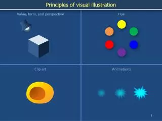
Elements The pieces that are being arranged within a composition. Could also be thought of as components or pieces. Includes the traditional “Elements of Art” or in Graphic Design, the logos, text, photographs, illustration, linework, borders and background of a piece.
Concept Theme, connotation, message, style… The thought or idea behind the design. Responsible for delivery of the desired message.
Design works when all three of these – composition, elements and concept – work in unison around a properly identified audience and purpose.
Composition Principles of Design
Layout Noun or Verb… A plan or design of something. The process of arranging editorial content, advertising, graphics and other information to fit within certain constraints. Sometimes used as a synonym for composition (noun).
It does not matter how good the element is, if it is not placed correctly it is DOOMED.
Effective placement and divisions of space are like grammar for visual vocabulary.
Principle of Unequal Spacing Variety is the Spice of Life
Variety A Principle of Design Variety adds interest Variety in spacing of points makes a composition interesting
Point Point, dot, spot… An Element of Art For our purposes today, a point is going to be a dot. A point could also represent a point of interest in a design or photograph
Try it. Place one point in each of the boxes. Make sure it is placed a different measurement from each edge. Make each composition distinctly different from the others.
Now try it with two dots. Make sure the measurement between the dots is unique as well.
The Point? Appropriate placement of elements doesn’t “just happen”. Become aware of the spatial relationships of the elements of your designs. The more you think about it, the more you won’t have to.
Division of Space Lines
When a line (or implied line) is used to divide space in a design or photograph, its placement falls under the Principle of Unequal Spacing as well.
Dead-center placement creates a static, uncreative image. The viewer doesn’t know where to look – both halves are given equal weight.
Horizon Lines An implied line is created where the sky and the ground meet in a photograph or illustration. Placing it in the center of the space confuses the viewer – is it the sky or the ground they are supposed to look at?
Horizon Lines, cont. Get out your horizon line photographs and an extra piece of paper. Use the paper to crop the image – move the horizon line up and down in the image. Try out extremes – move it WAY up or WAY down and see what happens.
When the horizon line is in the top half of the image, where do you look? What is the focus of the picture now?
When the horizon line is in the bottom half of the image, where do you look? What is the focus of the picture now?
Slightly Off-Center Slightly off-center isn’t much better than dead center. In fact, it could be worse. Slightly off-center makes it look like you are unsure of where to place something or were to lazy to do it right.
OWN the placement of your elements! It is better to be extreme in the placement of elements than wishy-washy.
The Rules Why You Have to Learn Them
Why Rules? Rules help you develop an understanding of how design works. Rules tell you what a design is trying to communicate. Rules tell you how to accomplish a look, feeling or idea visually.
For Instance The Principle of Unequal Spacing creates visual movement and interest within a piece. What if you don’t want visual movement? You would place it dead center. Centering the point of interest draws immediate and final attention.
Homework Observe the world around you. Look at design work in magazines, newspapers, advertisements, movie posters… Examine the placement of the point of interest in these images. How often do you see dead-center placement? What kind of designs use this? Why do you think that is?