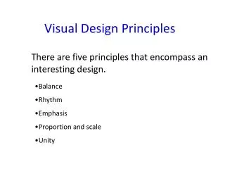
Visual Design Principles
Visual Design Principles. Jay Crook. Principles of Design and Composition. Dominance Emphasis Focal Point Scale Proportion Contrast Simplicity Repetition Symmetrical Asymmetrical Radial Pattern. Similarity Harmony Unity Continuance Variety Movement Dynamics Rhythmic

Visual Design Principles
E N D
Presentation Transcript
Visual Design Principles Jay Crook
Principles of Design and Composition • Dominance • Emphasis • Focal Point • Scale • Proportion • Contrast • Simplicity • Repetition • Symmetrical • Asymmetrical • Radial • Pattern • Similarity • Harmony • Unity • Continuance • Variety • Movement • Dynamics • Rhythmic • Arrhythmic • Directional • Closure Placement • Random • Proximity • Alignment • Balance • Center of Interest • Rule of Thirds • Positive & Negative Space Press ESC to exit
Visual Elements in Design Point Line color shape texture form value size
random Positioning visual elements carelessly without any planning or bias, as if with the eyes closed. Randomization was an important principle in Dadaism art which embraced chaos.
proximity Arranging elements that relate to one another to become a visual unit. When elements are close in proximity a relationship is implied.
alignment Formatting elements by either centering, flush left, flush right or justified. Everything on a page is visually connected to something else on the page. Nothing is placed arbitrarily.
balance Arranging elements in a given design as it relates to their visual weight within a composition. Balance usually comes in two forms: symmetrical and asymmetrical.
center of interest Positioning elements just slightly above and to the right of the actual (mathematical) center. This tends to be the natural placement of visual focus, and is also sometimes referred to as museum height.
rule of thirds Dividing any frame of reference into thirds and placing the elements of the composition on the lines in between, with the notion that the most interesting compositions are those in which the primary element is off center.
positive & negative space Balancing the elements (positive space) with the background of a composition
E mph A sI s Placing dominance to varying degrees on the design elements. It determines the visual weight of a composition, establishes space and perspective, and often resolves where the eye goes first when looking at a design
focal point Positioning larger figures usually in the foreground. It is usually quite easy to spot. If most of the figures are horizontal, a vertical element will stand out as a focal point.
scale Sizing elements in relation to each other. Importance is often associated with its scale.
proportion Relating the scale of elements between each other, or between a whole object and one of its parts. Differing proportions within a composition can relate to different kinds of balance or symmetry, and can help establish visual weight and depth.
con trast Opposing elements either by such factors as size, color, weight, texture or meaning. Often causes dynamic tension in a conflict that exists within a given design.
simplicity Omitting all non-essential elements in order to emphasize what is important. To focus on the essentials instead of trying to include everything you can.
symmetrical symmetrical Balancing elements evenly around a central vertical or horizontal axis. Normally, it assumes identical forms on both sides of the axis.
A symmetric al Balancing un-evenly around a central axis. Arranging objects of differing size in a composition such that they balance one another with their respective visual weights.
radial Balancing elements from a center point in a circular fashion. All the elements lead your eye toward the center.
pattern Repeating shape or form in an organized manner.
harmony Selecting elements that relate to and complement each other., pulling the pieces of a visual image together. Harmony can be achieved through repetition and rhythm.
un i t y Relating individual elements and the whole of a composition, tying the composition together, to give it a sense of wholeness.
continuance Directing the viewer towards one direction, until something more significant catches the attention.
variety Providing contrast to harmony and consisting of differences in objects that add interest to a visual image
dynamics Arranging of visual elements to suggest the illusion of movement or direction. The effective use of dynamics can add an emotive characteristic to your design making it appear restful and calming or active and energetic.
rhythmic Repeating or alternating elements, often with defined intervals between them. Rhythm can create a sense of movement, and can establish pattern and texture.
Ar rhyth mic Creating unstructured rhythm to add visual interest to a composition.