Visual and Message Design Principles
Visual and Message Design Principles. Preinstructional Strategies. Pretest Objectives Overview Advance organizer – writing at a high level of abstraction Comparative organizer – compares new content with something the learner already knows

Visual and Message Design Principles
E N D
Presentation Transcript
Preinstructional Strategies • Pretest • Objectives • Overview • Advance organizer – writing at a high level of abstraction • Comparative organizer – compares new content with something the learner already knows • Expository organizer – incorporates relevant information the learner already knows
Message Design of Text • Common text elements • Lists of items or ideas • Comparisons or contrasts • Temporal sequences • Cause and effect structures/explanations • Definition and example structure • Signaled by • Pointer words • Typographical signals
Relationship between Text and Graphics • Functions • Representation (represents peoples, tools, thing, event in the text) • Organization (step-by-step, how to’s etc. provide a framework for the text) • Interpretation (help understand difficult or abstract information) • Transformation (mnemonic learning aid for example) • Decoration (no direct connection to the text information)
Goals of Visual Design • Ensure legibility • Reduce the effort required to interpret the message (so are free to understand message) • Increase the learners active engagement in the message (make appealing) • Focus attention on the most important part of the message
Design Decisions • Elements • Pattern • Arrangement
Elements • Visual Elements: photographs, illustrations, graphics, etc. • Realistic (the real thing) • Analogic (e.g., solar system for atom) • Organizational (flowcharts, graphs, etc.) • Ornamental (no related purpose)
Elements • Verbal elements • Letter style – consistent and harmonic
Elements • Verbal elements • Letter style – consistent and harmonic • Number of lettering styles – no more than two different styles and they shouldharmonize with each other
ELEMENTS • VERBAL ELEMENTS • LETTER STYLE – CONSISTENT AND HARMONIC • NUMBER OF LETTERING STYLES – NO MORE HTAN TWO DIFFERENT SYTLES AN DTHEY SHOULD HARMONIZE WITH EACH OTHER • CAPITALS
Elements • Verbal elements • Letter style – consistent and harmonic • Number of lettering styles – no more than two different styles and they should harmonize with each other • Capitals • Color – consider figure ground contrast
Elements • Verbal elements • Letter style – consistent and harmonic • Number of lettering styles – no more than two different styles and they should harmonize with each other • Capitals • Color – consider figure ground contrast • Size and spacing
Elements • Verbal elements • Letter style – consistent and harmonic • Number of lettering styles – no more than two different styles and they should harmonize with each other • Capitals • Color – consider figure ground contrast • Size and spacing
Elements • Elements that add appeal • Surprise • Texture • Interaction
Pattern • The overall look (how it’s laid out). • Alignment – position so they have a clear relationship to each other • Shape – put in a shape that is already familiar to the learner • Rule of thirds • Balance – the weight of the elements. Have a symmetrical or asymmetrical balance (preferred and more dynamic)
Pattern • Style – the “look” • Color scheme – choose complementary color, but not as figure and ground • Color appeal • Blue, green, & violet are “cool” • Red & orange are “warm” • Cool colors recede
Arrangement • Proximity – if they are close together it is assumed that they are related. • Directionals • Figure-ground contrast • Consistency
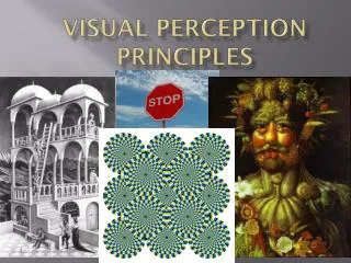
Perception Principles • Why consider perception in visual design? • What are Winn’s principles? On what are they based? • How would you use these? • Were any of them particularly informative for your own use?
What Next? • Don’t just shoot your pictures, design what pictures need to be taken. Create a story board. • Develop a style guide (visual design decisions) • Take your pictures • Use your software, drawing on your design decisions and story board.

