Graphic Design
180 likes | 335 Vues
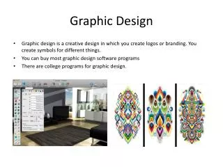
Graphic Design. What is it?. Process of combining text and graphics to communicate an effective message through the design of logos, graphics, brochures, newsletters, posters, signs, etc. Have a Plan. Know your client Know your audience Have a plan for design. Items to Consider. Emphasis

Graphic Design
E N D
Presentation Transcript
What is it? Process of combining text and graphics to communicate an effective message through the design of logos, graphics, brochures, newsletters, posters, signs, etc.
Have a Plan Know your client Know your audience Have a plan for design
Items to Consider Emphasis Balance Alignment Repetition & Consistency Contrast Typeface White Space
Balance Asymmetrical Symmetrical
Alignment Centered text considered a mark of a novice designer When planning your layout, consider the alignment of text
Repetition & Consistency What’s important in your layout? Use the same fonts throughout Colors Textures Images Lines and shapes
Contrast Helps attract attention & visually organizes Size Color Typeface Weight/mass Texture
Typeface • Too many are not professional and busy • Stick to no more than two or three fonts per document • One for headlines and one for other text • Avoid all CAPS • Don’t overuse underline, italics, bold • Keep size in check • 18-24 Headlines, 14-16 Subheads, 10-12 body • Be CoNsisTent!!!
White Space Too much can be confusing and messy Too little doesn’t keep attention