Download
1 / 29
290 likes | 508 Vues
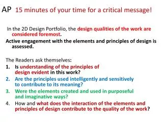
AP 15 minutes of your time for a critical message!. In the 2D Design Portfolio, the design qualities of the work are considered foremost . Active engagement with the elements and principles of design is assessed. The Readers ask themselves :

E N D
AP 15 minutes of your time for a critical message! In the 2D Design Portfolio, the design qualities of the work are considered foremost. Active engagement with the elements and principles of design isassessed. The Readers ask themselves: • Is understanding of the principles ofdesign evident in this work? • Are the principles used intelligently and sensitivelyto contribute to its meaning? • Were the elements created and used in purposefuland imaginative ways? • How and what does the interaction of the elements andprinciples of design contribute to the quality of the work?
These words were copied from the AP website regarding the reading of portfolios at AP Board: The principles of design (unity/variety, balance, emphasis, contrast, rhythm, repetition, proportion/scale, figure/ground relationships), articulated through the visual elements (line, shape, color, value, texture, space), help guide artists in making decisions about how to organize the elements on a picture plane in order to communicate content.Effective design is possible whether one uses representational or abstract approaches to art.For this portfolio, students are asked to demonstrate mastery of 2-D design through any two-dimensional medium or process, including, but not limited to, graphic design, digital imaging, photography, collage, fabric design, weaving, illustration, painting, and printmaking.
Breadth: Rationale from the AP Syllabus regarding Breadth: The student’s work in this section should demonstrate understanding of the principles of design, including unity/variety, balance, emphasis, contrast, rhythm,repetition, proportion/scale, and figure/ground relationship. Successful works of art require the integration of the elements and principles of design; students musttherefore be actively engaged with these concepts while thoughtfully composing their art. The work in this section should show evidence of conceptual, perceptual, expressive, and technical range.
Breadth Continued: These works as a group should demonstrate the student’s visual organization skills. As a whole, the student’s work in this section should demonstrate exploration, inventiveness, and the expressive manipulation of the elements and principles of design, as well as knowledge of compositional organization. The best demonstrations of breadth clearly show experimentation and a range of conceptual approaches to the work.
What are some breadth examples: • Work that employs line, shape, or color to create unity or variety in a composition• Work that demonstrates symmetry/asymmetry, balance, or anomaly• Work that explores figure/ground relationships• Development of a modular or repeat pattern to create rhythm—(can be done on Adobe easily)• Color organization using primary, secondary, tertiary, analogous, or other colorrelationships for emphasis or contrast in a composition• Work that investigates or exaggerates proportion and or scale
What is figure ground? • Everything that is not figure is ground. • As our attention shifts, the ground also shifts so that an object can go from figure to ground, and then back. (see PowerPoint on Wiki regarding FG) Ground is sometimes thought of as background or negative space. • Figure-ground refers to the relationship between an object and its surround. • Great website to understand Gestalt Principles: facweb.cs.depaul.edu/.../gestalt_principles.htm
How do these artists bring emphasis to their focal points? Were they able to unify the many elements? If so, how? http://www.susanadameart.com/
Nice negative space and lots of movement with the petals—diagonal line formed by the body creates tension—work is unified by color scheme. The pattern in the lady’s face is a nice use of the elements, and creates a unique surface.
Variety galore, but how is it unified? Emphasis—is it effective? Even if you don’t like it, could this divided work give you an idea for altering one of your less successful works to create emphasis?
Here is what the readers said about submissions in 2010: 2-D Design Quality Submissions for the 2-D Design Portfolio included some very inventive work, perhaps because there is such a range of media allowed. The Quality section remained very strong this year. There were excellent examples of design-based photography and digital work. (which means they will grade this years photographs on a stricter scale. 2-D Design Concentration Readers felt that the Concentration section remained problematic. Helping students define what a concentration is, as opposed to selecting work that seems to “go together,” is key. 2-D Design Breadth Like last year, students often did not engage with a sufficient range of design issues. Readers noted that the quality of the Breadth section was good, but often students did not really display breadth in design issues. Instead they sometimes showed many different works, or works in a variety of media. Active engagement with a broad range of design issues is one of the main requirements of this section of the portfolio.
Principles of Art reviewed: 1. REPETITION can be accomplished in a number of ways: by repeating a shape, line or colors in your work. Consider playing with one of your pieces on Photoshop: repeat one of your images in different colors (like Warhol), reverse it and have the images face each other or repeat them in a series, etc.--whatever seems most appropriate for the work. 2. EMPHASIS through color, line or placement to bring the viewer's focus to the subject (which could be a shape, object or subject)-try cropping a photo in such a dramatic way as to thrust the viewer's eye to the focal point--perhaps everything is black and white except the focal point, or it is a contrasting or complementary color, etc. You might change the scale of the focal point to bring emphasis to it; the list is endless. 3. UNITY/VARIETY: find a work that demonstrates unity/variety (this could be a photo, drawing or collage) -can the work employ a variety of elements but be unified? How would you unify a work with a lot of texture, line, color, value, shape, etc? 4. CONTRAST-pure black and white offers contrast, as do complementary colors. Charcoal pieces are usually a great example of contrast too. 5. RHYTHM-do you have an example of rhythm ?A good photo that creates a nice rhythm through a series of carefully placed objects can serve this purpose . If you are confused, look at examples on AP website. 6. PROPORTION/SCALEAn example would be a tiny bug on a big leaf. To exaggerate proportion/scale, you can use any media, including a montage or collage that exaggerates proportion. What if you created a montage using magazine pictures with little people sitting on silverware, pieces of fruit, or any other surreal composition? I have examples if you need them. 7. FIGURE/GROUNDconsider Escher and other famous figure/ground artists. Google figure ground relationships in art 8. BALANCE: For this, you could use a formal balance design, asymetricalbalance, radial balance...make sure that all of your pieces do not display the same type of balance. Show some variety in your breadth.
Your Assignment for Breadth: • Using the form on the next slide (or the one on the Wiki), list all 12 of your breadth pieces. • Indicate what principle of art is used in each piece. Make SURE you have an example of all 8 principles in your breadth. This might require tweaking some of your old work on Adobe Photoshop or another such program. • Record the physical size (measurements) of each piece; you will be required to do this when submitting to AP Board. • Photograph each piece, save it to the proper size (780 x 530 pixels) and save images in your class folder on the X drive.
List each breadth piece below: Principle of Design it represents: 1. 2. 3. 4. 5. 6. 7. 8. 9. 10. 11. 12. l 1. 2. 3. 4. 5. 6. 7. 8. 9. 10. 11. 12.
Pattern and variety What do you think these scored in the breadth portion? What is your rational for the score? Can you back your score up using the AP Rubric? Figure Ground and Contrast
Which way is your favorite? Flipping took less than 30 seconds and is worth a try. original
What do you think about this figure/ground? Did Rachel add another component with repetition? Original image
Let’s try several ideas: • What would this score? • There is something weak about the shoulder in the background? Could there be a plagiarism issue? (this is an image copied from a magazine by previous AP student). • Next slide, please.
Could you change the meaning with color? Diffused anger? Do we have a little repetition now? This took me less than 10 minutes.
Or add filters and change completely? Evokes feeling of EVIL… Would either of the new ones score higher? If so, why?
What happened to Amanda’s composition? What color scheme does it employ? What would a thick black border do for this? What would you suggest? Do you see the dove coming down in between the heads?
One lonely head… • What could you do with this if you wanted to develop a piece for your breadth portion? • Certainly it has nice negative spaces… • Next slide please.
Perfect ads for depression medication; import into Photoshop and design with font
Student had photos from trip; what if she took the best of these pictures and make an poster for a Safari Trip?
These are nice examples of contrast—would you add anything or change the composition to reflect stronger design? A little cheezy but you get the idea…
So, where do we go from here? • Reduction print with altered color—what are the possibilities? • Napkin design? Add a border of coffee beans and java printed in many different languages around the edges of the design? • Be creative with your old work and see what you can do with it.
http://www.marcomodi.it/gallery/ Works with scale and else?
This is mostly geometric, so what does the tree do—serve as variety? Does it bring emphasis to the mauve colored structure on the horizon line? Do all lines lead to the focal point? You be the judge.
A good link if you like collages:http://www.collageart.org/links/ Once again… When is your breadth due? What will you be required to turn in at the end of the exam period in December?