Download
1 / 27
270 likes | 568 Vues
Analysis of Time Series. For AS90641 Part 2 Extra for Experts. Contents. This resource is designed to suggest some ways students could meet the requirements of AS 90641. It shows some common practices in New Zealand schools and suggests other simplified statistical methods.

E N D
Analysis of Time Series For AS90641 Part 2 Extra for Experts Created by Polly Stuart
Contents • This resource is designed to suggest some ways students could meet the requirements of AS 90641. • It shows some common practices in New Zealand schools and suggests other simplified statistical methods. • The suggested methods do not necessarily reflect practices of Statistics New Zealand.
Aims • This presentation (and the next) takes you through some extra types of analysis you could try for time series data. • It also makes suggestions for writing your report • You will need to open the spreadsheet: Example sales.xls • Choose the worksheet labeled Clothing.
Beginnings • You have already learned a basic analysis of a time series and how to isolate some components. • We are now going to do a more complex analysis. • Before doing any analysis you need to: • Graph the raw data • Identify the components of the data • Decide on the best method of analysis.
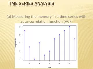
0 Look at : the trend the seasonal component the irregular component
Indexes show how prices have changed over time. They show the percentage increase in prices since a base period. The index for the base period is usually 1000. An index of 1150 shows that prices have increased 15 percent since the base period. You can use indexes to ‘deflate’ time series data which contains dollar values. Statistics New Zealand indexes include: Consumers Price Index Labour Cost Index Food Price Index Farm Expenses Price Index Step 1: Using Indexes
Consumers Price Index • The Consumers Price Index (CPI) measures the change in prices of a specific basket of goods and services in New Zealand. • For retail sales of clothing this is an appropriate index to use as clothing is included in the ‘basket’ of goods priced. • Open the CPI worksheet and copy the series into the next column of the clothing worksheet. Look at the CPI data. Which is the base period? How do you know?
If the value of sales from clothing shops are increasing over time there several possible reasons: • Prices have increased because of inflation • The number of people in the population is growing so there are more possible customers needing clothes • Sales are actually increasing because people are buying more clothing • Something else? To help find out if total sales are increasing because of inflation we can turn the sales into constant 1999 dollars using the value of the CPI for each year.
The present base period for the Consumers Price Index (CPI) is 1999. Assume that the CPI now is 1150. Constant dollars In 1999, $100 could buy the same amount as: can buy now Now, $100 can buy the same amount as: could buy in 1999
Calculate your deflated value We will use constant 1999 dollars for the rest of this exercise. Use this formula to calculate the value in constant 1999 dollars.
Some data follows an additive model where: Data value = trend + seasonal + irregular Other data follows a multiplicative model where: Data value = trend x seasonal x irregular Step 2: Deciding on an appropriate model
Additive When the size of the seasonal component stays about the same as the trend changes, then an additive method is usually best.
Multiplicative When the size of the seasonal component increases as the trend increases, then a multiplicative method may be better.
0 Look again at the graph below • Which model seems more suitable? In the previous PowerPoint we used an additive model and we will do this also for this data (An example of using a multiplicative model is given at the end of the third presentation).
Step 3: Analyse the data • Do the spreadsheet analysis as far as calculating the seasonally adjusted data. • Use the constant dollar values for your analysis.
Step 4: Describe and justify your model for the trend • Try some different models for the moving average. • Decide which one will give a sensible forecast.
0 Describe what you can see. Trend Does this linear trend model look sensible?
0 • Many trends cannot be modelled by a single straight line • A quadratic model may be tempting… But is it realistic?
0 • Remember the shape of a parabola. • Do you think that sales (in constant dollars) are going to grow at that rate?
0 • An option is to use a linear model over the trend at the end of the series. • This is likely to give the most realistic forecast.
Step 5: Describing the seasonal component • A graph can help you to see the patterns more clearly.
Describe the patterns you can see. You can also identify amounts easily from the graph.
Step 6: Analysing the irregular component • There is always random variation in a time series, the irregular component. • When a very unusual event happens it may cause a spike in the data, called an outlier. • This can distort the trend and seasonal component values. • The larger the spike the more distortion. • It is useful to calculate the irregular component and look for outliers.
Subtract the values in the ‘Seasonal’ column from the ‘Seasonal and Irregular’ column. A graph is often useful.
Highlight the date and irregular columns for the graph. Outliers Both the pattern of the irregular component and any extreme values are worth commenting on.
This is not the end! Continue the analysis and write a report on retail clothing sales. Some ideas are given in the next presentation, Reporting.