Download
1 / 25
250 likes | 375 Vues
Boating Beyond Simple Shewhart. Model 11. Destinations. Purpose—To provide a quick long distance view. Content Time or observations between events (g, h, t charts). CUSUM and EWMA Following a panel of patients Small Multiples (Thanks to Jerry Langley) Problem of changing denominators.

E N D
Boating Beyond Simple Shewhart Model 11
Destinations • Purpose—To provide a quick long distance view. • Content • Time or observations between events (g, h, t charts). • CUSUM and EWMA • Following a panel of patients • Small Multiples (Thanks to Jerry Langley) • Problem of changing denominators. • Comparing beginning and ending performance • Prevalence difference vs. Percent Improvement • Scatterplots • Smoothed Curves vs. Control Charts
Analyzing Rare Events Using Time or Occurrences Between Them
t and g chart summary • t-chart measures the time between events • g-chart measures the number of incidents (procedures, admission) between events • Both charts are useful when looking at rare events • Eliminates the need to wait for a long time period to collect enough data points
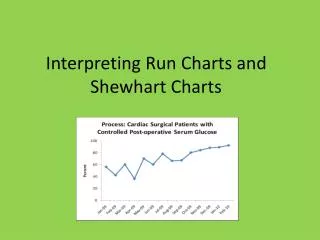
CUSUM and EWMA Early detection of shifts
Or, you can use an exponentially weighted moving average chart. Surgeries Deaths Source: Benneyan, 2001
Small Multiple Graphs Denominator in blue Denominator Rate (Percent) Screening rate in red Month
Small Multiple GraphsThink-Pair-Share • Why are they powerful? • What are their limitations?
An Alternative:Percent of Patients Screened for Depression: A Period-Cohort Analysis. A cohort is a group of patients empanelled within a particular quarter.
Scatter plot comparing beginning and ending of period of observation.
Your Turn! • Think about your work and select a key quality characteristic (KQC). • Develop an operational Definition for the KQC. • Evaluate your definition with the criteria from the NQF in module 2. • Answer: What kind of chart or analysis would you use?