Download
1 / 50
520 likes | 1.04k Vues
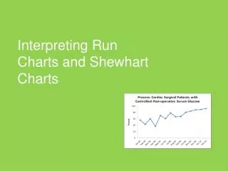
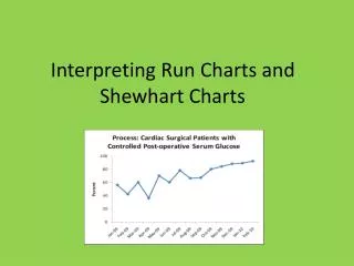
Interpreting Run Charts and Shewhart Charts. Agenda. Features of Run Charts Interpreting Run Charts A quick mention of variation Features of Shewhart Charts Interpreting Shewhart Charts. Displaying Key Measures over Time – Run Chart. Data displayed in time order Time is along X axis

E N D
Agenda • Features of Run Charts • Interpreting Run Charts • A quick mention of variation • Features of Shewhart Charts • Interpreting Shewhart Charts
Displaying Key Measures over Time – Run Chart • Data displayed in time order • Time is along X axis • Result along Y axis • Centre line = median • One “dot” = one sample of data
Three Uses of Run Charts in Quality Work • Determine if change is an improvement Median 429 The Data Guide, p 3-18
Three Uses of Run Charts in Quality Work • 2. Determine if improvement is sustained Median 429 The Data Guide, p 3-18
Three Uses of Run Charts in Quality Work 3. Make process performance visible Median 429 The Data Guide, p 3-18
How Do We Analyze a Run Chart? Visual analysis first If pattern is not clear, then apply probability based rules The Data Guide, p 3-10
Non-Random Signals on Run Charts A Trend 5 or more A Shift: 6 or more Too many or too few runs An astronomical data point Evidence of a non-random signal if one or more of the circumstances depicted by these four rules are on the run chart. The first three rules are violations of random patterns and are based on a probability of less than 5% chance of occurring just by chance with no change. The Data Guide, p 3-11
Source: Swed, Frieda S. and Eisenhart, C. (1943) “Tables for Testing Randomness of Grouping in a Sequence of Alternatives.” Annals of Mathematical Statistics. Vol. XIV, pp. 66-87, Tables II and III. The Data Guide, p 3-14
Interpretation? • There is a signal of a non-random pattern • There is less than 5 % chance that we would see this pattern if something wasn’t going on, i.e. if there wasn’t a real change
Plain Language Interpretation? There is evidence of improvement – the chance we would see a “shift” like this in data if there wasn’t a real change in what we were doing is less than 5%.
1. bring out the table2. how many points do we have (not on median?)3. how many runs do we have (cross median +1)4. what is the upper and lower limit? Two few or too many runs?
1. bring out the table2. how many points do we have 203. how many runs do we have (cross median +1) 34. what is the upper and lower limit? 6 - 16 Two few or too many runs?
Two few runs? Plain language interpretation There is evidence of improvement – our data only crosses the median line twice – three runs. If it was just random variation, we would expect to see more up and down.
Two many runs? Plain language interpretation There is evidence of a non-random pattern. There is a pattern to the way the data rises and falls above and below the median. Something systematically different. Should investigate and maybe plot on separate run charts.
Understanding Variation Walter Shewhart (1891 – 1967) W. Edwards Deming (1900 - 1993) The Pioneers of Understanding Variation
Intended and Unintended Variation • Intended variation is an important part of effective, patient-centered health care. • Unintended variation is due to changes introduced into healthcare process that are not purposeful, planned or guided. • Walter Shewhart focused his work on this unintended variation. He found that reducing unintended variation in a process usually resulted in improved outcomes and lower costs. • (Berwick 1991) Health Care Data Guide, p. 107
Shewhart’s Theory of Variation Common Causes—those causes inherent in the system over time, affect everyone working in the system, and affect all outcomes of the system • Common cause of variation • Chance cause • Stable process • Process in statistical control Special Causes—those causes not part of the system all the time or do not affect everyone, but arise because of specific circumstances • Special cause of variation • Assignable cause • Unstable process • Process not in statistical control Health Care Data Guide, p. 108
Shewhart Charts The Shewhart chart is a statistical tool used to distinguish between variation in a measure due to common causes and variation due to special causes (Most common name is a control chart, more descriptive would be learning charts or system performance charts) Health Care Data Guide, p. 113
Control Charts/Shewhart Charts upper and lower control limits • to detect special cause variation Extend limits to predict future performance Not necessarily ordered by time • advanced application of SPC – is there something different between systems
Example of Shewhart Chart for Unequal Subgroup Size Health Care Data Guide, p. 114
Adapted from Health Care Data Guide, p. 151 & QI Charts Software
Note: A point exactly on the centerline does not cancel or count towards a shift Health Care Data Guide, p. 116
Special cause 2 out of 3 consecutive points in outer third of limits or beyond
Note: A point exactly on the centerline does not cancel or count towards a shift Health Care Data Guide, p. 116
Case Study #1b Percent of cases with urinary tract infection
Case Study #1c Percent of cases with urinary tract infection Percent of cases with urinary tract infection
Case Study #1d Percent of cases with urinary tract infection
Case Study #1e Percent of cases with urinary tract infection
Case Study #1f Percent of cases with urinary tract infection
Note: A point exactly on the centerline does not cancel or count towards a shift Health Care Data Guide, p. 116
Case Study #2a Percent of patients with Death or Serious Morbidity who are >= 65 years of age
Case Study #2b Percent of patients with Death or Serious Morbidity who are >= 65 years of age
Case Study #2c Percent of patients with Death or Serious Morbidity who are >= 65 years of age
Case Study #2d Percent of patients with Death or Serious Morbidity who are >= 65 years of age
References • BCPSQC Measurement Report • http://www.bcpsqc.ca/pdf/MeasurementStrategies.pdf • Langley GJ, Moen R, Nolan KM, Nolan TW, Norman CL, Provost LP (2009) The Improvement Guide (2nd ed). • Provost L, Murray S (2011) The Health Care Data Guide. • Berwick, Donald M, Controlling Variation in Health Care: A Consultation with Walter Shewhart, Medical Care, December, 1991, Vol. 29, No 12, page 1212-1225. • Perla R, Provost L, Murray S (2010) The run chart: a simple analytical tool for learning from variation in healthcare processes, BMJ Qual Saf 2011 20: 46-51. • Associates in Process Improvement website www.apiweb.org