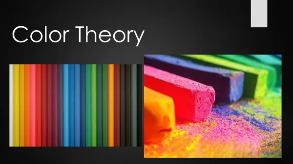
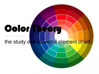
Color Theory
Color Theory. the study of a powerful element of art. WHAT IS COLOR? What we see as color is the way light waves in the visible part of the electromagnetic spectrum are absorbed or reflected by everything around us. White light = all of the colors mixed together.

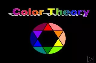
Color Theory
E N D
Presentation Transcript
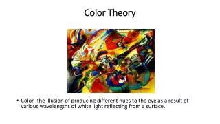
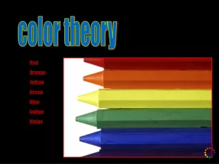
Color Theory • the study of a powerful element of art
WHAT IS COLOR? What we see as color is the way light waves in the visible part of the electromagnetic spectrum are absorbed or reflected by everything around us.
White light = all of the colors mixed together. Rainbows = white light that is broken apart by moisture in the air.
How is color important in nature? Helps ensure survival: camouflage helps animals hide from predators Can you find the animals in these images?
How is color important in nature? Helps ensure survival: tells predators, “If you eat me, you will be sorry.” Left: poisonous frog from Madagascar. Below: toxic nudibranch (tiny sea slug)
Color helps us understand the world around us, such as… How is color important in our daily lives? …the interior quality of objects, and whether food is good to eat.
Color helps us understand… properties of surfaces. Much better to know that this is hot without having to touch it to find out!
Color helps us understand… information… from charts and graphs to when to stop our cars.
How do we create color? PIGMENTS (colored powders) imitate the colors of light. They provide the color in ink, paints, markers, etc.
What are pigments made of? Ground colored material, from natural substances like clay to engineered chemical compounds. Early paint (10 – 17,000 years ago) = ground earth/clay + spit or fat. Modern paint = sophisticated chemical engineering.
Color is the most EXPRESSIVE element of art Expressive = affects our emotions directly and immediately, so creates moods in artwork. Color also catches our eye – creates focal points and guides our eyes around artwork.
How do the moods created by the artists’ use of color differ in these two paintings? Below: Damien Hirst. Beautiful Inside My Head Forever. Right: Picasso. Woman with Crossed Arms.
Now, let’s learn some more art-specific words… Roni Horn. Steven's Bouquet, 1991.
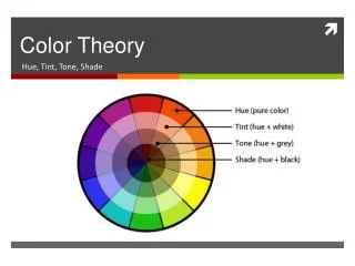
Technical Vocabulary:HUE HUE: the technical term for the word “color.” Red, green, and purple are all HUES.
Technical Vocabulary:VALUE VALUE: the lightness or darkness of a hue. TINTS = any hue + white SHADES = any hue + black TONES = any hue + gray
TINTS = a hue’s light values hue + white
SHADES = a hue’s dark values hue + black Mixing in a color’s complement instead of black is another way of creating a shade (e.g. red + a little green = darker red)
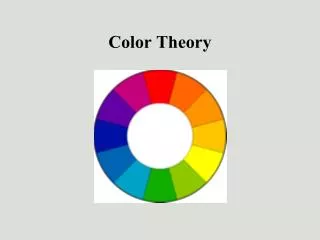
The foundation of all other colors.RedYellowBlue Primary Colors (first layer of the color wheel)
Two primary colors mixed together Secondary Colors (second layer of the color wheel) Red + Yellow = Orange Yellow+ Blue = Green Blue+ Red = Purple
Tertiary Colors (third layer of the color wheel) One primary color + the secondary color next to it The tertiary colors are:
Created by mixing: a complementary pair all three primaries Neutral Colors: Colors not on the color wheel. • Browns • Grays • Black • White Leonardo da Vinci. Perspective study for The Adoration of the Magi (unfinished),1481. Oil on canvas.
Now that we know about color in general, we’ll learn how to arrange it in our artwork to create the most visually engaging pieces possible Sol LeWitt Wall Drawing #1136, 2004 Tate Liverpool, 24 yards Acrylic on wall
Color Schemes: Planned combinations of colors that create harmonious visual experiences
Primary Color Scheme: primary colors - red, yellow, blue Jasper Johns Target,1958 Oil and collage on canvas
Roy Lichtenstein, who used comic strips as his inspiration, consistently used a primary color scheme in his work. Roy Lichtenstein (1923-1997) In the Car, 1963
Secondary Color Scheme: only, or predominantly, secondary colors orange, green, purple Henri Matisse The Open Window, Collioure, 1905 Oil on canvas
Neutral Color Scheme: only, or predominantly, neutral colors Giorgio Morandi. Natura morta (Still Life), 1952. Oil on canvas, 16x18 inches Margaret Kilgallen, Untitled (mural in LACMA garage), circa 2005
Warm Color Scheme: only, or predominantly, warm colors orange, yellow, red Warm colorsmake objects come forward toward the viewer. Wayne Thiebaud Gumball Machine, 1971 Oil on canvas
Warm colors symbolize/evoke in the viewer: excitement, passion, liveliness, anger... Above left: Sidewalk drawing by Kurt Wenner. Below left: Joseph Mallord William Turner (1775-1851) The Scarlet Sunset, circa 1830-1840 Oil on canvas
Cool Color Scheme: only, or predominantly, cool colors green, blue, and purple Cool colors recede away from the viewer. Paul Cézanne Mount Sainte-Victoire view from Lauves, 1904-06 Oil on canvas
Cool colors symbolize/evoke in the viewer: serenity, sadness... Right: Pablo Picasso, The Tragedy, 1903 Oil on wood, 41 x 27 inches Below: sidewalk drawing by Kurt Wenner
Mono - one Chroma - color Monochromatic Color Scheme: shades, tones, and tints of any one color Gerhard Richter Roter Kopf Red Head, 1965 Oil on canvas, 26x24 cm
Monochromatic color schemes create strong unity. Edward Hopper Chair Car, 1965 Oil on canvas 40x50 inches
Complementary Color Scheme: only, or predominantly, a complementary color pair Complementary colors = two colors opposite each other on the color wheel They are: Yellow/Purple Orange/Blue Red/Green
What complementary color pair is featured in this Warhol Print? Andy Warhol Elvis I and II, 1964 silkscreen on acrylic on aluminum 208.3 x 208.3 cm
Complementary color schemes have the most color contrast of any simple, two-color, color scheme. Camille Pissarro Le Boulevard Montmartre, effet de nuit (The Boulevard Montmartre at Night), 1897 Oil on canvas
Triadic Color Scheme: three colors evenly spaced on the color wheel TYPES • 3 evenly spacedtertiary colors, e.g. yellow-orange + green-blue + red-violet • 3 primary colors • (aka primary color scheme) • 3 secondary colors • (aka secondary color scheme)
Which type of triadic color scheme is this painting? This abstract use of color is characteristic of Fauvism (French for “wild beasts”), an art movement from the early 1900s that emphasized strong, emotional color over realism. André Derain Mountains at Collioure 1905. Oil on canvas 32x29 inches.
One color dominates; related colors enhance. Analogous Color Scheme: colors that are adjacent on the color wheel Paul Gauguin Washerwomen, 1888 Oil on canvas, 29x36 inches