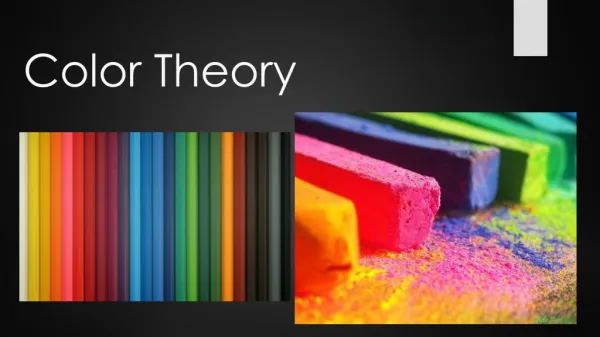
Color Theory
Color Theory. Color.

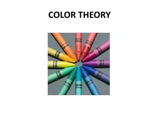
Color Theory
E N D
Presentation Transcript
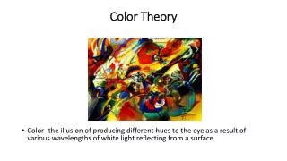
Color • Color is a property of light. When we say an object is red, for example, we mean that its surface absorbs certain wavelengths of light and reflects others. Each color has a different wavelength. If all wavelengths of light are absorbed, we see a black object; if all are reflected, we see a white object.
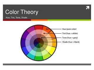
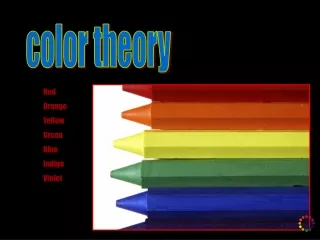
Color • HUE: is the color we see in the rainbow or color wheel (such as red) • VALUE: is the lightness or darkness of a color. Value is determined by adding white or black(maroon is a dark value of red and pink is a light value) • INTENSITY: is the brightness of the color. Intensity is effected by adding the opposite hue. (some reds are appear bright and clear while others appear muddy or dull
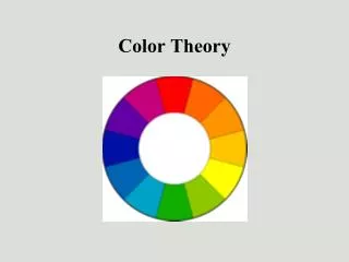
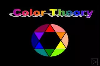
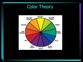
The Color Wheel • There are 3 primary colors: Red, Yellow and Blue • These colors can’t be mixed to be made • They make all the other colors on the wheel • If you draw straight lines connecting the primaries, you will create a triangle
The Color Wheel • When you mix equal parts of 2 primary colors together, you get a secondary color • Secondary colors are Orange, Green, and Violet (Purple) • If you draw straight lines connecting secondary colors, you will create a triangle
Making Color When you mix equal parts of a primary and a secondary color together, you will get a tertiary color Tertiary colors are Red-Orange, Red-Violet, Blue-Green, Blue-Violet, Yellow-Orange and Yellow-Green
Colors have a visual temperatureSome are warm and some are cool
Warm Colors Red, red-orange, orange, yellow-orange and yellow are warm colors Warm colors appear to advance (or come forward) in a picture and make objects appear to be larger They remind us of fire or sun and bring excitement and boldness to art. Warm colors make objects seem larger and to come forward (advance) in a work of art
Cool Colors Greens, blues, and violets are cool colors. Cool colors appear to recede (or go back into) the picture and make objects seem smaller. These colors are calm and restful. They make us think of cool water, distant mountains, sky and foliage.
Yellow-Green and Red-Violet can function as either warm or cool since they have properties of both. In a painting that is primarily cool, red-violet would add warmth while in a warm color scheme, it would appear cooler Putting both warm and cool colors in a painting gives it balance and creates interesting contrast
Tints, Tones and Shades • When white is added to a hue, the resulting color is called a TINT---for example, pink is the resulting color when white is added to red. Tints seem to come forward in a picture and tend to make objects look bigger and appear to float or rise up in space. • When black is added to a hue, it produces a SHADE. Navy blue is a shade of blue and maroon is a shade of red. Shades make objects appear heavy and sink, to seem smaller and to recede or go back. • By adding gray to a hue, it produces a TONE. This dilutes the intensity of the color. • By altering a hue in this way, we are changing its VALUE
Color Schemes COLOR SCHEMES ARE LOGICAL, BALANCED RELATIONSHIPS OF COLORS based on the twelve hue color wheel. Using color schemes eliminates the need for selecting colors based on trial and error. They are useful in establishing visual unity and preventing poor color combinations. Learning how to use color is important. If you just add colors to a picture without thinking about why you’re using them, the result could be visually confusing. You must think of the mood you wish to convey with your work and choose colors appropriately. Sometimes, less is more.
Color Schemes Monochromatic: Mono means one and Chroma means color. Thus Monochromatic means all shades and tints of one color. Depending upon the color chosen, this can be a calm or exciting color scheme to use.
Color Schemes Complimentary: A compliment is a good thing, correct. Well, in a complimentary color scheme, 2 colors compliment each other because they are equally strong. Complimentary colors are directly opposite each other on the color wheel. Examples are Violet and Yellow, Blue and Orange, and Red and Green This color scheme can be hard on the eye because both colors are equally strong and fight for the eyes attention. However, they can create wonderful optical illusions because they tend to vibrate against one another.
Color Schemes A Split Complimentary color scheme is when you chose a color and the two colors on either side of the chosen colors compliment. Examples include: Red and Yellow-Green and Blue-Green or Blue and Yellow-Orange and Yellow-Green This scheme can create vibrant contrast in a work of art.
Color Schemes • A Double Split-Complimentary color scheme is when you use the colors on either side of a set of compliments. An example could be: Red-Orange, Yellow-Orange, Blue-Green and Blue-Violet
Color Schemes • A Triadic color scheme is a set of 3 colors (tri means 3) that are equally spaced apart on the color wheel. Examples are Red, Yellow and Blue or Orange, Green and Violet.
Color Schemes • An Analogous color scheme is the use of 3-4 colors that are next door neighbors because they live side by side on the color wheel. Examples could include: Red, Red-Orange, Orange, and Yellow-Orange or Blue-Green, Blue and Blue-Violet
Color Schemes • Black, White, Gray and Brown are neutral colors and are not on the color wheel. An Achromatic color scheme is the use of black, white and shades of gray.
Can you identify the color schemes used in the following works of art?