Visual Design Elements
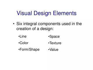
Visual Design Elements. Six integral components used in the creation of a design:. Line Color Form/Shape. Space Texture Value. Line. Types Vertical- Represents dignity, formality, stability and strength. Horizontal- Represents calm, peace and relaxation.

Visual Design Elements
E N D
Presentation Transcript
Visual Design Elements • Six integral components used in the creation of a design: • Line • Color • Form/Shape • Space • Texture • Value
Line Types • Vertical- Represents dignity, formality, stability and strength. • Horizontal- Represents calm, peace and relaxation. • Diagonal- Represents action, activity, excitement and movement. • Curved- Represents freedom, the natural, having the appearance of softness and creates a soothing feeling or mood.
Color Color has an immediate and profound effect on a design. • Types • Warm Colors • Reds, oranges, yellows • Cool Colors • Blues, purples, greens • Colors can affect how humans feel and act.
Form and Shape The shape, outline, or configuration of anything. Examples • Squares • Circles • Ellipses • Ovals • Rectangles • Triangles
Space By incorporating the use of space in your design, you can enlarge or reduce the visual space. Types • Open, uncluttered spaces • Cramped, busy • Unused vs. good use of space
Texture The surface look or feel of something. • Types • Smooth surface • Reflects more light and, therefore, is a more intense color. • Rough surface • Absorbs more light and, therefore, appears darker.
Value The relative lightness or darkness of a color. • Methods • Shade • Degree of darkness of a color • Tint • A pale or faint variation of a color
Visual Design Principles There are five principles that encompass an interesting design. • Balance • Rhythm • Emphasis • Proportion and scale • Unity
Balance Parts of the design are equally distributed to create a sense of stability. There can be physical as well as visual balance. Types • Symmetrical or Formal Balance • Asymmetrical or Informal Balance • Radial Balance • Vertical Balance • Horizontal Balance
BalanceSymmetrical or Formal BalanceThe elements within the design are identical in relation to a centerline or axis. PLTW Project Lead The Way IED POE DE CIM EDD
Balance Asymmetrical or Informal Balance Parts of the design are not identical but are equal in visual weight.
BalanceRadial Balance Design Elements radiate outward from the center.
BalanceVertical Balance The top and bottom parts are equal.
BalanceHorizontal Balance The parts on left and right are equal.
Rhythm Repeated use of line, shape, color, texture or pattern. Types • Regular rhythm • Graduated rhythm • Random rhythm • Gradated rhythm
RhythmRegular RhythmA element is repeated at the same repetition/interval each time.
RhythmGraduated RhythmThe beats of the element become closer or further apart as they move.
RhythmRandom RhythmThe beats of the element are random or are at irregular intervals.
RhythmGradated RhythmThe repeated element is identical with the exception of one detail increasing or decreasing gradually with each repetition.
Emphasis • Points of attention in a design. • The feature in a design that attracts one’s eye. • The focal point. • Emphasis can be achieved through size, placement, color and use of lines. • The most personal aspect of a design.
Proportion • Comparative relationships between elements in a design with respect to size. • 3:5 ratio is known as the Golden Mean.
Scale • Scale • The proportions or size of one part of the image in relationship to the other.
Unity • Unity is applying consistent use of lines, color, and texture within a design. • To be harmonious.

