Download
1 / 19
270 likes | 571 Vues
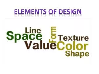
Elements of Visual Interface Design. Overview. Layout Grid Systems Visual Flow Typography Typefaces Typographic Guidelines Colour Basics Materials & shape. Grid systems. Grid systems help designers organise information ito a coherent pattern.

E N D
Overview Layout Grid Systems Visual Flow Typography Typefaces Typographic Guidelines Colour Basics Materials & shape
Grid systems Grid systems help designers organise information ito a coherent pattern. Gutters are the blank spaces that separate rows and columns
Another familiar grid? See Comments in notes
Internet explorer grid Sketch the grid IE uses
Internet explorer grid Sketch the grid IE uses
Your screen product Sketch here the type of grid that would be most useful for the product you are building
Visual Flow • In Western culture the visual flow is left to right, top to bottom. • Don’t force users eyes to jump all over the screen. • Achieve visual flow by the use of whitespace, positioning and alignment of objects
Squint test • Squinting at the screen enables you to smudge the details and see which items on the screen have prominence. • Good idea to use this on any visual interface you are designing • Results may be surprising – as it reveals that secondary of unimportant items seem overly important in the design
Typography • An important choice in any visual interface • Provides a platform for usable readable and clear labels and text & also personality
Typefaces • Commonly called fonts • Generally categorised into two groups: serif and sans serif Serif Sans - serif Times New Roman Georgia Bookman Old Style Arial Verdana Trebuchet Tahoma
Typefaces • Serif typefaces are easy to read, excellent for long passages of text (eg books) • San serif typefaces traditionally used for shorter passages of text – eg signage • Default choice for interaction designers in screen or physical design – used for button labels instructional text, menus etc • Medium width typefaces are good to use • Avoid any that appear very heavy or very light • Avoid using lots of different typefaces at one or combining type faces that are too similar
Generally typographic guidelines • Avoid using too many different type sizes and widths at the same time. • All CAPITALS severely detracts from readability • Avoid stretching or distorting typefaces
Typographic guidelines • Size: for screens 9 – 12points; mobile screen 6- 10 points; on physical devices- depends on size of device 6-9 points common • Alignment: flush left and ragged right is more legible than flush right or justified. Use flush right sparingly; and justified for long line lengths. • Rivers: formed when the white spaces between words seemingly lin up and form a ‘river’ Avoid these. • Widows & orphans: avoid widows (a word left on a line by itself) and orphans (a single word at the beginning of a column or page). • Line Length: Goldilocks principle: not too long; not too short; but just right! Minimum characters 40; strive for 55- 75 • Leading: vertical space between lines. should 20% more than the font size (eg 10 point font, 12 point leading); very small fonts (ie below 8 points) needs more space; longer the lines – more space is required; never add more than 40% • Kerning: horizontal space between letters. Usually only needed in font sizes larger than 18 point.
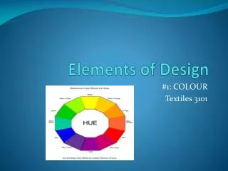
Colour • In visual interface design, colour can be used to create personality and tone and provide cues for use • Eg red buttons on a mobile phone – stop. • Colour can • establish relationships between disparate objects; • Indicate importance
Colour • Colour can be greatly misused: • Dull • Too many colours • Too many saturated colours • 10% of male population has colour blindness (red/green) • For more on colour see http://learnline.cdu.edu.au/units/hit151/basics/ colour.html
Material and Shape • The physical form of a device tells a lot about how and where the device is meant to be used. • Physical form can be made of: metal, plastic, wood clay, ceramic, cloth, rubber, glass, leather or a combination • Ergonomics and human factors come into play- eg how small can a button be before a person cant press it • Overall shape and size of a device are important visually. Think about the tablet PC as an example.