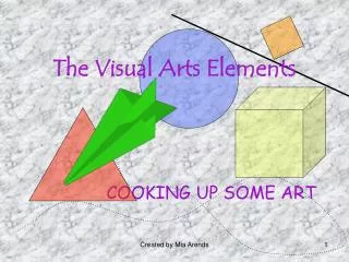
Exploring Visual Elements: The Art of Line, Shape, and Color
Dive into the components of art - from line and shape to form and color. Discover how these elements influence the look and feel of an artwork, and learn techniques like shading and texture to enhance your creations.

Exploring Visual Elements: The Art of Line, Shape, and Color
E N D
Presentation Transcript
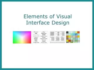
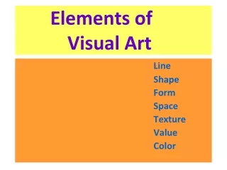
Visual Elements The components of art
The elements are the parts used to make a piece of artwork. The art elements are line, shape, form, tone, texture, pattern and colour. They are often used together, and how they are organised in a piece of art determines what the finished piece will look like.
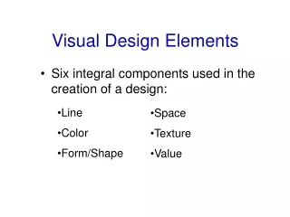
Line • Line is the path left by a moving point. For example, a pencil or a brush dipped in paint. • A line can take many forms. It can be horizontal, diagonal or curved. It can also change over its length, starting off curved and ending up horizontal, for example. • Line can be used to show many different qualities, such as: • contours - showing the shape and form of something • feelings or expressions - a short, hard line gives a different feeling to a more flowing one • movements
Shape A shape is an area enclosed by a line. It could be just an outline or it could be shaded in. Shapes can be either geometric, like a circle, square or triangle, or irregular. When drawing shapes, you must consider the size and position as well as the shape of the area around it. The shapes created in the spaces between shapes are referred to as negative space.
Form Form is a three dimensional shape, such as a cube, sphere or cone. Sculpture and 3D design are about creating forms. In 2D artworks, tone and perspective can be used to create an illusion of form.
Tone This refers to the lightness or darkness of something. This could be a shade or how dark or light a colour appears. Tones are created by the way light falls on a 3D object. The parts of the object on which the light is strongest are called highlights and the darker areas are called shadows. There will a range of tones in between the highlights and shadows. Shading Shading is used to capture these different tones in a drawing. It helps to create an illusion of form in a 2D artwork. When shading it's important to think about the direction of the marks you are making as this can help to emphasise the form of the object. Contrast Contrast means the amount of difference between the lightest and darkest tones. It should be combined with a range of mid tones. Contrast in tones can help create a dramatic artwork.
Texture This is to do with the surface quality of something, the way something feels or looks like it feels. There are two types of texture: actual texture and visual texture. Actual texture really exists, so you can feel it or touch it. You can create actual texture in an artwork by changing the surface, such as sticking different fabrics onto a canvas. Combining different material techniques can create interesting textures. Visual texture is created using marks to represent actual texture. It gives the illusion of a texture or surface but if you touched it, it would be smooth. You can create visual texture by using different lines, shapes, colours or tones. Think about how different marks can be used to show texture.
Pattern A design that is created by repeating lines, shapes, tones or colours. The design used to create a pattern is often referred to as a motif. Motifs can be simple shapes or complex arrangements. Patterns can be man-made, like a design on fabric, or natural, such as the markings on animal fur and are often used in architecture to make buildings more interesting.
Tertiary coloursare created by mixing a primary colour and the secondary colour next to it on the colour wheel. Colour Red, yellow and blue are primary colours, which means that they can’t be mixed using any other colours. In theory, all other colours can be mixed from these three colours. Two primary colours mixed together make a secondary colour. Artists and designers sometimes use complimentary colours in their work to make colours stand out against each other as they are opposites on the colour wheel, such as blue and orange, purple and yellow and red and green.
The Theory Of Colour Colour Wheel Colours that are next to each other on the colour wheel are called harmonious . Complementary colours are colours that are opposite each other on the colour wheel. When complementary colours are used together they create contrast. Adding a colour’s complimentary colour usually makes are darker shade. This is often preferable to adding black. Warm Colours are colours on the red side of the wheel. These are red and include orange, yellow, brown and tans. Cool colours are colours on the blue side of the wheel. These are blue and include green, violet and most greys. Black, white and grey are called neutral colours
Colour schemes Monochromatic Monochrome means one colour. Artwork can be created that explores the toneand intensity of a selected colour. You can change the tone of a colour by adding its complementary colour or by adding black or white to it. Adding white to a colour creates a tint, and adding black creates a tone. You can also alter the tone of a colour with saturation techniques. This means adding either more paint or more water. The more water that is added the lighter the tone and the more paint the darker. Limited colour You can select a limited number of colours and use these to represent different tones. For example, you could pick two complimentary colours, or you could use only the three primary colours. This can create a striking image.
By now you probably realise that most art and design works involve numerous elements and are rarely exclusively just one element. It is also important to recognise which things are not included in a work such as the absence of colour or tone which might make the image look flat or dull for instance. When writing about art it is also important to realise that mood or atmosphere can have an impact on the way we respond to art or design and the artist wants to suggest that in their work. The size or scale of a piece of work is also important to create impact. An example of this would be Guernica painted by the famous Spanish artist, Pablo Picasso in 1937. This work is mural sized and it purposely uses tones of grey, black and white to illustrate how Picasso felt about the bombing by the Fascists, of the Spanish town of Guernica during the Spanish Civil War. He wanted to portray the pain and suffering by taking the colour out of the work and to use the sheer scale to create impact in his signature style of cubism, line and shape , simplifying in a minimal way but filling the composition with strong visual imagery. Guernica, by Pablo Picasso 1937, 3.5m x 7.75m oil on canvas.
To help understand and to be able to write about art and design you need to know some of the terminology Here are some websites which are helpful. www.tate.org.uk/art/art-terms learn.leighcotnoir.com/artspeak/art-vocabulary grammar.yourdictionary.com › ... › List of Descriptive Words to Critique Art www.words-to-use.com/words/art