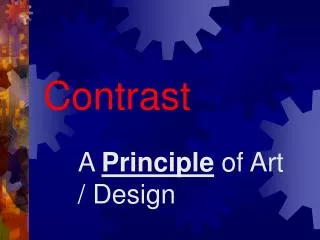
Effective Design Principles: Contrast, Repetition, Alignment, and Proximity
Learn essential design principles including contrast, repetition, alignment, and proximity to enhance visual communication. By using contrasting type sizes and colors, you can create visually appealing designs that are easy to read. Maintain consistency across headings and bullet points for a unified look. Group related items closer together to indicate their relationship and ensure visual connections throughout your layout. Discover how to effectively combine serif and sans-serif fonts while adhering to the maximum font style rule.

Effective Design Principles: Contrast, Repetition, Alignment, and Proximity
E N D
Presentation Transcript
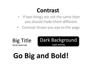
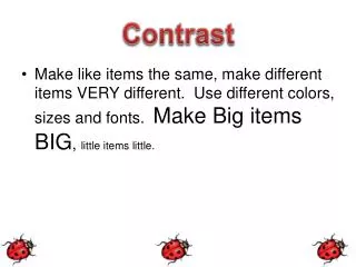
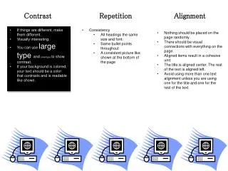
Contrast Repetition Alignment • If things are different, make them different. • Visually interesting. • You can use large type and small type to show contrast. • If your background is colored, your text should be a color that contrasts and is readable like shown. • Consistency • All headings the same size and font. • Same bullet points throughout • A consistent picture like shown at the bottom of the page • Nothing should be placed on the page randomly. • There should be visual connections with everything on the page. • Aligned items result in a cohesive unit. • The title is aligned center. The rest of the text is aligned left. • Avoid using more than one text alignment unless you are using one for the title and one for the rest of the text.
Design Principles Danielle Meier Proximity Font Families • Group related items together. • The closer items are together, the closer relationship is shown. • Close relationship helps the eyes flow better down and across the page. • There are 2 font families: • Serif – font with tails • Example: Century Gothic • San Serif – font without tails • Example: Courier • A maximum of 2 font styles are • allowed to be used in a paper. One • Serif and one San Serif. • My headers are Serif and the rest of • the text is San Serif. Examples Good Example: Veggies: Carrots Cucumbers Beans Fruits: Apples Bananas Strawberries Bad Example: Apples Bananas Strawberries Carrots Cucumbers Beans