Download

1 / 29
290 likes | 440 Vues
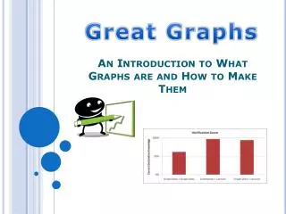
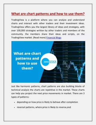
Great Graphs. An Introduction to What Graphs are and How to Make Them. A graph is a picture of your data. Graphs and charts are great because they communicate information visually . They take lots of data ( numbers ) and represent it visually . Great Graphs.

E N D
Great Graphs An Introduction to What Graphs are and How to Make Them
A graph is a picture of your data • Graphs and charts are great because they communicate information visually. They take lots of data (numbers) and represent it visually
Great Graphs • Graphs and charts are used very often in newspapers, magazines and SCIENCE to show information • With graphs, data we collect is easily interpreted and makes sense
So, how do we start? First, hand drawn graphs are ALWAYS done on graph paper You can also make them on a computer
There are three main types of graphs *Bar Graph *Line Graph * Pie Chart
All Graphs… • All Graphs have a TITLE • The Title should tell us about what kind of data we will see on the graph • The title is centered at the top of the graph Title
All Graphs… • X axis: The horizontal axis (across the page) • Usually this shows theindependent variable • Y axis: The vertical axis (up and down the page) • Usually this shows the dependent variable
All Graphs… • Lables: Graphs must have labels on the X axis and Y axis. • All lables must have UNITS for the data (ex: cm, seconds, minutes, meters)
All Graphs… • Numerical data: is listed on the line of the axis (ex: 0 is ON the bottom line)
Bar Graph * Bar Graphs are used to comparedifferent things * Bar Graphs are used to show discontinuous data (that is data that is not connected (example: graph showing who likes different fruit) * Bar graphs can be displayed vertically (up and down) or horizontally (side to side)
Bar graph Side Notes • Must have x and y axis labeled • Must have a title • Neat, organized bars • Appropriate use of space
Example • ALWAYS READ THE STORY!!! • EXAMPLE: The Purple Martin….. The purple martin is a small bird that eats mosquitoes and other insects. To catch its favorite meal, the purple martin glides through the air where mosquitoes fly, too. The bar graph below shows the number of insects caught by a group of purple martins one day during the afternoon and evening.
TITLE MOSQUITOES CAUGHT Y axis label Number of Mosquitoes X axis Time of day (HOURS) X axisaxis title UNITS
Example Questions • 1. How many insects were caught during each time period? • 4:00-4:30 ____________ • 4:30-5:00 ____________ • 5:00-5:30 ____________ • 5:30-6:00 ____________ • 6:00-6:30 ____________
Example Questions • 2. How many more insects were caught between 5:00-5:30 than between 5:30-6:00? ________________ • 3. How many fewer insects were caught between 6:00-6:30 than between 4:30-5:00? __________________ • 4. How many insects were caught between 4:30-6:00? ______________ • 5. Were more insects caught between 5:30-6:00 or between 6:00-6:30? ________________ • 6. How many insects were caught in all? _____________ • 7. What is the average number of insects caught during each half hour period? ____________
Line Graph Line Graphs are used to demonstrate change over time. Line graphs are used to demonstrate continuous data (that is data that is connected, such as over of period of time)
Line graph • Must label x and y axis • Must have a title • Uses a line to connect points
Line Graph • Line Graphs consist of data points connected together with a line this shows the trends in the data collected • X axis (independent variable) usually shows the units of timesuch as hours, seconds, days, weeks etc. • Y axis (dependent variable) usually shows the units of measurement
Title Y axis label Feet Traveled UNITS Days of the Week X axis label
Example Questions • 1. How much farther did Casey skate on Wednesday than on Thursday? ____________ • 2. What day did Casey skate the farthest? ___________ • 3. How many feet did Casey skate in all on Saturday and Sunday? ___________________ • 4. What was the average number of feet Casey skated each day? (round to the nearest whole number) ______________ • 5. If Casey skated twice as far as she did on Wednesday, how far will she skate? ____________
Circle or pie chart Pie Charts are most often used to compare percentages. The entire “pie” is equal to 100% and the size of each “pie slice” corresponds to a percentage amount * Pie Charts also show proportions
Circle or pie chart • The whole pie is 100% • Each piece of the pie is a fraction of 100% • All pieces must start in the center or the circle
What’s a Legend? The Legend • The legend tells what each slice represents. Just like on a map, the legend helps the reader understand what they are looking at. This legend tells us that the blue slice represents money spent on non-instruction, the green slice represents money spent on support services, and the orange slice represents money spent on instruction activities. • ***A legend can be used in any graph that has more than one set of data.***
EXAMPLE: A large machine at the mall holds 900 gum balls in six flavors. The pie chart shows how many gumballs there of each flavor.
Example Questions • 1. How many gumballs taste like green apples?_________ • 2. What is the total number of gumballs that taste like apples? _____________________ • 3. Which flavor has the most gumballs?_________ • 4. Why do you think this flavor has the most gumballs in the machine?________________________ • 5. Write a fraction to show how many of the gumballs are cinnamon apple flavor. (Write the fraction in lowest terms) _____________________________ • 6. What percentage of the gumballs are cinnamon apple? _____
So what do we do with the information that is on a graph anyway??? We get the information for the graph from the DATA TABLE We use the graphs to help us DRAW CONCLUSIONS FROM THE RELATIONSHIPS IN THE DATA.
What’s wrong here? No title or labels!!!!
What’s wrong here?... No titles, no labels and circle does not equal 100%!!
Now that you know what graphs are and how to create them you will practice creating your own! Good luck!