Download
1 / 13
140 likes | 274 Vues
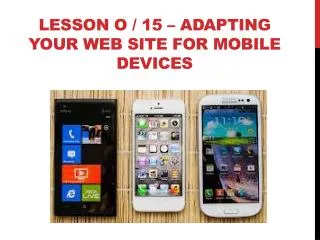
Lesson o / 15 – ADAPTING YOUR WEB SITE FOR Mobile DEVICES. Unique Needs . Viewability small screen variety of sizes Variety of resolutions Navigation features that can be manipulated on a touchscreen Minimal download size. Mouse pointer vs. touch selection. Media queries :

E N D
Unique Needs • Viewability • small screen • variety of sizes • Variety of resolutions • Navigation features that can be manipulated on a touchscreen • Minimal download size
Media queries: • Conditional statements that you can include in an @media rule. • Enable browser feature checks • Apply style rules based on set requirements
Conditional Style Sheets: • Style sheets specified using media queries within link elements • Indicates which style sheet should be loaded. • Can change the way Web pages are displayed in browser windows over a certain size
Layout adaptation • Quickest and easiest way to make site mobile-friendly. • The best way to deal with mobile capabilities is to create separate sets of HTML and CSS documents.
Decreasing Page Load Time • Speed optimization especially important to consider for mobile users • Often access site over slower connections • Web developers agree on many best practices for decreasing page load time • Table O-2 details a few that apply equally to larger and smaller Web sites
Minified: • Compressed version of mobile style sheet
Sprites • Combination of simple image editing and CSS code that enables multiple background image loads for a Web page with a single server request • Combine all background images into single image • Use CSS background-image properties to control which part of the compound image is displayed in each instance http://www.w3schools.com/css/css_image_sprites.asp
Sprite EXAMPLES http://www.w3schools.com/css/css_image_sprites.asp A sprite for TASK.
Geolocation • HTML5 objects and methods that enable you to obtain and work with a user’s precise location • Calculate distances • Display relevant maps • Provide other information that pertains to a user’s location • API key • Unique string that links map-related requests to your account
Cloaking: • Configuring a site so different content goes to crawlers and to browsers


![Progressive Enhancement & Mobile [HOW Interactive 2012]](https://cdn4.slideserve.com/7565332/progressive-enhancement-mobile-dt.jpg)