Download
1 / 29
290 likes | 362 Vues
Learn design principles, correct usage, and avoidance of common mistakes when creating charts and graphs. Understand how to display information accurately using pie charts, bar charts, line graphs, and more. Enhance your data visualization skills.

E N D
Designing & Using Charts & Graphs Compiled by: Jim Lucas Modified by: Luke Reese Franklin (42-48, 91-96, 105-114, 280-282, 305-311)
Overview • After this presentation, you should better understand: • Using the right chart or graph to present your information • Design principles for charts and graphs • How to lie and cheat with graphs, numbers and statistics
Pie charts • Pie is based on 100% • Slice represents relative amount of a whole • Slices should be percentages—not absolute values • Good design: • Easily distinguished pie slices • Largest slice starts at 12 o’clock and continues clockwise • Slice size decreases clockwise around pie • Label the pie directly
Things to avoid on a pie • Exploding all the slices • Inconsistent labeling • Legends • No labeling
Pie Chart Figure 1. Michigan’s Economy
Pie Chart Figure 1. Industry Contribution to 2007 Michigan’s Economy
Proportional bar chart • Used to show proportional amounts as a pie chart • Use side scale for more precise measures • Make it wide enough to read • If you have multiple bars, put the least varying factors first
Pie Chart Figure 1. Industry Contribution to 2007 Michigan’s Economy
Bar charts • Use to show change in ordinal (ordered sequence, e.g., 1st, 2nd, 3rd) or nominal (name or form, e.g., Yahoo, Google, Ask.com) data • Usually vertical, but use horizontal if it makes sense • Color code consistently • Avoid over emphasizing one line • If you use a legend, have it follow the order of your bars
Figure 2. 2006 cattle loss percentages by cause Figure 3. 2006 cattle loss percentages by state
Line graphs • Used to show change in trends and continuous data • Vary color or line weight to call attention to specific points • Points on the line are important for precise values • Be consistent with labeling
Line graphs continued • Put warm, bright colored lines on top • Use a scale that accurately reflects the change in information
Figure 4. Currency Exchange Rate (US$ to NZ$ and AU$) for first day of month, 2006
Picture chart or graph • You can use pictures in the place of a bar chart or graph • Follow color and theme conventions • Have the pictures align in the same direction • Vary size not color or shading
Tips for diagrams and maps • Follow the culture of the information • Identify relationships on a chart • Use color, line weight, shading to organize information • Show only relevant information • Avoid gridlines unless needed
Organizational charts • Squares or rectangles to indicate divisions • Top down structure • Solid lines - direct relationships • Dashed line - indirect relationships
Organizational Chart Department Chairperson Administrative Assistant Assistant Technology Communications Chair Manager Manager Staff Specialists Information Officers Faculty Figure 5. Departmental organizational chart, February 2008
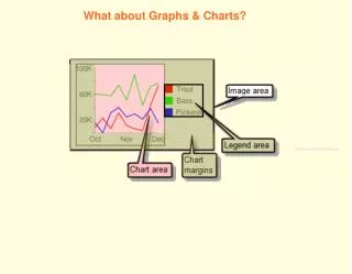
Figure and Table Labels • Very important • Number each figure sequentially • Place label under chart in same location (repetition) • Provide a title • Provide an informative caption to identify the purpose or meaning • All figures must be referenced in the narrative • Figure placed as close as possible immediately after the narrative reference
Lying with graphs • Altering the y-axis • Distorted shapes • Uneven start point • Using color, lines or other technique to distort differences • Using 3-D effects or distortions
Lying charts and statistics • Percentages and absolute values • Numbers are relative • Squishy numbers and figures • Value labels • Error