Download

1 / 14
140 likes | 520 Vues
Graphing Types of Graphs Pie Charts XY Graphs Bar Charts What type of graph to use? Pie Charts Limited in their applicability Can only be used when you have a quantitative variable associated with a list of categories where BOTH the categories and the quantities each add up to a WHOLE

E N D
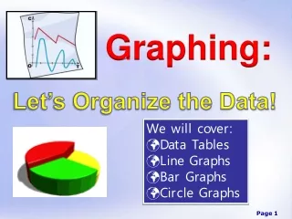
Types of Graphs • Pie Charts • XY Graphs • Bar Charts
What type of graph to use? • Pie Charts • Limited in their applicability • Can only be used when you have a quantitative variable associated with a list of categories where BOTH the categories and the quantities each add up to a WHOLE • The categories must be disjoint • Most common error – using a pie chart on a set of categories that do not make a whole & to use a pie chart when the categories overlap • Do not include the total in your pie chart • Add percentage data labels
What type of graph to use? • XY Graphs • Should be used when you have “a lot” of data points and the categories along the x-axis are numerical • Use the XY Scatter type and then choose a graph option with connected data points, usually • What Excel calls a “line graph” is very confusing and should essentially never be used (Excel “line graph” always treats the x-axis categorically)
What type of graph to use? • Bar Charts • Very flexible • Can be used whenever there is a quantitative variable associated with the categorical variable • Great when you have a limited amount of data or when you want to compare more than one series • If you do use a bar chart and have years along the x-axis, be sure the years are consecutive
How to make a pie chart • ../../Excel_Files/EnergyConsumption2005.xls • Select both the categories and the values • The graph needs a descriptive title • The percentages might need to be “increased” to show one or two decimals
How to make a Bar Chart • http://qrc.depaul.edu/Excel_Files/HomeHeating.xls • Advantages and disadvantages with bar charts • Main advantage is their succinctness and the ability they afford to make comparisons within categories and across categories • Best used in printed works so that a view can study them carefully • Disadvantage is that they sometimes present far too much information to view as part of a presentation • It is hard to make a single, clear point with them, and presenters tend not to leave them up long enough to absorb the information fully • People often make bar charts with quantitative data on the x-axis, but they are not careful about the fact that bar charts treats the x-axis categorically
How to Make an XY Graph • http://qrc.depaul.edu/Excel_Files/LakeMichiganLevels1988-2000.xls • Vocabulary: increasing/decreasing, absolute minimum/maximum, relative minimum/maximum, increasing at an increasing rate, decreasing at a decreasing rate, periodic • Be able to write paragraphs which describe what the graph is saying, generally going from left to right, telling the “story” of the graph
Guidelines for making an effective Graph • What is the purpose of making a graph from this data? • What type of graph should you make? • Pie • Bar • XY scatter (line) • Decide on a title and consider the Ws (who, what, where, and when) • Legend: yes or no? • Descriptive x-axis label (if applicable) • Descriptive y-axis label (if applicable) • Scale (if applicable) • Source
How to Describe Graphs • The graph should be able to stand alone without any words to tell the reader what they are looking at • If the reader doesn’t understand the graph without a caption (or story) then the graph isn’t very good • In a paragraph describing the graph, you should point out what you want the reader to know about the graph
Y-Axis Scale Effects • One of the most common ways graphs can be misleading • It has become more and more accepted in the media to adjust the y-axis