Graphing
Learn 3 key ways to interpret scientific data effectively: reading scholarly journals, looking at data directly, and creating graphs. Understand the importance of graphs in estimating values, making predictions, and identifying trends. Explore various types of graphs and relationships, including direct, indirect, static, and cyclic. Practice calculating rates of change graphically and analyze dynamic equilibrium in lab scenarios. Enhance your knowledge of measuring volume and mass in scientific experiments.

Graphing
E N D
Presentation Transcript
Graphing Our favorite thing to do…
3 ways to look at scientific information • 1.) Read a scholarly journal which discusses the data or lab report http://onlinelibrary.wiley.com/doi/10.1111/j.2153-3490.1976.tb00701.x/pdf • 2.) Look at the data http://cdiac.ornl.gov/ftp/ndp001/maunaloa.co2 • 3.) Make a graph of the data • http://celebrating200years.noaa.gov/datasets/mauna/image3b.html
Clearly graphs are important… • Not just to save time but also: • 1.) Estimate unmeasured values • Interpolate: using the graph to estimate a value between data points • 2.) To make predictions • By Identifying a trend:a general direction by which something is changing • Extrapolate: estimating values beyond what’s plotted on the graph
Extrapolating Year/Time (x-independent) vs. Population (Y-dependent)
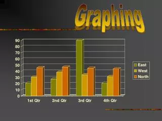
Bar Graphs • Used when a value changes in distinct steps (not continuously- like U.S. oil production) • To compare groups of data • Only one data set for each group
Pie Charts • Used to show how an entire quantity (ex: crust) is divided into parts (by composition)
There are 4 types of graphing relationships: • Direct: as X ↑ Y ↑ • Indirect: as X ↑ Y ↓ • Static: As one value increases the other stays the same • Cyclic: The system follows the same trend over and over again
Question of the Day What happens when relationships change? (In graphs, that is.) Warm-up: You’ve driven your Ferrari for 2 hours and travelled 300 miles. How fast did you go? 18
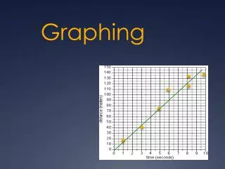
You’ve just used this formula: Rate of change = Change in Field Value Time
Rate of Change How a measurable aspect of the environment has changed over time
Rate of Change in a world problem Example: A pile of sand 10 feet high is eroded over 60 days to a height of 7 feet. What is the RC? 10 ft- 7 ft = 3 ft = 0.05 ft/day 60 d 60 d Practice: pg 34 and 35 (#1-7) worksheet
What is the rate of change in temperature between 6 a.m. – 10 a.m.? Rate of change = Change in Field Value Time 20 ºC - 10 ºC = 10:00 – 6:00 10 ºC = 4 hr. 2.5 ºC/hr.
Dynamic equilibrium • Opposing forces or actions balancing out. • State of balanced change. • Example: Level of lake remains same, even though water moves in and out.
LAB: Graph Analysis ● Warm-up What’s the rate of change for Weather Balloon A between 6 & 10 minutes? ● 18
What do measurements represent? • Volume:The space something occupies • Units: in cm³ , ft³ , litres and mL, ounces… • Can be measured using: • A ruler (measure width, length and height) A graduated cylinder • Mass:How much matter is in a substance ↑ • Measured in grams, kilograms… • - Measured using: a beam balance or a digital scale

