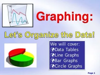
GRAPHING
Graphing is crucial for comparing measurements in experiments. The independent variable, which we control, is plotted on the X-axis, while the dependent variable, which we measure, is on the Y-axis. Remember T.A.I.L.S: Title, Axis, Increment, Label, and Scale. Every graph needs a clear title, proper axis labels with units, and an appropriate scale. Data points represent ordered pairs and should be plotted carefully without connecting the dots; instead, draw a best-fit line to summarize the trend.

GRAPHING
E N D
Presentation Transcript
GRAPHING We use a graph to compare two measurements (variables) in an experiment. The independent variable is the one we control. The dependent variable is the one we want to measure.
What do we include on a graph? T A I L S T itle A xis I ncrement Label S cale
TITLE: The graph must have a title that explains what is being compared to what. AXIS: The independent variable (usually the first column of the data table) goes on the X axis. The dependent variable (the second column of the data table) goes on the Y axis. NOTE: Time always goes on the X axis. ALWAYS!!!!!!!!!
Increments: The X and Y axis are number lines. You have to decide what numbers to put on each line. Label: You need to identify what the X axis and Y axis stand for. Your label must contain units of measure. It’s not enough to say “distance” and “time.” The labels must say “cm” and “seconds” (it’s ok to abbreviate though).
Which number line is the X axis and which one is the Y axis? The X axis is always horizontal, the Y axis is always vertical. Or……. The X stands on his own two feet. The Y reaches for the sky.
Scale: The graph should take up about ¾ of the graph paper. Looks kind of silly, don’t you think? Distance in cm over time Distance (cm) Time (sec)
HOW DO WE NUMBER THE Y AXIS? Distance in cm over time Distance (cm) Time (sec)
Y axis Distance in cm over time 44 40 34 NO NO NO!!!!!!! Distance (cm) 31 26 22 X axis Time (sec)
Distance in cm over time 50 • Put your highest value for the Y axis on top. • Tip: Sometimes it helps to round this value to the nearest 10. Distance (cm) Time (sec)
Distance in cm over time 50 2. Now, find ½ of the largest number. Put that value ½ of the way up the Y axis. Distance (cm) 25 Time (sec)
Distance in cm over time 50 45 3. By now, you may be able to fill in the rest of the numbers on the Y axis. 40 35 Distance (cm) 30 25 20 15 10 5 Time (sec)
MAKING THE GRAPH Each data point is an ordered pair. For each, you count to the right for the seconds and you count up for the cm. Let’s do the first one.
Distance in cm over time 50 45 40 35 (5 sec, 22 cm) Distance (cm) 30 25 20 15 10 5 Time (sec)
If you do the same thing with the other points, your graph will look like this:
Distance in cm over time 50 45 40 35 Distance (cm) 30 25 20 15 10 5 Time (sec)
Use a “best fitting line” on your graph. This means, use a ruler to draw a line that is approximately in the middle of all the points. DO NOT CONNECT THE DOTS!!!! EVER!!!!!!
Distance in cm over time 50 45 40 35 Distance (cm) 30 25 20 15 10 5 Time (sec)