Understanding Graphing: How to Create Clear and Effective Data Visualizations
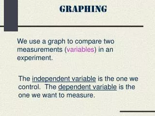
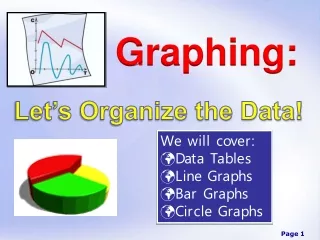
Graphing is essential for visualizing data effectively. A good graph serves as a clear picture that helps readers understand your data. Key elements of a good graph include T for Title, A for Axes, I for Intervals, and L for Labels. Different types of graphs serve different purposes: Bar Graphs for comparisons, Line Graphs for continuous data, Pie Charts for showing parts of a whole, and Scatter Plots for identifying patterns. Master these elements to ensure your graph communicates accurately and effectively.


Understanding Graphing: How to Create Clear and Effective Data Visualizations
E N D
Presentation Transcript
Graphing Creating a picture of your data
A graph is… a picture of your data. Make sure it is a clear picture that helps your reader understand your data.
TAIL…elements of a good graph T = title (must name the graph) A = axes (x and y axes for line graphs, bar graphs, histograms, scatterplots, etc) I = intervals (fit your data to your graph using intervals that make sense. AVOID BREAKS!) L = labels (titles for the axes otherwise we don’t know what we are looking at!)