Graphing
Graphing. Graphing. Representing numerical information in a picture. Graph shows a picture of a relationship -how two processes relate -what happens when two events occur simultaneously -how one factor influences another. Parts of a Graph. Factors plotted along an axis

Graphing
E N D
Presentation Transcript
Graphing • Representing numerical information in a picture. • Graph shows a picture of a relationship -how two processes relate -what happens when two events occur simultaneously -how one factor influences another
Parts of a Graph • Factors plotted along an axis • Numeric or some measurable term • Uses a scale • Horizontal = x-axis = abscissa • Vertical = y-axis = ordinate
Independent variable on x-axis (horizontal) • Variable that you select to study • Variable that you manipulate • Dependent variable on y-axis (vertical) • Values that are produced • Variable that responds
Data Table – data collected is organized in a table. Independent Variable → Goes on X axis →data on left side of data table Dependent Variable → Goes on Y axis → data on right side of data table
Types of Graphs Bar Graphs - used to compare amounts of the same type of measurement Number of miles Type of Car
Monthly Budget Pie Graph -used to represent percentage data
Line Graphs -used for representing data that constantly changes at regular intervals - may not necessarily show a regular pattern
Using a graph to determine information not directly measured or calculated. • Done with line graphs • Is impossible to measure every point that exists on that line or a distance from either end of the line constructed from the experimental points. • Use the processes of interpolation and/or extrapolation
Interpolation – • The process of obtaining a value from a graph or table that is located between data points plotted or major points given. • You make a prediction about what would happen at a given point.
How much money did the student earn after 5 hours? • Since you know how the experiment worked before and after the point of interest, you have a better chance of making a correct prediction.
Extrapolation – • The process of obtaining a value from a chart or graph that extends beyond the given data. • The “trend” of the data is extended past the last point given and an estimate is made of the value. • You can predict what would happen beyond the measured data. • Must be done with caution. You must assume that any variable in the experiment would not greatly change.
How much money did the student earn after 10 hours? • Extrapolation may not be very accurate since you are assuming the trend continues outside the boundaries of your data points
Relationship is Inversely Proportional (one value increase and the other decreases – line is a curve) Relationship is Directly Proportional (both values increase or decrease at the same rate – line is straight) Analyzing a Graph
Line Graphs – Kinds of Relationships Classroom Exercise 1:
Relationship – steady increase over a period of time Curve is a straight line ~ since both factors are increasing the relationship is directly proportional
Relationship – increases over period of time until a max is reached and then decreases
Relationship – change over period of time then remains constant
Building a Graph • Identify the variables • Determine the range of each variable • Determine the scale (fill at least 2/3 of paper) • Number and label each axis • Plot the data points • Draw the graph • Title the graph (provide a key if needed)
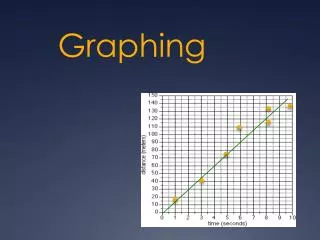
“Connecting the dots” • A line of best fit or also called a “best fit line” is a straight line that best represents the data on a scatter plot. • This line may pass through some of the points, none of the points, or all of the points. • It may also be called a "trend" line.
Best Fit Line • Choose two points that you think will form the line of best fit. Best fit line may not go through the “O” point
Classroom Exercise 5:Interpolation and Extrapolation of Data

