
Uploaded by
daveigh
16 SLIDES
368 VUES
170LIKES
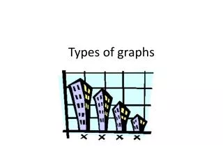
Understanding Line Graphs: Visualizing Scientific Data Relationships
DESCRIPTION
Line graphs are essential tools for presenting scientific data, illustrating how one variable affects another. The independent variable, typically plotted on the x-axis, is the one you control, while the dependent variable (on the y-axis) represents the data you measure in response to the changes in the independent variable. Line graphs are particularly effective for showcasing continuous changes over time, allowing researchers to visualize trends and make predictions based on the experimental results.
Download

1 / 16
Télécharger la présentation 
Understanding Line Graphs: Visualizing Scientific Data Relationships
An Image/Link below is provided (as is) to download presentation
Download Policy: Content on the Website is provided to you AS IS for your information and personal use and may not be sold / licensed / shared on other websites without getting consent from its author.
Content is provided to you AS IS for your information and personal use only.
Download presentation by click this link.
While downloading, if for some reason you are not able to download a presentation, the publisher may have deleted the file from their server.
During download, if you can't get a presentation, the file might be deleted by the publisher.
E N D
Presentation Transcript

More Related
Audio
Live Player