Types of Graphs
Types of Graphs. Types of Graphs. Does a bag of M&Ms have an equal number of each color?. Types of Graphs. Open your bag of M&Ms and count the number of each color. Fill in the table provided. How could these data be displayed?. Elements of a Graph. Title. Units. Connecting lines.

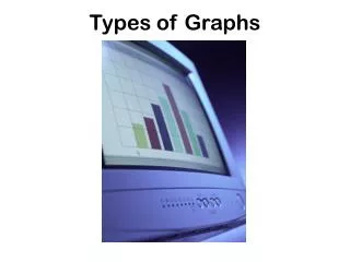
Types of Graphs
E N D
Presentation Transcript
Types of Graphs • Does a bag of M&Ms have an equal number of each color?
Types of Graphs • Open your bag of M&Ms and count the number of each color. • Fill in the table provided. • How could these data be displayed?
Elements of a Graph Title Units Connecting lines Data Points X and Y Labels Units
Line graphs • Line graphs are only used when both variables are continuous. (usually numerical) They are very useful for showing how changing one variable affects another. • Example- light intensity vs. rate of photosynthesis
Line graphs • Many times a variable is measured over time on a line graph.
Line graphs • Sometimes, more than one line will appear on a graph when comparing a variable for two or more sets of data.
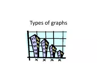
Bar graphs • In these graphs the data is displayed in either vertical columns or horizontal bars • The height of the column (or the length of the bar) represents the number of the individual objects in a particular category. • Bar graphs should be used when the data is grouped into separate categories • Example- car colorin a parking lot
Bar graphs • Here is a bar graph displayed horizontally
Pie graphs or charts • Pie graphs are circles divided up into pieces or sectors. The area of each circle represents the percentage of objects that fall into a particular category. • Pie graphs should be used when showing parts of a whole. • Pie graphs should only be used with data grouped in categories and then converted into percentages of the total number.
How to make a Pie graph • Suppose you wanted to make a pie graph to show the number of seeds that germinate in a package. You would have to determine the total number of seeds and the number of seeds that germinate out of the total. You count the seeds and find that the package contains 143 seeds. Therefore, the whole pie will represent this amount. • You plant the seeds and determine that 129 seeds germinate. The group of seeds that germinated will make up one section of the pie graph, and the group of seeds that did not germinate will make up another section.
How to make a Pie graph • To find out how much of the pie each section should take, you must divide the number of seeds in each section by the total number of seeds. You then multiply your answer by 360, the number of degrees in a circle. Round your answer to the nearest whole number. The number of seeds that germinated would be determined as follows: • 129/143 x 360 = 324.75 or 325° • To plot these data on the pie graph, you need a compass and a protractor.
What type of graph would you use? • For the following descriptions, decide what type of graph would best illustrate the data provided. Explain your choice to your partner.
Sarah buys a new car in 2001 for $24,000. She tracks the value of her car over the next 6 years. Below is the table of her car’s value.
A student wants to know what types of movies her classmates prefer. She surveys 20 students. Below is the table of her results
A researcher records the average monthly rainfall in two cities. Can you predict what this graph would look like?
The Little Debbie snack food company puts a survey on Facebook to determine what percentage of each snack food is the customers’ favorites.
A teacher graphs the number of students who receive an A, B, C, and D on her last test.
Jill receives a graph on her growth of her secondary math scores for grades 7 through 12. Her grades are provided below.
A researcher records the number of wing vibrations for one minute of various insects. The data are provided in the table.
The value of 3 portfolios of stocks are recorded each month for one year. • Can you predict what this graph will look like?
A student keeps track of how much time she spends on different activities over a 24 hour period. The table shows what she learned about her activities.
On the back of your M&M data table answer the question below. • How could we represent the data from your bag of M&Ms? Explain your answer.