Download
1 / 15
150 likes | 191 Vues
Explore refinements made to the Online Course Reserves system including improved search functionality, clear navigation, and user-friendly design enhancements. Tailored to optimize student experience.

E N D
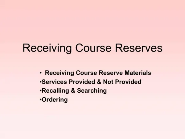
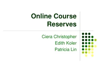
Online Course Reserves Ciera Christopher Edith Koler Patricia Lin
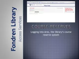
Introduction to the System • The course reserves system allows students to: • Search for course reserves by course or professor • Find information on books stored in the reserve room • Download copies of online reserves
Problems Identified • Our evaluation of the Online Course Reserves produced the following results: • Unnecessary text • Links that went to useless searches • Circular Links • Forced to download only one item at a time • Lack of color • Spacing made text difficult to read • Table borders were large and distracting • Ugly
Search Course Reserves Clear affordances Clear Search Links to get more information Link to contact
Old: Missing Entry Not centered Table borders are ugly Table columns are unclear
New: Missing Entry Color attracts user attention Table is clear
Old: Professor with Multiple Courses What’s Num?
New: Professor with Multiple Courses Table makes sense
Old: View all Reserves What does the button do? Circular Links Too much information What’s this referring too?
New: View all Reserves Columns clearly defined Clearly defines what table displays Removed useless buttons
Old: View Online Reserves Too much work to download all Useless Link Table is unnecessary Three Pages?! Centering makes it difficult to read “View image of:”…What’s that about? What’s all this junk?
New: View Online Reserves Only two pages! Removed useless links No extra table and text User can select all for easy download Easy to ready article titles
Old: Permissions What number? Glad you gave me a choice
New: Permissions Clear where number is
Evaluation of New System • Conducted same evaluation on 6 users. • No confusion by unnecessary text. • Users could not click on links that were confusing • Users could download multiple files • Color attracted users to important information • Information was easy to find