Navigation
Navigation. Research Presentation 10-09-07 Eryn Whitworth INF385e. Defining Navigation . Navigation refers to the method used to find information within a web site. -usability.gov Menu: a list of available commands or facilities, esp. one displayed on screen. -OED online.

Navigation
E N D
Presentation Transcript
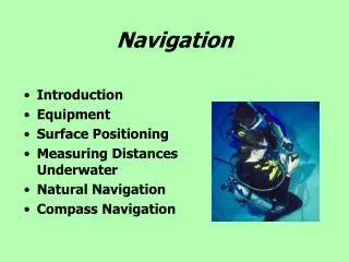
Navigation Research Presentation 10-09-07 Eryn Whitworth INF385e
Defining Navigation • Navigation refers to the method used to find information within a web site. -usability.gov • Menu: a list of available commands or facilities, esp. one displayed on screen. -OED online
Types of Navigation Embedded Navigation is situated within the content of the site and helps to provide a context for the user. • local • global • contextual Supplemental Navigation exist outside the content bearing pages. • sitemap • site index • guides • search
The Game Plan • All together these are the navigation tools you have to satisfy users’ needs to find the information they seek. • After this presentation you should be able to: • think critically about the specific navigation needs of your final project. • better evaluate the navigation tools you use everyday. • identify common pit falls of navigation and suggest alternatives.
Designing a Navigation System Designing a navigation system involves the work of many disciplines. To begin we need to know about the tools at our disposal.
Site Map • Small sites may not need a site map. • Sitemaps’ offer a bird’s eye view. • They lend themselves naturally to sites’ with strong hierarchy. • Good site maps create accurate mental models. • Usability.gov chapter 7.8 found strong evidence for Keeping Navigation- Only Pages Short
A-Z Index • Information arranged alphabetically by some designated word. • Best for Known Item Seeking • Two methods of generating a site index.
Guides • Guides offer a specific “take” on your site. • Linear navigation through a guide prevents users from getting lost; hypertext can add flexibility where appropriate.
Global Navigation • Global navigation is heavily used by most users. • Often it is compact because global navigation appears on every page. • It is important to validate your design of the global navigation with user testing.
Local Navigation • This navigation offers connection to sub-sites so, the labels used are important. • Local and Global navigation designs should complement one another. • Sometimes local navigation is an extension of the global navigation bar. • Usability.gov chapter 7.6 suggests using Descriptive Tab Labels
Contextual Navigation: Embedded Links • Hyperlinked text embedded in the content of a webpage. • This kind of navigation supports associative learning. • Links are not derived form hierarchal relationships.
Further Contextual Navigation • Some pages have a lot of textual information in them, that requires a lot of scrolling. • Usability.gov chapter 7.3 suggests using a Clickable ‘List of Contents’ on Long Pages
Contextual Navigation • Other pages need External Contextual navigation links • To offer a lot of links to related information. e.g. p128 Figure 7-13
Decisions to make when designing a Navigation System • You must decide… • how to place your various navigation tools. • whether to use dynamic or static navigation and menus. • how to strike a balance between… • hierarchy and flexibility. • lateral and vertical navigation. • how to provide Context in you navigation design. • how to deal with different browsers.
Navigation Bar Placement Conventional Diagram • The usual way navigation bars are placed has the global navigation across the top of the webpage and the local navigation arranged on the left side of the screen.
Navigation Bar Placement Examples Unconventional Non-traditional placement can intrigue users and confuse them.
Dynamic Navigation “Pros” • Interactive • Reduces clicks • Saves screen real estate • User directed “Cons” • Usability and accessibility suffer • Can hide important navigation • User directed
Dynamic Navigation: Glosses • Usability.gov chapter 7.11 emphasizes that Glosses help users choose the right links
Static Navigation “Pros” • Offers reliable navigation • Great for the differently abled “Cons” • Predictable, boring • Less and less used • Crowds screen real-estate.
Striking a balance between Hierarchy and Navigation • It’s a matter of deciding what to provide hyperlinks for, and it’s also a matter of deciding when to stop adding hyperlinks. • Recall the “Structure and Memorablity of Web Sites”
Lateral and Vertical Navigation • Why lateral navigation? • The user might need to access information within a site that does not follow the hierarchical (vertical) navigation. • Sometimes it is helpful to give users additional options to navigate bypassing the hierarchy. • It allows for greater flexibility in navigation. • Why vertical navigation? • Allows user to develop clear mental models of the site, and perceive the site as smaller.
Providing Context in your Design • We all know that… you can’t count on users entering a site through the “front door” • Usability.gov chapter 7.4 suggests providing the user feedback to let users know where they are in the Web site. • It is important to make user’s location within the site visible in content bearing pages.
Ways of Providing User Feedback • Matching link title and linked page’s url. • Using descriptive Header and Title information. • Breadcrumbs-provide path or hierarchy information. • e.g. Employees>Region 6> Sales dept.> quarterly profits • Usability.gov Chapter 7.12 warns Breadcrumb Navigation can be misunderstood by users.
Other ways of Providing Context • Logo-extend organization’s branding throughout the site so users know who they are dealing with. • Graphics- should bind your whole site with a tone. Simple colors and shapes often are easiest to recognize.
Dealing with Web Browsers • User need to understand the formatting of links. • Using standard formatting insures usability. Links want to be Links • Many like the browser bookmark features • Not designing for browser bookmark features can prevent repeat visits. Learning to Let Go
Dealing with web browsers • Most users love the Back button. • When they can’t use it they get angry. • Usability.gov chapter 7.1 cited 5 studies that prove the importance of Providing Navigational Options
Implementing a Navigation System • The interface design if often under someone else’s control. Still, the interface has a huge effect on the overall success of the project. • There are a variety of options for implementing you navigation system. • Text, Graphics, Pull-down menus, Pop-ups, Rollovers, or Cascading menus. (Advocate for the one that best suits your content and user, or else.)