Download

1 / 27
270 likes | 295 Vues
Avoid common PowerPoint pitfalls like excessive text, overused bullets, distracting animations, and poor color choices with these design tips for impactful presentations. Learn how to enhance visuals, improve audience focus, and create professional slides that convey your message effectively.

E N D
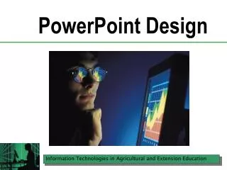
PowerPoint Design PowerPoint Presentation Assignment
What NOT to do… Too small
Think about… The oldest person in the room, sitting furthest away.
What NOT to do… Too much text
Get rid of bullets! • Inappropriate use • Presenter reads • Part of PowerPoint template structure, but…
Bullet Points Fail • Visually uninspiring • Usually rattled off in a stacatto-like fashion without the audience being able to absorb the details • Rarely elaborated upon because they are read straight off the screen • Dull the senses because of the sheer repetition of slide after slide of the same stuff
Find an Alternative Transform each bullet into a separate slide, with a separate graphic.
Graphic Impact Audiences remember both pictures and text.
Availability of Pictures Takes time to search for the right picture to match the slide.
What about clipart? It’s available, quick, and easy. But, it can cheapen or trivialize the message.
What NOT to do… Too much, audience can’t find focus
Colors look different on the monitor than when projected.
Too much background… • How do you like trying to read text on this slide?
Contrast, contrast, contrast! Select complimentary colors or opposite colors to get the right blend.
Contrast, contrast, contrast! Test it on a projector! Colors on monitor look different on projectors Dark background, light text Or Light background, dark text
Build your own! The blue line was created using a combination of a bar and a circle at the end A similar effect was used on the right, but this time a circle was used to punch a hole through the green box. The left green shape is a combination of a green box over-layed with a white special shape and a triangle. The white effectively acts as a cut out. The red circle was made using a special semi-circle shape and then creating a duplicate and rotating it. The salmon colored arrow was constructed using a box and an arrow special shape.
Annoying Animation Letters that grow and shrink… Words that flash in, spin, boomerang. Screeches and buzzes as information appears. Are you annoyed by the sound, yet?
Make it Professional Avoid bullets if you can. Bigger font, bigger impact. Use sounds carefully. Use graphics. Use basic or subtle animations.