Improve Your PowerPoint Slides: Tips for Effective Design and Clarity
Discover practical tips to enhance your PowerPoint presentations and avoid common pitfalls like excessive text and cluttered design. Learn the importance of alignment, the Rule of Thirds, and effective use of visual elements. This guide covers slide layouts, visual image grouping, and the significance of white space. Get tips for text boxes, image and video insertion, and how to use transitions and animations effectively—without annoyance. Master these techniques for clearer, more engaging presentations that captivate your audience.

Improve Your PowerPoint Slides: Tips for Effective Design and Clarity
E N D
Presentation Transcript
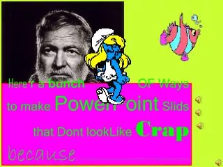
Here r a bunch OF Ways to make PowerPoint Slids that Dont lookLike Crap becausea lot of people write way too mich text in slides and they make everything too small so that no one can read it and you have to wonder, what’s the point, anyway?????????????
Here r a bunch OF Ways to make PowerPoint Slids that Dont lookLike Crap becausea lot of people write way too mich text in slides and they make everything
Basic PowerPoint Design A Quick Lesson in Graphic Communication
Align major elements with each other or with a grid. • Show gridlines by clicking View: Grid and Guides: Display grid on screen • Use the “Rule of the Thirds” sweet spots: place your most important info here
Use slide layouts • Create a new slide by clicking Insert: New Slide. • If the toolbar doesn’t automatically appear on the right, click Format: Slide Layout • Select the layout style that best fits your text, images, graphs, and video
In general, use one strong visual image. If using multiple images, group together with rules, such as: • Same horizontal or vertical axis • Similar content • Color schemes • Connecting lines
In general, use one strong visual image. If using multiple images, group together with rules, such as: • Same horizontal or vertical axis • Similar content • Color schemes • Connecting lines
Ernest Hemingway BLAH BLAH BLAH BLAH BLAH BLAH BLAH BLAH BLAH BLAH BLAH BLAH BLAH BLAH BLAH BLAH BLAH BLAH BLAH BLAH BLAH BLAH BLAH BLAH BLAH BLAH BLAH BLAH BLAH BLAH BLAH BLAH BLAH BLAH BLAH BLAH BLAH BLAH BLAH BLAH BLAH BLAH BLAH BLAH BLAH BLAH BLAH BLAH BLAH BLAH BLAH BLAH BLAH BLAH BLAH BLAH BLAH BLAH BLAH BLAH BLAH BLAH BLAH BLAH BLAH BLAH BLAH BLAH BLAH BLAH BLAH BLAH BLAH BLAH BLAH BLAH BLAH BLAH BLAH BLAH BLAH BLAH BLAH BLAH BLAH BLAH BLAH BLAH BLAH BLAH BLAH BLAH
Ernest Hemingway BLAH BLAH BLAH BLAH BLAH BLAH BLAH BLAH BLAH BLAH BLAH BLAH BLAH BLAH BLAH BLAH BLAH BLAH BLAH BLAH BLAH BLAH BLAH BLAH BLAH BLAH BLAH BLAH BLAH BLAH BLAH BLAH BLAH BLAH BLAH BLAH BLAH BLAH BLAH BLAH BLAH BLAH BLAH BLAH BLAH BLAH BLAH BLAH BLAH BLAH BLAH BLAH BLAH BLAH BLAH BLAH BLAH BLAH BLAH BLAH BLAH BLAH BLAH BLAH BLAH BLAH BLAH BLAH BLAH BLAH BLAH BLAH BLAH BLAH BLAH BLAH BLAH BLAH BLAH BLAH BLAH BLAH BLAH BLAH BLAH BLAH BLAH BLAH BLAH BLAH BLAH BLAH
Ernest Hemingway BLAH BLAH BLAH BLAH BLAH BLAH BLAH BLAH BLAH BLAH BLAH BLAH BLAH BLAH BLAH BLAH BLAH BLAH BLAH BLAH BLAH BLAH BLAH BLAH BLAH BLAH BLAH BLAH BLAH BLAH BLAH BLAH BLAH BLAH BLAH BLAH BLAH BLAH BLAH BLAH BLAH BLAH BLAH BLAH BLAH BLAH BLAH BLAH BLAH BLAH BLAH BLAH BLAH BLAH BLAH BLAH BLAH BLAH BLAH BLAH BLAH BLAH BLAH
Ernest Hemingway BLAH BLAH BLAH BLAH BLAH BLAH BLAH BLAH BLAH BLAH BLAH BLAH BLAH BLAH BLAH BLAH BLAH BLAH BLAH BLAH BLAH BLAH BLAH BLAH BLAH BLAH BLAH BLAH BLAH BLAH BLAH BLAH BLAH BLAH BLAH BLAH BLAH BLAH BLAH BLAH BLAH BLAH BLAH BLAH BLAH BLAH BLAH BLAH BLAH BLAH BLAH BLAH
Ernest Hemingway BLAH BLAH BLAH BLAH BLAH BLAH BLAH BLAH BLAH BLAH BLAH BLAH BLAH BLAH BLAH BLAH BLAH BLAH BLAH BLAH BLAH BLAH BLAH BLAH BLAH BLAH BLAH BLAH BLAH BLAH BLAH BLAH BLAH BLAH BLAH BLAH BLAH BLAH BLAH BLAH BLAH BLAH BLAH BLAH BLAH
“White” Space Leave lots of empty space on your slide, especially around the edges and above and below the text.
This Looks Really Bad This looks really bad. This looks really bad. This looks really bad. This looks really bad. This looks really bad. This looks really bad. This looks really bad. This looks really bad. This looks really bad. This looks really bad. This looks really bad. This looks really bad. This looks really bad. This looks really bad. This looks really bad. This looks really bad. This looks really bad. This looks really bad.
How to create a text box • Click Insert: Text Box. (Or use the button from the toolbar at the bottom of the screen. • Drag the box to the size you want it. • Select a font that matches your previous slides • Use font sizes 24 or larger
Inserting different types of files: • Pictures: Click File: Insert Picture: From file • Find the saved picture you want to insert • Video: Click File: Insert: Movies and Sounds: Movie from file • Find the saved movie you want to insert
Adding transitions & animation • Transitions • Select the slide you want to modify • Click Slide Show: Slide Transition: Select a transition • Note: There is a button at the bottom of the transition selection box that lets you apply this transition to all slides • Animations • Select the element (picture, piece of text, etc.) that you would like to be animated • Click: Slide Show: Custom Animation: Add Effect
WARNING! MOST TRANSITIONS AND ANIMATIONS ARE EXTREMELY ANNOYING
When to use animations • Fly in bullets one at a time so people don’t read ahead. • That’s the only reason I can think of.
Repetition • Repetition is a very good thing. Remember: • Fonts: Choose one or two. • Colors: Establish a color palette for your master slide and stick with it. • Alignment: Align pictures, text, and all elements to the grid. Use the Rule of Thirds. • Images: Use one strong image per slide, or connect pictures with colors, alignment, lines, etc. • White space: Leave plenty of empty space. Nobody likes to look at a zillion words on a slide.
Activity! • Form groups of 2 or 3 • EACH member of the group (with everyone’s help) create the WORST slide you can possibly create • As a group, create a master slide/style • EACH member of the group create one PERFECT slide, each with a different layout