Download
1 / 18
180 likes | 358 Vues
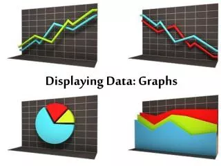
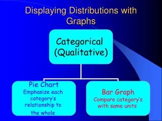
Displaying Distributions with Graphs. Examples:. Examples:. Displaying Distributions with Graphs. Display Shoe Size. Human Graph…….. Watch as the graph changes shape. Does the interpretation change also?. Stemplot. Stem (all but the right most digit) Leaf (the final digit)

E N D
Display Shoe Size Human Graph…….. Watch as the graph changes shape. Does the interpretation change also?
Stemplot • Stem (all but the right most digit) • Leaf (the final digit) • Smallest on top to largest on bottom • Leaf in row to right in increasing order • Back-to-back stemplots compare two related distributions: read carefully!!!!!!! • Does not work well for large data sets with each stem holding lots of leaves.
Examples: Stem-and-leaf of Exercise N = 48 Leaf Unit = 100 N* = 5 (30) 0 000000000000000000000011111111 18 0 222233333 9 0 4455 5 0 677 2 0 8 1 1 1 1 1 1 1 1 1 1 1 2 1 2 1 2 1 2 1 2 8
Forty students took a statistics examination having a maximum of 50 points. The score distribution is given in the following stem-and-leaf plot.Stem-and-leaf of Scores on Exam N = 39Leaf Unit = 1.0 2 0 28 6 1 2245 17 2 01333358889(8) 3 00156679 14 4 22444466788 3 5 000
Dotplot • Each observation is a dot above a number line to show the distribution of the variable.
Histogram • Breaks the range of values into classesand displays only the count or percent of observations in each class. • Always chose classes of equal width. • Five classes is a good minimum but use your best judgment. What you don’t want are gaps (too many classes) or skyscrapers (too few)
Five number summary and Boxplots • Minimum: smallest value • Q1: first quartile (25%) • M: median (middle number 50%) second quartile • Q3: third quartile • Maximum: largest value
Others • Relative cumulative frequency plot • Time plot
Calculator Use and Graphs: • Data: Tip of the nose to tip of the finger • 81 95 85 84 87 80 88 97 86 92 89 80 73 85 90 88 82 70 93