International Typographic Style
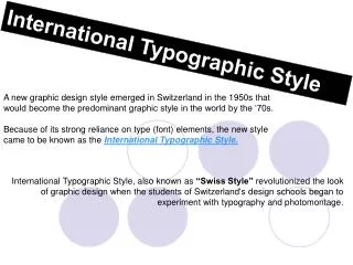
International Typographic Style. A new graphic design style emerged in Switzerland in the 1950s that would become the predominant graphic style in the world by the ‘70s.

International Typographic Style
E N D
Presentation Transcript
International Typographic Style A new graphic design style emerged in Switzerland in the 1950s that would become the predominant graphic style in the world by the ‘70s. Because of its strong reliance on type (font) elements, the new style came to be known as the International Typographic Style. International Typographic Style, also known as “Swiss Style” revolutionized the look of graphic design when the students of Switzerland's design schools began to experiment with typography and photomontage.
how did this genre of art originate? Strongly relying on typographic elements, the "Swiss Style" was refined at two design schools in Switzerland, one in Basel, led by Armin Hofmann and the other in Zurich under the leadership of JosefMueller-Brockmann. All had studied at the Zurich School of Design before WWII, where the principles of the Bauhaus Architecture and Design and New Typography were taught.
what are some of the defining characteristics of international typographic style? The style was marked by: 1.) The use of a math grid to provide an overall orderly and unified structure
what are some of the defining characteristics of international typographic style? 2.) Sans serif typefaces (especially Helvetica, introduced in 1961). Helvetica is perfect for international marketing: no ornament, no emotion, just clear presentation of information. Helvetica is still one of the most well-know fonts in use today. Text is central to the “look” of this style. It is usually set in a flush left or ragged right
what are some of the defining characteristics of international typographic style? 3.) Black and white photography in place of drawn illustration. The overall impression was simple and rational, tightly structured and serious, clear and objective, and harmonious.
what are some of the defining characteristics of international typographic style? 4.) Simplicity in design. A clean, simple and easily identifiable look. Simple, minimal colors.
who are some of the defining artists of this category? • Mueller-Brockmann abruptly rose to prominence in the early 1950s, with the appearance of his highly abstract series of classical concert posters in Zurich. • He replaced drawn illustration with a mathematical grid. • - He reduced the color palette to its most elemental – • black and white - or at other times to one or two colors • - He replaced traditional typefaceswith clean and • straightforward sans-serif faces. • The result was utterly straightforward and logical. Josef Mueller-Brockmann
who are some of the defining artists of this category? Josef Mueller-Brockmann
who are some of the defining artists of this category? Josef Mueller-Brockmann 1972 1952 1959 1955 1973
who are some of the defining artists of this category? Armin Hofmann • Armin Hofmann was a Swissgraphic designer. He helped to found the Basel School as well as a graphic style known as the Swiss Style. He was well known for his posters. • - He emphasized simple or minimal use of color and fonts • He emphasized simplicity and sans serif text “sans” means “no”
who are some of the defining artists of this category? Armin Hofmann These are from 1958 - 1963
German applied graphics Magazine Cover 1954 Municipal Theatre Program Cover 1961, Museum Poster 1955, who are some of the defining artists of this category? Armin Hofmann Martin, Morlotti, Schiess 1966, Art exhibition Herman Miller Furniture Retrospect Poster 1962
who are some of the defining artists of this category? Armin Hofmann
who are some of the defining artists of this category? PAUL RAND was a well-known Americangraphic designer, best known for his corporate logo designs and as one of the originators of the Swiss Style of graphic design. He designed many posters and corporate identities, including the logos for IBM, UPS and ABC Paul Rand
who are some of the defining artists of this category? Paul Rand
wherecan examples of this genre of art be found? The Swiss Style was perfectly suited to the marketplace. Corporations needed international identification and global events such as the Olympics called for universal solutions which the Typographic Style could provide.
wherecan examples of this genre of art be found? The new style became the "look" of Swiss culture, appearing on theatre and magazine covers and to advertise art galleries. Multinational corporations soon adopted the look of InternationalTypographicStyle in the use of trademarks, colors, and typefaces.
wherecan examples of this genre of art be found? The simple, sleek design also became the look of modern style PICTOGRAMS PICTOGRAMS are simple, internationally recognized symbols which represent and convey a wide range of information in visual form.
wherecan examples of this genre of art be found? The following pictograms were created in this class…
one of Mr. Juul’s favorite series of albums were by Enoch Light & His Light Brigade. they introduced me to this “style.”
one of Mr. Juul’s favorite series of albums were by Enoch Light & His Light Brigade. they introduced me to this “style.”
one of Mr. Juul’s favorite series of albums were by Enoch Light & His Light Brigade. they introduced me to this “style.”
References http://www.kerrywilliampurcell.com/ http://www.posterpage.ch/exhib/ex03_hof/hofintro.htm (Armin Hoffmann) http://internationalposter.com/IntTypoStyle_Text.htm (About Intl. Typo. Style) http://internationalposter.com/thumbdir.cfm?StartPage=1&Style=Int%27l%20Typographic%20Style&NavBar=PosterFinder%26%23153%3B%20%3A%20Style%20%3A%20Int%27l%20Typographic%20Style http://www.internationalposter.com/sw-text.cfm http://www.artandculture.com/cgibin/WebObjects/ACLive.woa/wa/movement?id=351 http://www.internationalposter.com/thumbdir.cfm?StartPage=1&Style=Int%27l%20Typographic%20Style&NavBar=PosterFinder%26%23153%3B%20%3A%20Style%20%3A%20Int%27l%20Typographic%20Style (Genre Examples)
SUMMATION of international typographic style 1.) An overall orderly and unified structure 2.) Sans serif typefaces (especially Helvetica) are perfect for international marketing: no ornament, no emotion, just clear presentation of information. Helvetica is still one of the most well-know fonts in use today. 3.) Black and white photography is used in place of drawn illustrations. 4.) Simplicity in design. The Swiss Style is a clean and easily identifiable look which uses of simple or minimal colors.