Understanding and Identifying Misleading Graphs and Statistics
230 likes | 380 Vues
This document emphasizes the importance of recognizing misleading graphs and statistics, which can skew public perception. It provides various examples of how graphs can misinform by manipulating scales, intervals, and sample populations. Readers will learn to analyze inequalities, evaluate the integrity of data representation, and understand the significance of random sampling. Exercises included prompt critical thinking about potential biases in interpreting statistical data, enabling readers to better discern how information can be distorted.

Understanding and Identifying Misleading Graphs and Statistics
E N D
Presentation Transcript
Algebra1Misleading Graphsand Statistics CONFIDENTIAL
Warm Up Solve each inequality and graph the solutions. 1) 2x - 3 < 7 2) 3 (t - 1) ≥ -15 3) 6 - n < 2n + 9 CONFIDENTIAL
Misleading Graphs and Statistics Graphs can be used to influence what people believe. The way data is displayed can influence how the data is interpreted. CONFIDENTIAL
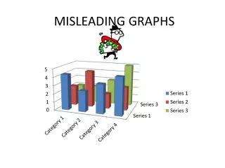
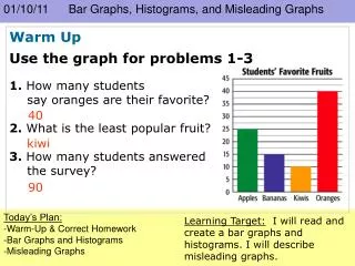
Misleading Bar Graphs The graph shows the size of tomatoes on plants that were treated with different fertilizers. A) Explain why the graph is misleading. The scale on the vertical axis begins at 80. This exaggerates the differences between the sizes of the bars. B) What might someone believe because of the graph? Someone might believe that the tomato treated with fertilizer D is much larger than the other tomatoes. It is only 4 grams larger than the tomato treated with fertilizer B. CONFIDENTIAL
Now you try! 1. Who might want to use the graph below? Explain. CONFIDENTIAL
Misleading line Graphs The graph shows the average price of gasoline in the U.S. in September. A) Explain why the graph is misleading. The intervals on the vertical axis are not equal. B) What might people be influenced to believe by the graph? Someone might believe that the price of gasoline increased the most between 1995 and 1997. However, the change between 1995 and 1997 was only $0.14/gal while the change between 1999 and 2001 was $0.17/gal. CONFIDENTIAL
Now you try! 2. Who might want to use the graph below? Explain. CONFIDENTIAL
A circle graph compares each category of a data set to the whole. When any category is not represented in the graph, it may appear that another category represents a greater percentage of the total than it should. CONFIDENTIAL
Misleading Circle Graphs The graph shows what percent of the total votes were received by three candidates for student council president. A) Explain why the graph is misleading. The sections of the graph do not add to 100%, so the votes for at least one of the candidates is not represented. B) What might someone believe because of the graph? Someone might believe that Smith won the election. CONFIDENTIAL
Now you try! 3. Who might want to use the graph below? Explain. CONFIDENTIAL
Statistics can be misleading because of the way the data is collected or the way the results are reported. A random sample is a good way to collect unbiased data. In a random sample , all members of the group being surveyed have an equal chance of being selected. CONFIDENTIAL
Misleading Statistics A researcher surveys people leaving a basketball game about what they like to watch on TV. Explain why the following statement is misleading: “80% of people like to watch sports on TV.” The sample is biased because people who attend sporting events are more likely to watch sports on TV than people who watch TV but do not attend sporting events. CONFIDENTIAL
Now you try! 4) A researcher asks 4 people if they have seasonal allergies. Three people respond yes. Explain why the following statement is misleading: “75% of people have seasonal allergies.” CONFIDENTIAL
Assessment 1) The graph shows the average salaries of employees at three companies. a. Explain why the graph is misleading. b. What might someone believe because of the graph? c. Who might want to use this graph? CONFIDENTIAL
2) The graph shows hotel occupancy in San Francisco over four years. a. Explain why the graph is misleading. b. What might someone believe because of the graph? c. Who might want to use this graph? CONFIDENTIAL
3) The graph shows the nutritional information for a granola bar. a. Explain why the graph is misleading. b. What might someone believe because of the graph? c. Who might want to use this graph? CONFIDENTIAL
4) Three students were surveyed about their favorite teacher. Two students answer Mr. Gregory, and one answers Mr. Blaine. Explain why the following statement is misleading: “Mr. Gregory is the favorite teacher of a majority of the students.” CONFIDENTIAL
5) A researcher surveys people at a shopping mall about whether they favor enlarging the size of the mall parking lot. Explain why the following statement is misleading: “85% of the community is in favor of enlarging the parking lot.” CONFIDENTIAL
Let’s review Misleading Bar Graphs The graph shows the size of tomatoes on plants that were treated with different fertilizers. A) Explain why the graph is misleading. The scale on the vertical axis begins at 80. This exaggerates the differences between the sizes of the bars. B) What might someone believe because of the graph? Someone might believe that the tomato treated with fertilizer D is much larger than the other tomatoes. It is only 4 grams larger than the tomato treated with fertilizer B. CONFIDENTIAL
Misleading line Graphs The graph shows the average price of gasoline in the U.S. in September. A) Explain why the graph is misleading. The intervals on the vertical axis are not equal. B) What might people be influenced to believe by the graph? Someone might believe that the price of gasoline increased the most between 1995 and 1997. However, the change between 1995 and 1997 was only $0.14/gal while the change between 1999 and 2001 was $0.17/gal. CONFIDENTIAL
Misleading Circle Graphs The graph shows what percent of the total votes were received by three candidates for student council president. A) Explain why the graph is misleading. The sections of the graph do not add to 100%, so the votes for at least one of the candidates is not represented. B) What might someone believe because of the graph? Someone might believe that Smith won the election. CONFIDENTIAL
Misleading Statistics A researcher surveys people leaving a basketball game about what they like to watch on TV. Explain why the following statement is misleading: “80% of people like to watch sports on TV.” The sample is biased because people who attend sporting events are more likely to watch sports on TV than people who watch TV but do not attend sporting events. CONFIDENTIAL
You did a great job today! CONFIDENTIAL