MISLEADING GRAPHS
MISLEADING GRAPHS. WHAT IS MISLEADING ABOUT THIS GRAPH?. ANSWER : VERTICAL AXIS DOESN’T BEGIN AT 0 SO LOOKS AS THOUGH HOUSING PRICES HAVE TRIPLED . This graph makes a truer comparison. WHAT IS MISLEADING ABOUT THIS GRAPH?.

MISLEADING GRAPHS
E N D
Presentation Transcript
ANSWER: VERTICAL AXIS DOESN’T BEGIN AT 0 SO LOOKS AS THOUGH HOUSING PRICES HAVE TRIPLED. This graph makes a truer comparison.
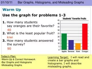
ANSWER: INTERVALS ON VERTICAL AXIS NOT EVEN . ALSO NO LABLES SO NOT SURE WHAT GRAPH IS TALKING ABOUT.
This 3D bar chart might look very attractive, but it is also very misleading. There is no scale on the vertical axis and, because of the perspective, it looks as though sales for 1995 were far greater than those for any other year. In fact, they were identical to those in 1997.The data would be better represented on a 2D-bar chart, with appropriate labelling on each axis:
What is wrong with this pictogram showing the number of people who own different types of pets?
On this pictogram, there is no category for people who do not own a pet. The pictures are different sizes, and it appears that more people own a horse than any other animal. An improvement would be to redraw the pictogram, with each of the animals the same size and aligned with one another like this:
SCALE IS TOO SMALL which makes it look as though Hot Dogs are the favorite food by 3 times over Pizza and 6 times over Hamburgers. If the SCALE IS TOO BIG, its hard to make a distinction as to which is the favorite!
Look how small the scale is!!!!Also, it doesn’t begin with 0.No wonder Gold stores are cropping up all over!
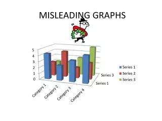
3D MODEL CAN BE MISLEADING BECAUSE IT APPEARS THE BAR IN FRONT IS MUCH LARGER THAN IT REALLY IS.
GRAPHS CAN BE MISLEADING WHEN: • DOES NOT BEGIN WITH “0” ON THE VERTICAL AXIS • VERTICAL AXIS HAS UNEVEN INTERVALS • 3D MODEL CAN BE MISLEADING • PICTOGRAPH HAS PICTURES THAT ARE DIFFERENT SIZES • SCALE IS TOO SMALL • SCALE IS TOO BIG