Misleading Graphs and Statistics
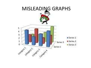
Misleading Graphs and Statistics. Chapter 2. Questions to Ask When Looking at Data and/or Graphs. Is the information presented correctly? Is the graph trying to influence you? Does the scale use a regular interval? What impression is the graph giving you?. Why is this graph misleading?.

Misleading Graphs and Statistics
E N D
Presentation Transcript
Misleading Graphs and Statistics Chapter 2
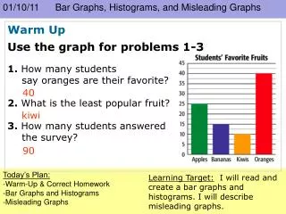
Questions to Ask When Looking at Data and/or Graphs • Is the information presented correctly? • Is the graph trying to influence you? • Does the scale use a regular interval? • What impression is the graph giving you?
Why is this graph misleading? This title tells the reader what to think (that there are huge increases in price). The scale moves from 0 to 80,000 in the same amount of space as 80,000 to 81,000. The actual increase in price is 2,000 pounds, which is less than a 3% increase. The graph shows the second bar as being 3 times the size of the first bar, which implies a 300% increase in price.
A more accurate graph: An unbiased title A scale with a regular interval. This shows a more accurate picture of the increase.
Why is this graph misleading? The scale does not have a regular interval.
Graphs can be misleading in the news. • The margin of error is the amount (usually in percentage points) that the results can be “off by.” • Be wary of data with large margins of error.
Problems: • The difference in percentage points between Democrats and Republicans (and between Democrats and Independents) is 8% (62 – 54). Since the margin of error is 7%, it is likely that there is even less of a difference. • The graph implies that the Democrats were 8 times more likely to agree with the decision. In truth, they were only slightly more likely to agree with the decision. • The graph does not accurately demonstrate that a majority of all groups interviewed agreed with the decision.
What does the top of this graph show? • About 12 million people are downloading music legally. • Just over 9 million people are downloading music illegally. The bottom of the graph is misleading. Why? • The graph implies that 1% of the iPods are filled with legally downloaded music. • It implies that the other 99% are filled with illegally downloaded music. Why is this wrong?
What could be in those iPods besides legally downloaded music? • Empty space – most people don’t have iPods that are filled to capacity. • Songs that were added from legally purchased CDs. • Games, calendars, other applications. • Songs that were downloaded illegally. It is possible that the rest of the iPod contains some illegally downloaded music, but it is unlikely that 99% of a person’s iPod is filled with illegal music.
More information: • The iPod graphic appeared in Wired magazine. • A quote from the article: “What’s filling all that excess capacity? Well, despite the efforts of the Recording Industry Association of America, nearly a billion songs are traded on P2P networks every month.” • This article was trying to imply that all of the excess space is filled with illegal downloads, which is likely untrue. • The statistics for the article were provided by the music industry.