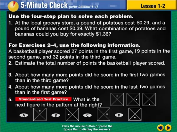

Constructing Bar Graphs and Histograms
E N D
Presentation Transcript
Transparency 7 Click the mouse button or press the Space Bar to display the answers.
Example 7-4b Objective Construct and interpret bar graphs and histograms
Example 7-4b Vocabulary Bar graph A visual display of data by using solid bars to represent quantities
Example 7-4b Vocabulary Histogram A special kind of bar graph using bars to represent frequency of numerical data
Example 7-4b Review Vocabulary Frequency Table A display of data that shows how often an item occurs
Lesson 7 Contents Example 1Construct a Bar Graph Example 2Construct a Histogram Example 3Compare Bar Graphs and Histograms Example 4Use Graphs to Solve a Problem Example 5 Use Graphs to Solve a Problem
Country Vacation Days per Year Italy 42 France 37 Germany 35 Brazil 34 United Kingdom 28 Canada 26 Korea 25 Japan 25 United States 13 Source:The World Almanac Example 7-1a TOURISMThe table below shows the average number of vacation days per year for people in various countries. Make a bar graph to display the data. 1/5
Example 7-1a Country Vacation Days per Year Italy 42 France 37 Germany 35 Brazil 34 United Kingdom 28 Canada 26 Korea 25 Japan 25 United States 13 Source:The World Almanac Decide on a scale and interval Find the largest number Since the scale must start at 0 on a bar graph and must include the largest number so scale should be at least 0 - 50 10 would be appropriate intervals 1/5
Example 7-1a The numbers of the intervals are identified on the lines not the spaces Start at zero (0) and use 10 as the intervals Label the vertical axis which is the intervals 1/5
Example 7-1a Label the horizontal axis which is the categories 1/5
Example 7-1a Give the graph a title Must have a relationship between the horizontal and vertical axis 1/5
Example 7-1a Draw the bars using the data from the chart 1/5
Example 7-1a Answer: 1/5
Example 7-1b SPORTSThe table below shows the average number of miles run each day during training by members of the cross country track team. Make a bar graph to display the data. 1/5
Answer: Example 7-1b 1/5
Example 7-2a BASKETBALLThe number of wins for the 29 teams of the NBA for the 2000-2001 season have been organized into a frequency table. Make a histogram of the data. Decide on a scale and interval Find the largest number Since the scale must start at 0 on a bar graph and must include the largest number so scale should be at least 0 - 10 2/5
Example 7-2a The numbers of the intervals are identified on the lines not the spaces Start at zero (0) The interval is by 1’s but can label every other line 2/5
Example 7-2a Label the vertical axis 2/5
Example 7-2a Add the categories on the horizontal axis 2/5
Example 7-2a Label the horizontal axis 2/5
Example 7-2a Give histogram a title BASKETBALLThe number of wins for the 29 teams of the NBA for the 2000-2001 season have been organized into a frequency table. Make a histogram of the data. 2/5
Example 7-2a Draw a bar to represent the frequency of each category Remember: The bars touch in a histogram 2/5
Example 7-2a Answer: 2/5
Example 7-2b SPEEDThe speeds of cars on a stretch of interstate are clocked by a police officer and have been organized into a frequency table. Make a histogram of the data. 2/5
Answer: Example 7-2b 2/5
Example 7-3a Using the graphs below, which graph would you use to tell how many cars under $30,000 were sold? Answer: Graph A 3/5
Which graph would you use to tell how many houses sold for $150,000 or greater in a recent year? Example 7-3b Answer: Graph B 3/5
Example 7-3a Which graph would you use to compare the prices of a mid-size car and an SUV? Answer: Graph B 3/5
Example 7-3b Which graph would you use to compare the price of a ranch style home to the price of a colonial style home? Answer: Graph A 3/5
A There are 67 cars in the data set. B Two cars are priced between $30,000 and $34,999. CMost of the cars are priced between $15,000 and $19,999. DMid-size cars sell the best. Example 7-4a MULTIPLE-CHOICE TEST ITEMWhich conclusion cannot be made about the data in the graph? 4/5
Example 7-4a MULTIPLE-CHOICE TEST ITEMWhich conclusion cannot be made about the data in the graph? A There are 67 cars in the data set. 30 + 26 + 10 + 1 Estimation could conclude there are 67 cars 4/5
Example 7-4a MULTIPLE-CHOICE TEST ITEMWhich conclusion cannot be made about the data in the graph? B Two cars are priced between $30,000 and $34,999. Could estimate 2 cars 4/5
Example 7-4a MULTIPLE-CHOICE TEST ITEMWhich conclusion cannot be made about the data in the graph? CMost of the cars are priced between $15,000 and $19,999. Bar shows most of cars are priced in this category 4/5
Example 7-4a MULTIPLE-CHOICE TEST ITEMWhich conclusion cannot be made about the data in the graph? DMid-size cars sell the best. Histogram does not have any information on size of car 4/5
A There are 67 cars in the data set. B Two cars are priced between $30,000 and $34,999. CMost of the cars are priced between $15,000 and $19,999. DMid-size cars sell the best. Example 7-4a MULTIPLE-CHOICE TEST ITEMWhich conclusion cannot be made about the data in the graph? Answer: D 4/5
MULTIPLE-CHOICE TEST ITEMWhich conclusion cannot be made about the data in the graph? AThere are 21 homes in the $150,000 - $199,000 interval. BColonial style homes tend to cost more than ranch style homes. CA total of 79 homes are in the data set. DThe most houses are priced between $200,000 and $249,000 Example 7-4b * Answer: B 4/5
End of Lesson 7 Assignment