Victor Vasarely
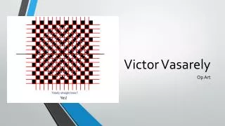
Victor Vasarely. Op Art. Yes!. Victor Vasarely 1906-1997 Op Art. Vasarely’s art we will focus on today is designed to get the viewer to see the image in different ways depending on how the viewer interacts with the art

Victor Vasarely
E N D
Presentation Transcript
Victor Vasarely Op Art Yes!
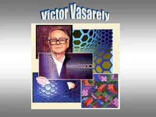
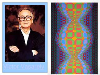
Victor Vasarely1906-1997Op Art • Vasarely’s art we will focus on today is designed to get the viewer to see the image in different ways depending on how the viewer interacts with the art • It was this particular set of artwork that branded the name “Op-Art” and noted Vasarely as the “inventor” of it Victor Vasarely is a Hungarian-French artist known for being the “grandfather/creator/inventor” of Op Art Op Art is short for optical art or artwork that creates optical illusions (or plays tricks) on the eye He actually studied to be a doctor before coming back to creating art
Victor VasarelyOp Art • Notice how bright the colors are in the middle of the picture and how they fade around the edges • Victor uses value (lights, mediums, and dark shades of a color to create the illusions of popping out or receding/going in) This first piece is Vega-Multi from 1976 Raise your hand if you think it looks like the ball is coming towards us Raise your hand if you think the area around the outside of the ball is sinking backward This is a perfectly flat painting that Vasarely designed to make your eye believe that it has three dimensions
Victor VasarelyOp Art • Contrast is what makes colors appear to “pop” forward (the yellow-orange pops off of the page while the purple seems to sink back) • Complementary sets of color look good together and really grab our attention with their contrast…think about Purple saying, “Oh Yellow you look so bright next to me!” and Yellow responding, “Thank you, we do make a great complementary pair!” Here is Vasarely’s work called Vega-Ball completed in 1979 Notice how Vasarely used yellow-orange and purple in his work Yellow and purple are what we call complementary colors - Artists use complementary colors next to each other to create contrast
Victor VasarelyOp Art • Here’s the color wheel we studied before • The complementary colors we will focus on today are the combinations of: • red/green • yellow/purple • blue/orange • Notice how these complementary colors are across from each other on the color wheel • Where have we seen any of these complementary colors before? • Bears uniforms • Holiday colors • Lakers uniforms
Victor VasarelyOp Art Medium purple Today we are going to pick one of those color combinations to create our own Op Art piece! First we are going to choose a ‘popping out’ or ‘going in’ checkerboard sheet – the art team will be around to show you these options Next, choose which set of complementary colors you want to use today - red/green, yellow/purple, blue/orange Once you have chose which set to use, start shading with a colored pencil the darker color of your set (blue for blue/orange, purple for purple/yellow, or green for green/red) to make a checkerboard pattern – watch me demonstrate As you are shading your checkerboard pattern, use value to create illusion (press hardest in smallest squares, medium in medium squares, lightest in biggest squares) See how Vasarely did this in Vega-ball? Light purple Dark purple
Victor VasarelyOp Art Next, cut out the checkerboard with your scissors Now, we will hand out watercolors for you to shade in the other “half” of your checkerboard Use watercolor paint (or stick with colored pencil) to fill in the lighter color of complement set and continue to shade the bigger boxes lighter, medium boxes medium, and smaller boxes darker For watercolors, more water = lighter paint shade, less water = darkest paint shade – the art team can help you with this as we move around the room Once you are done with your checkerboards you can do the same process with 1-2 spheres while the art team comes around to help you attach your checkerboard to your background paper that matches your complement set After you finish 1-2 spheres, glue the spheres onto the checkerboard in an interesting pattern (or to hide any little “mistakes”) and have at least one of your spheres coming off of the checkerboard and partially onto the colored paper - don’t forget to put your name on your finished work!
Victor VasarelyOp Art Let’s review what we learned today: Op Art is short for optical art or artwork that creates optical illusions (or plays tricks) on the eye The complementary colors are the combinations of red/green, yellow/purple, and blue/orange Contrast is what makes the dark of your complement pair go back and bright of the pair pop forward. Complements grab attention (think of football jerseys or other sports teams, and many advertising logos) because the lighter of the pair pops out and the darker of the pair goes back into space creating a pleasing contrast. Value changes (light yellow, medium yellow, dark yellows) are what helps give the illusion of a sphere popping out or receding in
Victor VasarelyOp Art Discussion Questions: What is Op Art? Name a set of complementary colors Can you think of an example of complementary colors used in real life? What is value and how does it help make an illusion in art? Who is the artist we studied today? What we he known for “inventing”? What would you name your art piece? How does your piece play tricks on your eyes?

