Understanding Color and Design Elements: Exploring Darkness, Lightness, and Composition Techniques
This guide focuses on the fundamental aspects of color and design elements, highlighting the concepts of tint and shade in relation to hues. It examines the role of lines in design—static, dynamic, and random—and their ability to divide or unify composition. Additionally, it categorizes shapes into geometric, natural, and abstract types, alongside their associated meanings. The importance of mass, texture, color theory, and space in visual design are emphasized, providing essential tips for effective communication through design.

Understanding Color and Design Elements: Exploring Darkness, Lightness, and Composition Techniques
E N D
Presentation Transcript
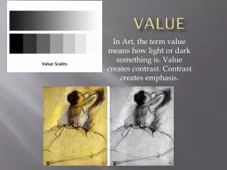
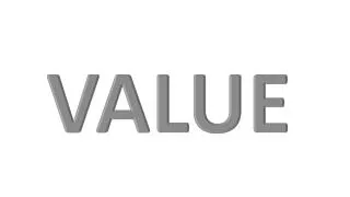
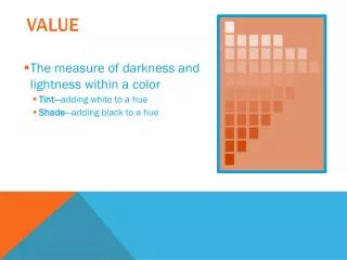
Value • The measure of darkness and lightness within a color • Tint—adding white to a hue • Shade—adding black to a hue
Design Elements Ann Ware - 2012
Lines • Can be used to divide or unite elements on a page • Can denote direction • Can provide an anchor to hold elements on a page
Lines can be: • Static—uniform spacing • Dynamic—uneven spacing of otherwise uniform lines • Random--freeform
Shapes • Geometric • Natural • Abstract
Geometric • Circle—suggests infinity; free movement
Geometric • Square—denotes honesty and stability; Squares are familiar, trusted shapes. Because the vast majority of the text we read is set in squares and rectangles, it has become familiar, safe, and comfortable.
Geometric • Triangle--suggests action, movement
Natural • Natural shapes are found in nature or they can be manmade shapes. Leaves are an example of a natural shape. An ink blob is a natural shape. Natural shapes are often irregular and fluid.
Abstract • Abstract shapes are stylized or simplified versions of natural shapes. Symbols found on signs, such as the stylized wheelchair shape for handicapped access, is one example.
Mass • Physical—the physical dimension (size) of the paper • Letter—8.5 x 11 • Tabloid—11 x 17 • Visual—the size of each element in relationship to the whole piece
Texture • Physical—the characteristics of the paper itself; also known as tactile; Examples: • Glossy • Matte • Linen • Rough—like construction paper, newsprint • Visual—the effects created by photographs or digital images
Color • Color is part of the viewer’s mental response to the light entering the eyes from the display and its surroundings; also known as hue • RGB color (red, green, blue) is the color mode used by monitors; color values range from 0-255 • CMYK color (cyan, magenta, yellow, black) is the color mode used by printers; colors are expressed in percentages—0-100% http://colorusage.arc.nasa.gov/index.php
Color • Important tips on using color: • Consider your audience • Use colors appropriate to the topic • Consider color contrast with your background color; • Older viewers need higher brightness levels to distinguish colors • Use color consistently across the project • Verify that the colors you use look okay on different projection methods; if creating for the web, use web-safe colors • Consider commonly accepted color meanings such as red/yellow are warm, blue/green are cool, red means stop, etc. • Be sensitive to the fact that colors mean different things in different countries and regions.
Space • The distance or area between or around elements on the page • Any area that is free from type or graphics is called white space • White space creates a rest for the eye, and visually organizes the elements on the page; also known as negative space. • It does not necessarily mean the space is white!