Web Site Usability
Web Site Usability. Page Layout Content Navigation Color. Page Layout. Users see the whole page before they notice details. First impression factor. Text and graphics flow to the left margin. Need balancing. Can be accomplished through tables, imagemaps, and dHTML

Web Site Usability
E N D
Presentation Transcript
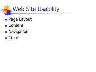
Web Site Usability • Page Layout • Content • Navigation • Color
Page Layout • Users see the whole page before they notice details. First impression factor. • Text and graphics flow to the left margin. Need balancing. • Can be accomplished through tables, imagemaps, and dHTML • Monitor space is too valuable to waste with unnecessary splashy pictures.
Content • People don’t read content on the Web – they skim • Avoid long narratives • One idea per paragraph • Highlight keywords • Use subheads, numbered or bulleted lists, indents, and outlines. • Z scanning pattern • Establish credibility • Avoid “marketese” • “writing style with boastful & subjective claims. Promotional language imposes a cognitive burden by requiring users to filter out the hyperbole” (Nielsen, 1997)
Navigation • Ease of getting around • Users must know at all times where they are in the site • Use consistent site identity – users not always entering from home page • Navigation toolbars are one method, but keep them simple, uncluttered, and immediately visible. Most sites keep them "above the fold," but studies also show value in repeating them at the bottom of the page, since the natural scanning direction is down. • Offer multiple approaches - arrows, forward & back, good textlinks that are brief and to the point. • Design navigation icons wisely - they are often unnecessary and studies show users won't wait for them to load unless they expect to find them helpful.
Color • A complete field of study! Be conservative, no more than 4 colors; color should be used to enhance black & white information. • Even placement on the page has issues: e.g., use blue for large areas, not for text, thin lines or small shapes -- in the retina, blue-sensitive cones are the least numerous of the color receptors. • Use red & green in the center of the visual field, not in the periphery - the edges of the retina are not sensitive to these colors. • Use black, white, yellow, and blue in the periphery of the visual field; the retina remains sensitive to these colors there. • Avoid using simultaneous high-chroma, spectrally extreme colors: red/green, blue/yellow, green/blue, red/blue cause vibrations & illusions of after images or shadows. A. Marcus, Graphic Design for Electronic Documents & User Interfaces, 1992
Advantages of Color Call attention to specific data Identify elements of structures & processes Portray time & progress Increase appeal, believability, memorability & comprehension Show quality & quantity in a limited space Disadvantages of Color May cause visual fatigue & after images May contribute to visual confusion due to complexity Requires more expensive display equipment May have negative cultural or historical associations (blue ribbon in US = red ribbon in England) May not account for color deficient vision (8% male) Color - continued
Graphics • Graphic Images - Relevant graphics are fine; users don't like waiting for purely decorative images. • Users don't like animation when they are seeking information (entertainment sites are a different ballgame)
Design & Strategy • Design should support strategy • Charles Schwab • Wrangler • Amazon • Edmund's
Managing Content • Creation • Conversion • Formatting • Editing • Conformance to standards • Correctness • Consistency (especially when multiple authors) • Staging and Testing • Content Testing – good markup code … works for the browsers that you want it to work • Link Testing • Commerce Testing – Correct pricing; transactions work, etc. • Indexing • Editorial Review • Archiving
Resources • Yale Web Style Guide (http://www.webstyleguide.com/index.html?/) • Usability Guide for Software Engineers (http://www.otal.umd.edu/guse/) • Web Content Accessibility Guidelines (http://www.w3.org/TR/1999/WAI-WEBCONTENT-19990505/)
