Download
1 / 16
160 likes | 285 Vues
This report presents the findings from the usability tests conducted on the EDF Information Center, focusing on the interface, navigation, and search features. With 27 testers, comprising both in-depth and brief users, the evaluation highlighted key areas for improvement—such as the home page organization, toolbar visibility, and search function effectiveness. Users provided valuable feedback, noting challenges with the current layout and a desire for more intuitive content retrieval. The report outlines actionable recommendations to enhance user experience and facilitate better access to information.

E N D
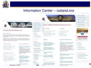
EDF Information Center Usability Test Results and Recommendations November 2007
Scope of testing • Usability of the interface • Content (presence, not quality of info) • Home page organization & navigation • Search feature • Toolbar actions • Glossary access • Most of STA-SI users • In-depth testers = 9 • Brief testers = 18 • Total = 27 of 36 target users, or 75% • Novice, intermediate, and expert EDF users
Quotable quotes • I can see it still needs work, but how do I rate the idea of it? It’s out of this world! • This is something that should have happened a long time ago. • I can see it to be very useful—a one-stop shop. • Can I bookmark this site? [Yes!]
Rating the overall help system • Data from 9 in-depth testers 4= Excellent 3= Good 2= Fair 1= Poor • “It’s like dating.” (A few excellent ratings dropped to good.)
Rating the overall experience • Data from 9 in-depth testers 3= Fully sat 2= Somewhat sat 1= Unsatisfactory • Post-test ratings
Top information needs found? • Results from all 27 users • Chose 1 of 3 top needs
Results interpreted (1 of 2) • Home page navigation • moderately difficult • users studied the page a long time before clicking • data • usually led to the answer (91% completion) • was fairly time-consuming (<1.68 minutes) • with few errors (.72 false attempts) • Search • very difficult • users tried several searches • users studied results lists, often without clicking any items • data • often did not lead to answer (44% completion) • was very time-consuming (<2.37 minutes) • with moderate errors (2.30 false attempts)
Results interpreted (2 of 2) • Toolbar • not noticeable • after error, users typically stopped trying or didn’t notice their error • data • usually was missed (39% completion) • spent little time (<1.22 minutes) • with few errors (.81 false attempts) • Glossary • easy • data • usually led to the answer (96% completion) • was quick (<1.11 minutes) • with few errors (.17 false attempts)
Users’ top comments & suggestions • Bland appearance; columns out of whack • Overwhelming amount of content on home page • Ambiguous major headings • Links on the main page are not descriptive • Search functionality is not intuitive • Unique country processing app. needs to go live • Layout of document links & abstracts is confusing • Toolbar isn’t noticeable; also needs better tips • Left pane is in the way; doesn’t help • Country codes need link to db for accuracy • Users need to be able to add/modify content
Next steps (1 of 3) • Improve appearance & organization: • Simplify the home page • Make the toolbar larger with better tool tips; include all tools needed to avoid alternating w/browser toolbar • Redesign the page layout • Eliminate drop-down abstracts for documents; use “summary” instead of “abstract” if needed
Next steps (2 of 3) • Improve content retrieval: • Convert long documents to help topic chunks for easier search, retrieve, scan, & use • Modify the Search feature’s method of operation (if possible) or provide search tips
Next steps (3 of 3) • Enhance technology: • Link to country name database • Finish the country processing app. • Enable user content contribution