Style Sheets for Print and Mobile Media Types
280 likes | 470 Vues
Style Sheets for Print and Mobile Media Types. Supplemental Material. Sources. Printing and Mobile: Murach’s HTML, XHTML,and CSS ; Anne Boehm, Chapter 12: How to work with print media and mobile devices. Printing: http://webdesign.about.com/cs/css/a/aa042103a.htm

Style Sheets for Print and Mobile Media Types
E N D
Presentation Transcript
Style Sheets for Print and Mobile Media Types Supplemental Material
Sources • Printing and Mobile:Murach’s HTML, XHTML,and CSS; Anne Boehm, Chapter 12: How to work with print media and mobile devices. • Printing:http://webdesign.about.com/cs/css/a/aa042103a.htm • Printing: http://www.webdesignerdepot.com/2010/01/10-tips-for-better-print-style-sheets/ • Mobile: http://www.alistapart.com/articles/return-of-the-mobile-stylesheet
Media-Based Style Sheets • Up until now we have used CSS style sheets to display Web pages on a computer screen • Style sheets can also be created and used for printing a Web page • Mobile devices can also recognize style sheets
Identifying Media Type • Use the HTML <link> element and the media attribute to provide media type • Some values for media types: • all – All device types • screen – computer screen • print- printed pages and print preview • handheld- mobile phones and PDAs • projection- projection devices
Example of <link> for Printing • The print.css style sheet should contain print-friendly styling for the page <link rel=“stylesheet” media=“print”href=“print.css” >
Media type within Style Sheet • If you want to use a style sheet for more than one media type, can create rule sets/groups within the CSS • Define rule set with @ symbol • Ex. @print{ } or @handheld{ } • Any style rules within the set apply only for that media type
Working with Print Media • If a Web page contains info a user may want to print, consider special formatting with a print style sheet • The default printing functionjust prints as the page ison the screen • May contain info not neededsuch as navigation • Some page elements may not be prime for printing
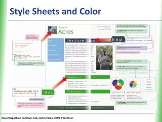
Suggestions for Print Formatting • Change the color of text to be black • Change background color to be white • Non-heading text change to serif for readability • Set a default font that is readable when printed • Remove site navigation • Remove unneeded images or animations • Remove floating, fixed margins and padding
Widows and Orphans • A widow is a stray line from a previous page appears at the top of a page • An orphan is a stray line or heading is left at the bottom of a page • Web pages on the screen don’t have these issues because the user can just scroll • On the printed page, widows and orphans should be prevented Example of a Widow
CSS Properties for Printing * Not supported by most browsers
Page Layout and Printing • If layout has one column, printing the page is not a problem • For two or three column layout, need to decide if you want column printed • Navigation column usually not printed, use display:none for id selector • Printed columns: remove float property and set width: 100% • Set body margin as in margin: .25in
Printing Links and Link URLs • Make links more visible • For links in the content areas, include the actual href attribute after the link Show Link URLs After Stronger Styling of Links a:link, a:visited { color: red; background: transparent; font-weight: bold; text-decoration: underline; } #content a:link:after, #content a:visited:after { content: " (" attr(href) ") "; font-size: 90%; }
Printing your Web Page • When you think you have your print style sheet finished, view the page in Print Preview to make sure: • Run your page, choose File->Print Preview command from the browser menu • To actually print a page: • choose File ->Print from the browser menu • Can also use JavaScript to print the page when a button is clicked: • onclick=“window.print();return false;”
Working with Mobile Devices • Many mobile devices are in use today • Because their screen sizes are much smaller, Web pages designed to display on full computer screen can be difficulty on mobile devices • Web developers can provide pages specifically for mobile devices
5 Methods to Provide Web Pages for Mobile Devices • Define CSS style sheets for mobile devices • Many new mobile browsers don’t recognize handheld media type • CSS3 media queries give more control in style sheet for media types, not widely supported yet • Include link to mobile version of site • Most large commercial sites do this • Use JavaScript to detect mobile devices and redirect to mobile site • Not all phones recognize JavaScript
5 Methods to Provide Web Pages for Mobile Devices (cont.) • Use server-side scripting language to detect mobile device and redirect • PHP, ASP.Net or other server-side language used to detect mobile device • So many types of mobile browsers, hard to detect all types • Use Wireless Universal Resource File (WURFL) to detect mobile device • An XML configuration file contains info on mobile devices and features, must be updated frequently • Needs an Application Programming Interface (API) and appropriate language to interact
Designing Web Pages Specifically for Mobile Devices • Keep layout simple, one column layouts are best • Include only essential content, divide content into smaller pages • Keep images small and few • Avoid the use of Flash animations • Include only essential navigation at top of page • Make links and other form elements large enough to easily manipulate • Use relative measurements so page looks good no matter the scale of the device • Eliminate large background images
Using Mobile Style Sheets Option • Most new mobile browsers as part of their “full web” focus ignore handheld style sheets and read only screen style sheet • Older mobile browsers read only handheld style sheets • Some mobile browsers read handheld if there is one, but will default to screen style sheet • Some read both handheld and screen style sheets
CSS3 Media Queries • These can be used in the <link> tag to target a specific class of mobile device • The media query contains two parts: • a media type • The actual query enclosed in ( ), containing a particular media feature to inspect, followed by the target value <link rel=“stylesheet” type=“text/css” media=“screen and (max-device-width: 480px)href=“core.css”>
Media Queries in CSS file • Can also include CSS3 media queries in the CSS style sheet • Use an @media rule • As part of an @import directive: @media screen and (max-device-width: 480px) { .column { float: none; } } @import url(“handheld.css") only screen and (max-device-width: 480px);
Best Mobile Coverage ??? • Define a style sheet screen.css for PC use • Define a style sheet antiscreen.css to cancel any non-mobile friendly effects set in the screen.css • Tie these two style sheets together into a core.css style sheet @import url("screen.css"); @import url("antiscreen.css") handheld; @import url("antiscreen.css") only screen and (max-device-width:480px);
Best Mobile Coverage (cont.) • Next, create a special mobile-friendly handheld.css style sheet specifically designed for mobile • Finally, link the suggested style sheets in your document as follows: <link rel="stylesheet" href="core.css" media="screen"/> <link rel="stylesheet" href="handheld.css" media="handheld, only screen and (max-device-width:480px)"/>
How Mobile Devices will Respond • Mobile browsers that can read handheld style sheets will never see the problem CSS properties in the screen.css • Mobile devices that read screen and handheld style sheets or media queries will not be affected by problem CSS in the screen.css because the antiscreen.css will cancel these • Finally, PC browsers will ignore both antiscreen.css and handheld.css and use screen.css.
The antiscreen.css • Begin with your screen.css • Set widths to be 100% which allows for fluid content wrapping within the window • Remove unnecessary margins • Remove floated columns to help prevent horizontal scrolling • Eliminate non-necessary content with display:none • Remove large background images • a:hover not supported on mobile, add an a:active pseudo-class to achieve this
Clickable Phone Numbers • If phone numbers appear in your content, it would be user-friendly to allow clicked phone number • Modify you page content to allow for this: • On screen style sheet set phone-link class to disable the link in the screen.css, then enable it again in mobile style sheets <a href="tel:15032084566" class="phone-link“ >(503) 208-4566</a>
Enable/Disable Phone Links Disable Clickable Phone # a.phone-link { pointer-events: none; cursor: default;} Enable Clickable Phone # a.phone-link{ pointer-events: auto !important; cursor: auto !important; }
Using Mobile Device Emulators • Nokia and Sony Emulator • http://mtld.mobi/emulator.php • Enter the URL • Iphone Simulator • http://www.testiphone.com/ • Enter the URL on the simulated phone
CSS for Media Types Summary • Use the media type in the <link> tag to include media specific style sheets • Creating a print-friendly style sheet is relatively painless with media=“print” • Mobile devices are so varied, not one solution can be used to present Web pages • Combination of mobile style sheets and CSS3 media queries can target most mobile devices • Test with Print Preview and Mobile Emulators