Denver Responsive Web Design - Eye9design
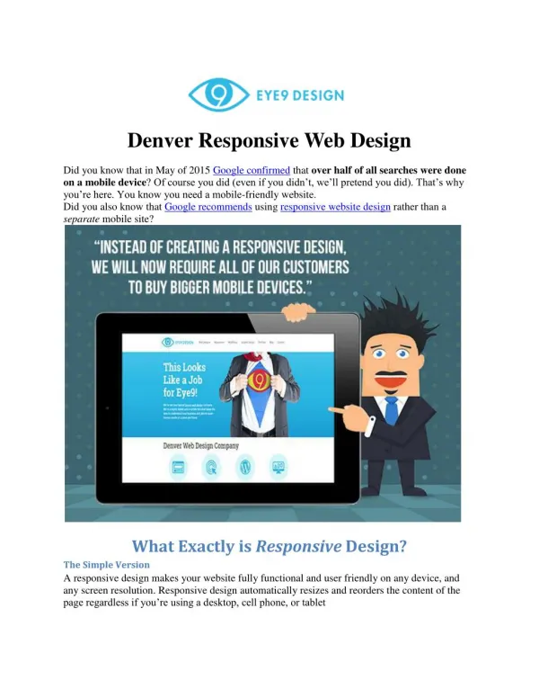
Did you know that in May of 2015 Google confirmed that over half of all searches were done on a mobile device? Of course you did (even if you didn’t, we’ll pretend you did). That’s why you’re here. You know you need a mobile-friendly website.

Denver Responsive Web Design - Eye9design
E N D
Presentation Transcript
Denver Responsive Web Design Did you know that in May of 2015 Google confirmed that over half of all searches were done on a mobile device? Of course you did (even if you didn’t, we’ll pretend you did). That’s why you’re here. You know you need a mobile-friendly website. Did you also know that Google recommends using responsive website design rather than a separate mobile site? What Exactly is Responsive Design? The Simple Version A responsive design makes your website fully functional and user friendly on any device, and any screen resolution. Responsive design automatically resizes and reorders the content of the page regardless if you’re using a desktop, cell phone, or tablet
Benefits of a Responsive Design (Simple Version): oStretchy.The website stretches to fit the browser no matter what device it’s being viewed on. It makes Jeggings look, like, so 2009. oSmart.The website knows what browser you are on! How is that even possible? It’s like your website just got a PhD, but a real one, not like Kanye West’s honorary PhD. oSmooth. It adapts without being clunky or robotic looking. As smooth as the first time MJ did the moonwalk. Magic.It’s basically magic. Houdini* once said “Responsive design makes me look like a rookie.” (*Source: Not verified) Technical Version Responsive websites employ flexible images (dynamically scaled images), CSS3 media queries (different CSS properties based on screen resolution), and proportion based grids (re-sizes based on percentages rather than absolute sizes). It’s a fluid grid that recognizes the screen resolution of the device you are viewing the webpage on, and appropriately displays the various elements on the page. Benefits of a Responsive Design (Technical Version): oOne Version. Unlike sites that use a separate, mobile website, responsive design ensures that there is only one version of your website. This makes marketing and maintaining your website more efficient because you don’t have to maintain multiple versions of the same site. oSearch Engine Optimization (SEO). All of your SEO efforts are consolidated into one site. No need to create separate link-building campaigns, on-site, and off-site optimization for two separate sites. oSite Management. Once again, one version of the site. You can update one portion and feel comfortable that your update will be viewable on all devices. oCompatibility. Your website can be viewed on any device, by any user. Simple as that. oReporting. Instead of creating different Analytics tracking for multiple sites, you can just have one main hub for all your tracking efforts. Simply apply filters if you want to distinguish desktop vs. mobile viewers. User Experience (UX). User experience is an often overlooked benefit of responsive design because marketers tend to focus on the enhanced SEO and scalability instead. However, well designed responsive websites also provide an exceptional user experience. Why Do You Need a Responsive Website? For the most part, separate mobile websites are a thing of the past. Investing in a separate mobile website means that your site is viewable correctly on only two resolutions; desktop and phone. While two is definitely better than one, it is not nearly close to enough when it comes to screen 720.229.0703 | hello@eye9design.com
resolutions. Let’s take a look at this super confusing chart showing us how many different screen resolutions people are using these days: The chart shows the percentage of all internet users in 2015 based on the screen resolution of their device. As you can see, there is not one, two, or even five main resolutions that users are viewing websites with. In fact, if you built a website with five different versions to account for the top 5 resolutions, you’d still be only accounting for 41.5% of all visitors. Mobile sites don’t seem so effective anymore, do they? Convinced You Need a Responsive Website Design? Eye9 Design has you covered. We build beautiful responsive sites that look amazing on any device. In the age of mobile viewing, you’re behind the times if you don’t have a functional website, and it will cost you business. Give us a call at 720-229-0703 or fill out this contact form, and we’ll get you started with a no-obligation, 100% free consultation. 720.229.0703 | hello@eye9design.com