Examining Relationships
Examining Relationships. Chapter 3. Scatterplots. A scatterplot shows the relationship between two quantitative variables measured on the same individuals. The explanatory variable, if there is one, is graphed on the x -axis. Scatterplots reveal the direction, form, and strength. Patterns.

Examining Relationships
E N D
Presentation Transcript
Examining Relationships Chapter 3
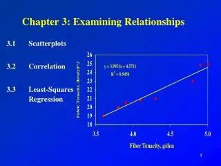
Scatterplots • A scatterplot shows the relationship between two quantitative variables measured on the same individuals. • The explanatory variable, if there is one, is graphed on the x-axis. • Scatterplots reveal the direction, form, and strength.
Patterns • Direction: variables are either positively associated or negatively associated • Form: linear is preferred, but curves and clusters are significant • Strength: determined by how close the points in the scatterplot are linear
Least Squares Regression Line • If the data in a scatterplot appears to be linear, we often like to model the data by a line. Least-squares regression is a method for writing an equation passing through the centroid for a line that models linear data. • A least squares regression line is a straight line that predicts how a response variable, y, changes as an explanatory variable, x, changes.
1. Following are the mean heights of Kalama children: Age (months) 18 19 20 21 22 23 24 25 26 27 28 29Height (cm) 76.1 77.0 78.1 78.2 78.8 79.7 79.9 81.1 81.2 81.8 82.8 83.5a) Sketch a scatter plot. Height (cm) Age (months)
f) b) What is the correlation coefficient? Interpret in terms of the problem.c) Calculate and interpret the slope. d) Calculate and interpret the y-intercept. e) Write the equation of the regression line. f) Predict the height of a 32 month old child. b) There is a strong positive linear relationship between height and age. c) b= .635 For every month in age, there is an increase of about .635 cm in height. • a = 64.93 cm At zero months, the estimated • mean height for the Kalama children is 64.93 cm.
2. Good runners take more steps per second as they speed up. Here are there average numbers of steps per second for a group of top female runners at different speeds. The speeds are in feet per second.Speed (ft/s) 15.86 16.88 17.50 18.62 19.97 21.06 22.11Steps per second 3.05 3.12 3.17 3.25 3.36 3.46 3.55 b) There is a strong, positive linear relationship between speed and steps per second. c) For every 1 foot per second increase in speed, the steps increase typically by .0803 steps per second.
2. Good runners take more steps per second as they speed up. Here are there average numbers of steps per second for a group of top female runners at different speeds. The speeds are in feet per second.Speed (ft/s) 15.86 16.88 17.50 18.62 19.97 21.06 22.11Steps per second 3.05 3.12 3.17 3.25 3.36 3.46 3.55 d) If a runners speed was 0, the steps per second is about 1.77 steps. e) f)
3. According to the article “First-Year Academic Success...”(1999) there is a mild correlation (r =.55) between high school GPA and college GPA. The high school GPA’s have a mean of 3.7 and standard deviation of 0.47. The college GPA’s have a mean of 2.86 with standard deviation of 0.85.a) What is the explanatory variable?b) What is the slope of the LSRL of college GPA on high school GPA? Intercept? Interpret these in context of the problem.c) Billy Bob’s high school GPA is 3.2, what could we expect of him in college? a) High school GPA b) c)
Car dealers across North America use the “Red Book” to help them determine the value of used cars that their customers trade in when purchasing new cars. The book lists on a monthly basis the amount paid at recent used-car auctions and indicates the values according to condition and optional features, but does not inform the dealers as to how odometer readings affect the trade-in value. In an experiment to determine whether the odometer reading should be included, ten 3-year-old cars are randomly selected of the same make, condition, and options. The trade-in value and mileage are shown below. a) b) For every 1000 miles on the odometer, there is a decreaseof about$26.68 in trade in value. c) There is a strong negative linear relationship between a car’s odometer reading and the trade-in value.
Coefficient of determination • Specifically, the value is the percentage of the variation of the dependent variable that is explained by the regression line based on the independent variable. • In other words, in a bivariate data set, the y-values vary a certain amount. How much of that variation can be accounted for if we use a line to model the data.
r2 example 1 • Jimmy works at a restaurant and gets paid $8 an hour. He tracks how much total money he has earned each hour during his first shift.
r2 example 1 • What is my correlation coefficient? • r = 1 • What is my coefficient of determination? • r2 = 1
r2 example 1 • Look at the variation of y-values about the mean. • What explains why the money varies as much as it does?
r2 example 1 • If I draw a line, what percent of the changes in the values of money can be explained by the regression line based on hours? 100%
r2 example 1 • We know 100% of the variation in money can be determined by the linear relationship based on hours.
r2 example 2 • Will be able to explain the relationship between hours and total money for a member of the wait staff with the same precision?
Car dealers across North America use the “Red Book” to help them determine the value of used cars that their customers trade in when purchasing new cars. The book lists on a monthly basis the amount paid at recent used-car auctions and indicates the values according to condition and optional features, but does not inform the dealers as to how odometer readings affect the trade-in value. In an experiment to determine whether the odometer reading should be included, ten 3-year-old cars are randomly selected of the same make, condition, and options. The trade-in value and mileage are shown below. d) We know 79.82% of the variation in trade-in values can be determined by the linear relationship between odometer reading and trade-in value. In other words, about 80% of the variation can be explained by the odometer while the remaining 20% of the variation relies on other variables. e) f)
The scatterplot shows the advertised prices (in thousands of dollars) plotted against ages (in years) for a random sample of Plymouth Voyagers on several dealers’ lots. Price = 12.37 – 1.13 Age R-sq = 75.5% a) b) For every year, there is a de-crease of about $1,130 in price. c) Since the 10 year old Plymouth appears to break from the pattern, expect the correlation to increase. d) We would expect the slope to become more negative.
In one of the Boston city parks there has been a problem with muggings in the summer months. A police cadet took a random sample of 10 days (out of the 90-day summer) and compiled the following data. For each day, x represents the number of police officers on duty in the park and y represents the number of reported muggings on that day. a) b) There is a strong negative linear relationship between the number of police officers and the number of muggings. c) For every additional police officer on duty, there is a decrease of approximately .4932 muggings in the park. d) We know 93.91% of the variation in muggings can be predicted by the linear relationship between number of police officers on duty and number of muggings. e)
Residual plot • A residual is the difference between an observed value of the response variable and the value predicted by the regression line. • residual = observed y – predicted y • The residual plot is the gold standard to determine if a line is a good representation of the data set.
Scatter plot of data Display of LSRL Residual plot Example 1 Age: 18 19 20 21 22 23 24 25 26 27 28 29 Height: 76.1 77.0 78.1 78.2 78.8 79.7 79.9 81.1 81.2 81.8 82.8 83.5 The residual plot is randomly scattered above and below the regression line indicating a line is an appropriate model for the data.
Scatter plot of data Display of LSRL Residual plot Example 2 The residual plot indicates a clear pattern indicating a line is not a good representation for the data.
Scatter plot of data Display of LSRL Residual plot Example 3 The residual plot is randomly scattered above and below the regression line but steadily increases in distance indicating a line is a reliable model only for lower x-values of the data.
The growth and decline of forests … included a scatter plot of y = mean crown dieback (%), which is one indicator of growth retardation, and x = soil pH. A statistical computer package MINITAB gives the following analysis:The regression equation isdieback=31.0 – 5.79 soil pHPredictor Coef Stdev t-ratio pConstant 31.040 5.445 5.70 0.000soil pH -5.792 1.363 -4.25 0.001s=2.981 R-sq=51.5%a) What is the equation of the least squares line?b) Where else in the printout do you find the information for the slope and y-intercept?c) Roughly, what change in crown dieback would be associated with an increase of 1 in soil pH? a) c) A decrease of 5.79%
d) What value of crown dieback would you predict when soil pH = 4.0?e) Would it be sensible to use the least squares line to predict crown dieback when soil pH = 5.67?f) What is the correlation coefficient? d) e) f) There is a moderate negative correlation between soil pH and percent crown dieback.
The following output data from MINITAB shows the number of teachers (in thousands) for each of the states plus the District of Columbia against the number of students (in thousands) enrolled in grades K-12.Predictor Coef Stdev t-ratio pConstant 4.486 2.025 2.22 0.031Enroll 0.053401 0.001692 31.57 0.000s=2.589 R-sq=81.5% a) For every increase of 1000 in student enrollment, the number of teachers increases by about 53.4. There is a strong, positive linear relationship between students and teachers.
The following output data from MINITAB shows the number of teachers (in thousands) for each of the states plus the District of Columbia against the number of students (in thousands) enrolled in grades K-12.Predictor Coef Stdev t-ratio pConstant 4.486 2.025 2.22 0.031Enroll 0.053401 0.001692 31.57 0.000s=2.589 R-sq=81.5% b) r2 = .815 We know about 81.5% of the variation in the number of teachers can be attributed to the linear relationship based on student enrollment.
Transforming Data Model Transformation Equ. Explanatory | Response Exponential x log y Final Model Equation
Transforming Data Model Transformation Equ. Explanatory | Response Power log x log y Final Model Equation
Exponential Power
Exponential Power
Exponential ? Power ?
Linear Power
Exponential Power
For every increase of 1 in population density, the log(agricultural intensity) increases by about 0.0064.
We know 86% of the variation in the log(intensity) can be explained by the linear relationship based on population density.
Cautions about Regression • Correlation and regression describe only linear relationships and are not resistant to the influence of outliers. • Extrapolation is not a reliable prediction. • A lurking variable influences the interpretation of a relationship, yet is not the explanatory or response variable.
The question of causation Association scenario 1 x y Causation
The question of causation Association scenario 2 x y z Common Response (lurking)
The question of causation Association scenario 3 x y ? z Confounding
Examples of relationships • Mother’s body mass index; daughter’s body mass index • A high school senior’s SAT score; the student’s first-year college GPA • The number of years of education a worker has; the worker’s income
More examples • The amount of time spent attending religious services; how long the person lives • Amount of artificial sweetener saccharin in a rat’s diet; count of tumors in the rat’s bladder • Monthly flow of money into savings; monthly flow of money into investments
Final cautions • Even when direct causation is present, it is rarely a complete explanation of an association between two variables. • Even well-established causal relations may not generalize to other settings. • No strength of association or correlation establishes a cause-and-effect link between two variables.
Regression Practice • An economist is studying the job market in Denver area neighborhoods. Let x represent the total number of jobs in a given neighborhood, and let y represent the number of entry-level jobs in the same neighborhood. A sample of six Denver neighborhoods gave the following information (units in 100s of jobs.)
Regression Practice • You are the foreman of the Bar-S cattle ranch in Colorado. A neighboring ranch has calves for sale, and you going to buy some calves to add to the Bar-S herd. How much should a healthy calf weight? Let x be the age of the calf (in weeks), and let y be the weight of the calf (in kilograms).
Regression Practice • Do heavier cars really use more gasoline? Suppose that a car is chosen at random. Let x be the weight of the car (in hundreds of pounds), and let y be the miles per gallon (mpg).