Examining Relationships
This guide examines scatterplots as a tool for analyzing relationships between two quantitative variables. Key questions to consider include identifying the individuals represented, determining the variables and their types, and distinguishing between explanatory and response variables. The example of alcohol's effect on body temperature illustrates these concepts. The guide also provides tips for drawing effective scatterplots, including scaling, labeling axes, and incorporating categorical variables, along with practice problems to reinforce learning.


Examining Relationships
E N D
Presentation Transcript
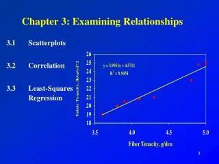
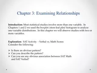
Examining Relationships 3.1 Scatterplots
Questions To Ask • What individuals do the data describe? • What are thevariables? How are they measured? • Are all of the variables quantitativeor is at least one a categoricalvariable?
Explanatory vs. Response • Domain / Range • Independent/ Dependent • x / y • Input / Output • Cause / Effect Outcome Attempt to explain the outcome
Example 3.1 Page 122 • Alcohol has many effects on the body. One effect is a drop in body temperature. To study this effect, researchers give several different amounts of alcohol to mice, then measure the change in each mouse’s body temperature in the 15 minutes after taking the alcohol. • Explanatory: Amount of alcohol • Response: Body temperature
Cause Or Just A Simple Relationship? • When you just want to observe, but there is not an explanatory variable • Examples: • SAT Verbal vs. SAT Math scores • Arm span vs. Height Be careful with “cause”. Just because two variables have a relationship, does not mean one causes the other.
Scatterplots • Shows the relationship between two quantitative variables measured on the same individuals. • One variable on the horizontal axis, the other on the vertical. (If there is an explanatory variable, it always goes on the horizontal axis) • Each individual is represented by a point on the plot.
Examining A Scatterplot - FODS Form – One big group? Any clusters? Linear? Curved? • F – • O – • D – • S - Outliers – Any points that deviate significantly from the overall pattern. Direction – positively associated (+ slope) negatively associated (- slope) Strength – how closely do the points follow the overall pattern?
Figure 3.1 P. 124 Form – two distinct clusters Outliers – No clear outliers Direction – Negative association Strength – Not strong overall
Tips For Drawing A Scatterplot • Scale the horizontal and vertical axes. Intervals must be uniform. • Label both axes. • If given a grid, try to use the whole grid.
Adding Categorical Variables • To add categorical variables, use different types of marks (●, ○, □, +) for your points.
Practice Problems: • Exercises 3.1, 3.2, 3.6, 3.9, 3.12