Download
1 / 109
1.1k likes | 1.58k Vues
Chapter 3 Examining Relationships. AP Statistics Hamilton/Mann. Introduction. A medical study finds that short women are more likely to have heart attacks than women of average height, while tall women have the fewest heart attacks.

E N D
Chapter 3Examining Relationships AP Statistics Hamilton/Mann
Introduction • A medical study finds that short women are more likely to have heart attacks than women of average height, while tall women have the fewest heart attacks. • An insurance group reports that heavier cars have fewer deaths per 100,000 vehicles than do lighter cars. • These and many other statistical studies look at the relationship between two variables. Statistical relationships are overall tendencies, not ironclad rules. They allow individual exceptions.
Introduction • For example, smokers on average die younger than non-smokers, but some smokers who smoke three packs a day live to be 90. • To understand a statistical relationship between two variables, we measure both variables on the same individuals. • Often we must measure other variables as well. • To conclude that shorter women have higher risk of heart attacks, the researchers had to eliminate the effect of other variables such as weight and exercise habits.
Introduction • One thing to always remember is that the relationship between two variables can be strongly influenced by other variables that are lurking in the background. • When examining the relationship between two or more variables, ask these key questions: • Who are the individuals described by the data? • What are the variables? • Why were the data gathered? • When, where, how, and by whom were the data produced?
Introduction • When we have data on several variables, categorical variables are often present and of interest to us. • For example, a medical study may record each subject’s sex and smoking status along with quantitative data such as weight, blood pressure and cholesterol levels. • We may be interested in the relationship between two quantitative variables (weight and blood pressure), between a categorical and quantitative variable (sex and blood pressure) or between two categorical variables (sex and smoking status). • This chapter focuses on quantitative variables.
Introduction • When you examine relationships among variables, a new question becomes important • Do you want simply to explore the nature of the relationship, or do you think that some of the variables help explain or even cause changes in the others? • This gets to the idea of response and explanatory variables. • Explanatory variables are often called independent variables and response dependent variables.
Introduction • Prediction requires that we identify an explanatory and response variable. • Remember that calling one variable explanatory and the other a response does not mean that changes in one cause changes in the other. • To examine the data we will do the following: • Plot the data and compute numerical summaries. • Look for overall patterns and deviations from these patterns. • When the pattern is quite regular, use a compact mathematical model to describe it.
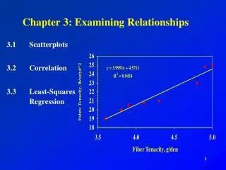
Chapter 3 Section 1 Scatterplots and Correlation HW: 3.21, 3.22, 3.23, 3.25
Scatterplots • The most effective way to display the relationship between two quantitative variables is a scatterplot. • Tips for drawing scatterplots by hand: • Plot the explanatory variable on the horizontal axis (x-axis). The explanatory variable is usually called x and the response variable is usually called y. • Label both axes. • Scale the horizontal and vertical axes. The intervals must be uniform; that is, the distance between tick marks must be the same. • If you are given a grid, try to use a scale so your plot uses the whole grid. Make the plot large enough so details can be seen.
State SAT Math Scores • More than a million high school seniors take the SAT each year. We sometimes see state school systems “rated” by the average SAT score of their seniors. This is not proper because the percent of high school seniors who take the SAT varies from state to state. Let’s examine the relationship between the percents of a state’s high school seniors who took the exam in 2005 and the mean SAT score in the state that year. • We think that percent taking will cause some change in the mean score. So percent taking will be the explanatory variable (on the x-axis) and mean score will be the response variable (on the y-axis). The scatterplot is on the next slide.
State SAT Math Scores Continue! Go back!
Interpreting Scatterplots • To interpret a scatterplot, look for patterns and any important deviations from those patterns. • What patterns did we see in the State SAT Math Scores scatterplot?
State SAT Math Scores • The scatterplot shows a clear direction: the overall pattern is from the upper left to the lower right. That is, states with a higher percent of seniors taking the SAT tend to have a lower mean math SAT score. This is called a negative association between two variables. • The form of the relationship is slightly curved. More important, most states fall into one of two clusters. In the cluster at the right, more than half of high school seniors take the SAT and the mean scores are low. In the cluster at the left, states have higher SAT math scores and less than 30% of seniors take the test. Only three states lie in the gap between the two clusters (Arizona, Nevada, and California).
State SAT Math Scores • What explains the clusters? • There are two tests students can take for acceptance into college: the SAT and the ACT. The cluster at the left are states that tend to prefer the ACT while the cluster at the right are states that prefer the SAT. The students in ACT states who take the SAT tend to be students who are applying to highly selective colleges. Therefore, the mean SAT score for these states is higher because the mean score for the best students will be higher than that for all students.
State SAT Math Scores • The strength of a relationship in a scatterplot is determined by how closely the points follow a clear form. For our example, is only moderately strong because states with the same percent taking the SAT show quite a bit of scatter in their mean scores. • Are there any deviations from the pattern? • West Virginia, where 20% of high school seniors take the SAT, but the mean SAT Math score is only 511 stands out. This point is an outlier.
Beer and Blood Alcohol • How well does the number of beers a student drinks predict his or her blood alcohol content (BAC)? Sixteen student volunteers at The Ohio State University drank a randomly assigned number of cans of beer. Thirty minutes later, a police officer measured their BAC. The data are below.
Beer and Blood Alcohol • The students were equally divided between men and women and differed in weight and drinking habits. • Because of this variation, many students don’t believe that number of drinks will predict BAC well? What do the data say?
Beer and Blood Alcohol • The scatterplot shows a fairly strong positive association. Generally, more beers consumed will results in a higher BAC. • The form of this relationship is linear. That is the points lie in a straight-line pattern. • It is a fairly strong relationship because the points fall pretty close to a line, with relatively little scatter. • If we know how many beers a student has consumed, we can predict BAC quite accurately from the scatterplot.
Not all relationships have a simple form and a clear direction that we can describe as positive association or negative association.
Adding Categorical Variables to Scatterplots • The South has long lagged behind the rest of the country in the performance of its schools. Efforts to improve our education have reduced the gap. We wonder if the south stands out in the study of average SAT math scores. • To observe this relationship, we will plot the 12 southern states in blue and observe what happens. • Most of the southern states blend in with the rest of the country. Several southern states do lie at the lower edges of their clusters. Florida, Georgia, South Carolina, and West Virginia have lower SAT math scores than we would expect from their percent of high school seniors who take the examination.
Adding Categorical Variables to Scatterplots • Dividing the states into “southern” and “nonsouthern” introduces a third variable into the scatterplot. • This is a categorical variable that has only two values. • The two values are displayed by the two different plotting colors.
Measuring Linear Association: Correlation • A scatterplot displays the direction, form, and strength of the relationship between two quantitative variables. • Linear relations are particularly important because a straight line is a simple pattern that is quite common. • We say a linear relation is quite strong if the points lie close to a straight line, and weak if they are widely scattered about a line. • Unfortunately, our eyes are not good judges of how strong a linear relationship is.
Which looks more linear? • They are two different scatterplots of the same data. • So neither is more linear. • This is why our eyes are not good judges of strength.
Measuring Linear Association: Correlation • As you can see, our eyes can be fooled by changing the plotting scales or the amount of empty space around the cloud of points in the scatterplot. • We need to follow our strategy for data analysis by using a numerical measure to supplement the graph. Correlation is the measure we use.
Measuring Linear Association: Correlation • Notice that the two terms inside the summation notation, are just standardized values for x and y. • The formula helps us to see what correlation is, but, in practice, is much too difficult to calculate by hand. Instead we will find correlation on the calculator. • Input the following in list 1 and list 2.
Measuring Linear Association: Correlation • Now go to Stat and then Calc. • We have two options for running a linear regression. • 4:LinReg (ax+b) • 8:LinReg(a+bx) • For whatever reason, in Statistics, we like to have a+bx, so we will use 8. • When you select this, you should get a screen like the one here.
Measuring Linear Association: Correlation • If you did not get the r and r2, then we need to fix a setting on your calculator. • To do this: • click the 2nd key and then 0 to go to Catalog • Click on the D (it’s above x-1) • Scroll down to Diagnostic On and click enter • Hit enter again • Now do the LinReg(a+bx) again and it should all be there.
Facts about Correlation • The formula for correlation helps us see that r is positive when there is a positive association between the variables. • Height and weight, for example, have a positive association. People who are above average in height tend to be above average in weight. • Let’s play with a correlation applet.
Facts about Correlation • Here is what you need to know in order to interpret correlation. • Correlation makes no distinction between explanatory and response variable. It makes no difference which variable you call x and y in calculating the correlation. • Because r uses the standardized values of the observations, r does not change when we change the units of measurement of x, y, or both. Measuring height in centimeters rather than inches and weight in kilograms rather than pounds does not change the correlation between height and weight. The correlation r itself has no unit of measurement; it is just a number.
Facts about Correlation • Positive r indicates positive association between the variables, and negative r indicates negative association. • The correlation r is always a number between -1 and 1. Values of r near 0 indicate a very weak linear relationship. The strength of the linear relationship increases as r moves away from 0 toward either -1 or 1. Values of r near -1 or 1 indicate that the points in a scatterplot lie close to a straight line. The extreme values -1 and 1 occur only in the case of a perfect linear relationship, when the points lie exactly along a straight line.
This gives us some idea of how the correlation relates to linearity and spread of the data.
Facts about Correlation • Describing the relationship between two variables is more complex than describing the distribution of one variable. Here are some cautions to keep in mind. • Correlation requires that both variables be quantitative, so it makes sense to do the arithmetic indicated by the formula for r. • Correlation describes the strength of only the linear relationship between variables. Correlation does not describe curved relationships between variables, no matter how strong they are.
Facts about Correlation • Like the mean and standard deviation, the correlation is not resistant: r is strongly affected by a few outlying observations. • Correlation is not a complete summary of two-variable data, even when the relationship between two variables is linear. You should give the means and standard deviations of both x and y along with the correlation. • Because the formula for correlation uses the means and standard deviations, these measures are the proper choice to accompany a correlation.
Scoring Figure Skaters • Two judges, Pierre and Elena, have awarded scores for many figure skaters. Our question is how well do they agree. • We calculate that the correlation between their scores is r = 0.9, but the mean of Pierre’s scores is 0.8 point lower than Elena’s mean. • The mean score shows that Pierre awards lower scores than Elena, but because he gives about 0.8 point lower than Elena, the correlation remains high. • Adding the same number to all values of x or y does not change the correlation.
Scoring Figure Skaters • If both judges score the same skaters, the competition is scored consistently because Pierre and Elena agree on which performances are better than others. • But if Pierre scores some skaters and Elena others, we must add 0.8 point to Pierre’s scores to arrive at a fair comparison.
Word of Warning • Even giving means, standard deviations, and correlation for “state SAT math scores” and “percent taking” will not point out the clusters that we saw in the scatterplot. • Numerical summaries complement plots of data, but they do not replace them.
Chapter 3 Section 2 Least-Squares Regression Line HW: 3.29, 3.30, 3.32, 3.34, 3.35 due Thursday 3.40, 3.41, 3.43, 3.44, 3.46 due Tuesday after spring break!!! Along with section 1 quizzes
Least-Squares Regression • Linear (straight-line) relationships between two quantitative variables are easy to understand and are quite common. • In Section 1, we found linear relationships in settings as varied as sparrowhawk colonies, sodium and calories in hot dogs, and blood alcohol levels. • Correlation measures the strength and direction of these relationships. • When a scatterplot shows a linear relationship, we would like to summarize the overall pattern by drawing a line on the scatterplot.
Least-Squares Regression • A regression line summarizes the relationship between two variables, but only in a specific setting: when one of the variables helps explain or predict the other. • Regression, unlike correlation, requires that we have an explanatory variable and a response variable.
Does Fidgeting Keep You Slim? • Some people don’t gain weight even when they overeat. Perhaps fidgeting and other “nonexercise activity” (NEA) explain why – some people may spontaneously increase NEA when fed more. • Researchers deliberately overfed 16 healthy young adults for 8 weeks. They measured fat gain (in kilograms) and, as an explanatory variable, change in energy use (in calories) from activity other than deliberate exercise – fidgeting, daily living, and the like.
Does Fidgeting Keep You Slim? • Who? The individuals are 16 healthy young adults who participated in a study on overeating. • What? The explanatory variable is change in NEA (in calories), and the response variable is fat gain (kilograms). • Why? Researchers wondered whether changes in fidgeting and other NEA would help explain weight gain in individuals who overeat. • When, Where, How, and By Whom? The data come from a controlled experiment in which subjects were forced to overeat for an 8-week period. The results of the study were published in Science magazine in 1999.
Does Fidgeting Keep You Slim? • The correlation between NEA change and fat gain is r = -0.7786.
Does Fidgeting Keep You Slim? • Interpretation: the scatterplot shows a moderately strong negative linear association between NEA change and fat gain, with no outliers. • People with larger increases in NEA do indeed gain less fat. • A line drawn through the points will describe the overall pattern well. This is what we wish to learn to do in this section.
Interpreting a Regression Line • When a scatterplot displays a linear form, we can draw a regression line through the points. • A regression line is a model for the data. • The equation of a regression line gives a compact mathematical description of what this model tells us about the dependence of the response variable y on the explanatory variable x.
Interpreting a Regression Line • Although you are familiar with the form y = mx + b for the equation of a line from algebra, statisticians have adopted y = a + bx as the form for the equation of the regression line. • We will also adopt this form too, so we will be consistent with notation that is used by others.
Does Fidgeting Keep You Slim? • Any straight line describing the nonexercise activity data has the form fat gain = a + b(NEA change) • In the plot below, the regression line with equation fat gain = 3.505 – 0.00344(NEA change) has been drawn. • The plot shows that the line fits the data well. • Go back! • Go back!
Does Fidgeting Keep You Slim? • Interpreting Slope • The slope b = -0.00344 tells us that fat gained goes down by 0.00344 kilogram for each added calorie of NEA, according to this linear model. • The slope of a regression line y = a +bx is the predicted rate of change in the response y as the explanatory variable x changes. • The slope of the regression line is an important numerical description of the relationship between two variables.
Does Fidgeting Keep You Slim? • Interpreting the y-intercept • The y-intercept, a = 3.505 kilograms, is the fat gain estimated by this model if NEA does not change when a person overeats. • Although we need the value of the y-intercept to draw the line, it is statistically meaningful only when x can actually take values close to zero.
Does Fidgeting Keep You Slim? • The slope b = -0.00344 is small for our example. • This does not mean that change in NEA has little effect on fat gain. The size of a regression slope depends on the units in which we measure the two variables. • For our example, the slope is the change in kilograms when NEA increases by 1 calorie. • There are 1000 grams in a kilogram. So if we measured in grams instead, the slope would be 1000 times larger or b =-3.44. • The point is, you cannot say how important a relationship is by looking at how big the regression slope is.