Chapter 3: Examining relationships between Data
This chapter explores the intricate relationships between explanatory and response variables in data analysis. It emphasizes that calling a variable explanatory does not imply causation. Through scatterplots, the chapter helps interpret the strength and direction of these variables' relationships, utilizing correlation coefficients and regression lines. The least-squares regression method is discussed, focusing on how it predicts outcomes based on explanatory variables. Additionally, it examines the significance of residuals and their contribution to understanding data patterns.

Chapter 3: Examining relationships between Data
E N D
Presentation Transcript
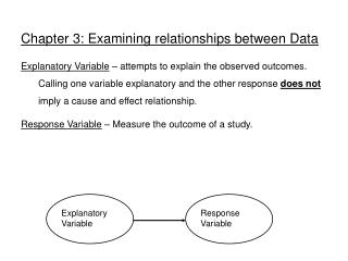
Chapter 3: Examining relationships between Data Explanatory Variable – attempts to explain the observed outcomes. Calling one variable explanatory and the other response does not imply a cause and effect relationship. Response Variable – Measure the outcome of a study. Explanatory Variable Response Variable
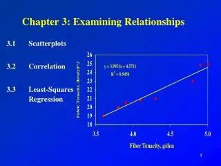
Analyzing Data • Start with a graph. • Look for patterns or deviation from patterns. • Examine numerical descriptors of the data. (mean median, IQR, etc.) Scatterplots Shows the relationship between two quantitative variables. Always put explanatory variable on the x axis if one can be identified. (Chicken or egg?)
Interpreting scatterplots • Look for pattern • - direction; negative or positive association. • - Form; clusters, linear, curved etc. • - Strength; strong if points in any discernable line or curve. Weak if points are scattered. • - Pay careful attention to any outliers or clusters. You may want to split the data into categories to reveal information. • Activity - length of ring and first finger.
Now we change the number of beers to the number of beers/weight of a person in pounds. Note how much smaller the variation is. An individual’s weight was indeed influencing our response variable “blood alcohol content.” There is quite some variation in BAC for the same number of beers drunk. A person’s blood volume is a factor in the equation that we have overlooked.
Correlation tells us about strength (scatter) and direction of the linear relationship between two quantitative variables. But which line best describes our data?
If Xi and Yi agree most of the time then r will be positive; if they do not agree most of the time then r will be negative.
Correlation coefficient app http://www.gifted.uconn.edu/siegle/research/Correlation/scatter/scatterplotdemo.html
Correlation coefficient app http://www.gifted.uconn.edu/siegle/research/Correlation/scatter/scatterplotdemo.html
Properties of r Pos r positive association; Neg r negative association r always lies between -1 and 1. -1--------------- 0 ---------------1 strong neg. no association strong pos. 3. Changing units will not change r; example converting lbs. to kg The correlation r describes the strength and direction of a straight-line relationship. r is nonresistant; like the mean and std it is affected by outliers or extreme observations Correlation is not a complete description of two variable data. The means and std of both variables are important as well.
A regression line is a straight line that describes how a response variable y changes as an explanatory variable x changes. We often use a regression line to predict the value of y for a given value of x. The average x value and the average y value are always a point on the regression line Least squares regression line app http://hspm.sph.sc.edu/courses/J716/demos/LeastSquares/LeastSquaresDemo.html
Least squares regression line app http://hspm.sph.sc.edu/courses/J716/demos/LeastSquares/LeastSquaresDemo.html
The least-squares regression line is the unique line such that the sum of the squared vertical (y) distances between the data points and the line is the smallest possible. Distances between the points and line are squared so all are positive values. This is done so that distances can be properly added (Pythagoras).
is the predicted y value (y hat) b is the slope a is the y-intercept The least-squares regression line can be shown to have this equation: "a" is in units of y "b" is in units of y/units of x
Determine the regression line First we calculate the slope of the line, b, from statistics we already know: r is the correlation sy is the standard deviation of the response variable y sx is the the standard deviation of the explanatory variable x Once we know b, the slope, we can calculate a, the y-intercept: where x and y are the sample means of the x and y variables This means that we don’t have to calculate a lot of squared distances to find the least-squares regression line for a data set. We can instead rely on the equation. But typically, we use a 2-var stats calculator or a stats software.
They are NOT points from your sample data (except by pure coincidence). The equation completely describes the regression line. To plot the regression line, you only need to plug two x values into the equation, get y, and draw the line that goes through those two points. Hint: The regression line always passes through the mean of x and y. The points you use for drawing the regression line are derived from the equation.
Residuals Points above the line have a positive residual. Points below the line have a negative residual. The distances from each point to the least-squares regression line give us potentially useful information about the contribution of individual data points to the overall pattern of scatter. These distances are called “residuals.” The sum of theseresiduals is always 0. ^ Predicted y Observed y
Residual plots Residuals are the distances between y-observed and y-predicted. We plot them in a residual plot. If residuals are scattered randomly around 0, chances are your data fit a linear model, were normally distributed, and you didn’t have outliers.
Residuals are randomly scattered—good! A curved pattern—means the relationship you are looking at is not linear. A change in variability across plot is a warning sign. You need to find out why it is and remember that predictions made in areas of larger variability will not be as good.
The x-axis in a residual plot is the same as on the scatterplot. • The line on both plots is the regression line. Only the y-axis is different.
Coefficient of determination, r2 r2 represents the fraction of the variance in y(vertical scatter from the regression line) that can be explained by changes in x. r2, the coefficient of determination, is the square of the correlation coefficient.
r = 0.87 r2 = 0.76 Changes in x explain 0% of the variations in y. The value(s) y takes is (are) entirely independent of what value x takes. r = 0 r2 = 0 Here the change in x only explains 76% of the change in y. The rest of the change in y (the vertical scatter, shown as red arrows) must be explained by something other than x. r = −1 r2 = 1 Changes in x explain 100% of the variations in y. y can be entirely predicted for any given value of x.
Grade performanceIf class attendance explains 16% of the variation in grades, what is the correlation between percent of classes attended and grade? 1. We need to make an assumption: Attendance and grades are positively correlated. So r will be positive too. 2. r2 = 0.16, so r = +√0.16 = + 0.4 A weak correlation.
r =0.9 r2 =0.81 There is quite some variation in BAC for the same number of beers drunk. A person’s blood volume is a factor in the equation that was overlooked here. r =0.7 r2 =0.49 We changed the number of beers to the number of beers/weight of a person in pounds. • In the first plot, number of beers only explains 49% of the variation in blood alcohol content. • But number of beers/weight explains 81% of the variation in blood alcohol content. • Additional factors contribute to variations in BAC among individuals (like maybe some genetic ability to process alcohol).
Outliers and influential points Child 19 = outlier in y direction Child 19 is an outlier of the relationship. Child 18 is only an outlier in the x direction and thus might be an influential point. Child 18 = outlier in x direction Outlier: An observation that lies outside the overall pattern of observations. “Influential individual”: An observation that markedly changes the regression if removed. This is often an outlier on the x-axis.
Outlier in y-direction Influential All data Without child 18 Without child 19 Are these points influential?
That’s why typically growth charts show a range of values (here from 5th to 95th percentiles). This is a more comprehensive way of displaying the same information.
(in 1000’s) There is a positive linear relationship between the number of powerboats registered and the number of manatee deaths. The least-squares regression line has for equation: Thus, if we were to limit the number of powerboat registrations to 500,000, what could we expect for the number of manatee deaths? Roughly 21 manatees.